Chapter 8 Selected Topics in Statistical Inference
This chapter looks at performing selected statistical analyses. It is not comprehensive. The focus is on implementation using Python and R. Good statistical practice is more than knowing which function to use, and at a minimum, we recommend reading the article Ten Simple Rules for Effective Statistical Practice (Kass et al. 2016).
8.1 Comparing group means
Many research studies compare mean values of some quantity of interest between two or more groups. A t-test analyzes two group means. An Analysis of Variance, or ANOVA, analyzes three or more group means. Both the t-test and ANOVA are special cases of a linear model.
To demonstrate the t-test, we examine fictitious data comprised of 15 scores each for two groups of subjects. The “control” group was tested as-is while the “treated” group experienced a particular intervention. Of interest is (1) whether or not the mean scores differ meaningfully between the treated and control groups, and (2) if they do differ, how are they different?
To demonstrate ANOVA, we use data from The Analysis of Biological Data (3rd ed) (Whitlock and Schluter 2020) on the mass of pine cones (in grams) from three different environments in North America. Of interest is (1) whether or not the mean mass of pine cones differs meaningfully between the three locations, and (2) if they do differ, how are they different?
We usually assess the first question in each scenario with a hypothesis test and p-value. The null hypothesis is that there is no difference between the means. The p-value is the probability of obtaining the observed differences between the groups (or more extreme differences) assuming that the null hypothesis is true. A small p-value, traditionally less then 0.05, provides evidence against the null. For example, a p-value of 0.01 indicates that there is a 1% chance of observing a mean difference at least as the large as the difference you observed if there really was no difference between the groups. Note that p-values don’t tell you how two or more statistics differ. See the ASA Statement on p-values for further discussion.
We assess the second question in each scenario by calculating confidence intervals for the difference(s) in means. Confidence intervals are more informative than p-values: A confidence interval gives us information on the uncertainty, direction, and magnitude of a difference in means. For example, a 95% confidence interval of [2, 15] tells us that the data are consistent with a true difference of anywhere between 2 and 15 units and that the mean of one group appears to be at least 2 units larger than the mean of the other group. Note that a 95% confidence interval does not mean there is a 95% probability that the true value is in the interval: A confidence interval either captures the true value or it doesn’t; we don’t know. However, the process of calculating a 95% confidence interval is such that the confidence interval will capture the true difference in roughly 95% of repeated samples.
Python
t-test
Our data are available as a pandas DataFrame. It’s small enough to view in its entirety:
    score    group
0    77.0  control
1    81.0  control
2    77.0  control
3    86.0  control
4    81.0  control
5    77.0  control
6    82.0  control
7    83.0  control
8    82.0  control
9    79.0  control
10   86.0  control
11   82.0  control
12   78.0  control
13   71.0  control
14   84.0  control
15   85.0  treated
16   85.0  treated
17   89.0  treated
18   88.0  treated
19   87.0  treated
20   89.0  treated
21   88.0  treated
22   85.0  treated
23   77.0  treated
24   87.0  treated
25   85.0  treated
26   84.0  treated
27   79.0  treated
28   83.0  treated
29   87.0  treated
A stripchart is one of many ways to visualize numeric data between two groups. Here, we use the function stripplot() from seaborn. It appears that the treated group have higher scores on average.
import seaborn as sns
import matplotlib.pyplot as plt
plt.clf()
sns.stripplot(x = "score", y = "group", data = ch8_d1)
plt.show()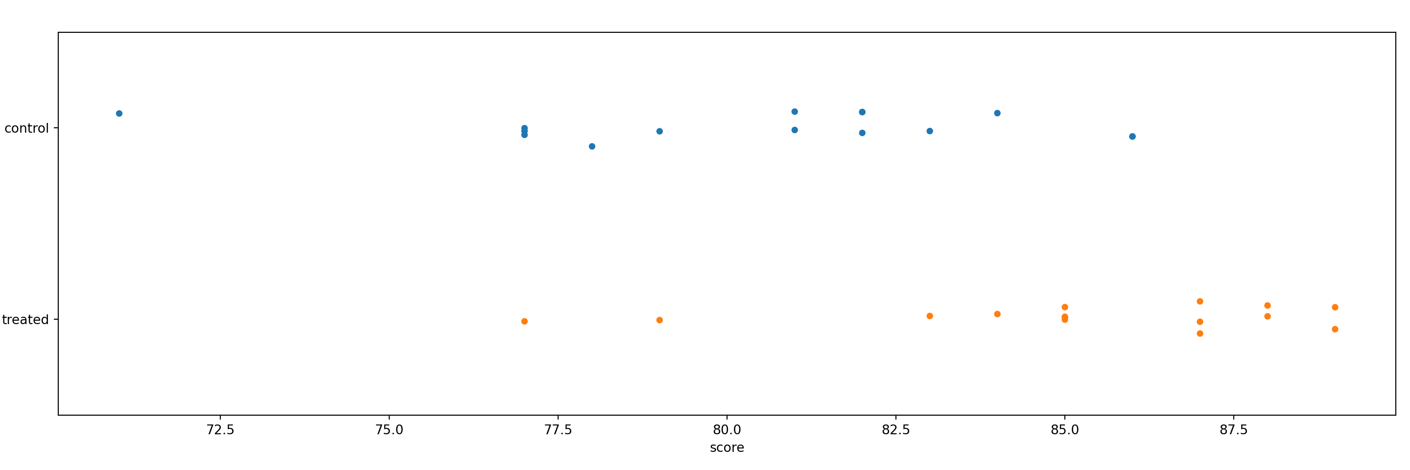
One way to perform a t test in Python is via the CompareMeans() function and its associated methods available in the statsmodels package. Below, we import statsmodels.stats.api.
We first extract the data we want to compare as pandas Series.
d_control = ch8_d1.query('group == "control"')['score']
d_treated = ch8_d1.query('group == "treated"')['score']
Next, we create Descriptive statistics objects using the DescrStatsW() function.
Descriptive statistics objects have attributes such as mean and std (standard deviation). Below, we print the mean and standard deviation of each group. We also round the standard deviation to three decimal places and place a line break before printing the standard deviation.
control mean: 80.4
control std: 3.844treated mean: 85.2
treated std: 3.331Next, we create a CompareMeans means object using the CompareMeans() function. The required inputs are Descriptive statistics objects. We save the result as ttest.
We can now use various methods with the ttest object: To see the result of a two sample t-test assuming unequal variances, along with a confidence interval for the difference, use the summary method with usevar = 'unequal'.
                          Test for equality of means
==============================================================================
                 coef    std err          t      P>|t|      [0.025      0.975]
------------------------------------------------------------------------------
subset #1     -4.8000      1.359     -3.531      0.001      -7.587      -2.013
==============================================================================
The p-value of 0.001 is small, suggesting that the difference we observed would be unlikely if there was no real mean difference in the population. The confidence interval on the difference in means tells us that the data are consistent with a difference between -7 and -2. It appears that we can expect the control group to score at least 2 points lower on average than the treated group.
ANOVA
Our data are available as a pandas DataFrame. We can view the data in their entirety:
mass location
0 9.6 1
1 9.4 1
2 8.9 1
3 8.8 1
4 8.5 1
5 8.2 1
6 6.8 2
7 6.6 2
8 6.0 2
9 5.7 2
10 5.3 2
11 6.7 3
12 6.4 3
13 6.2 3
14 5.7 3
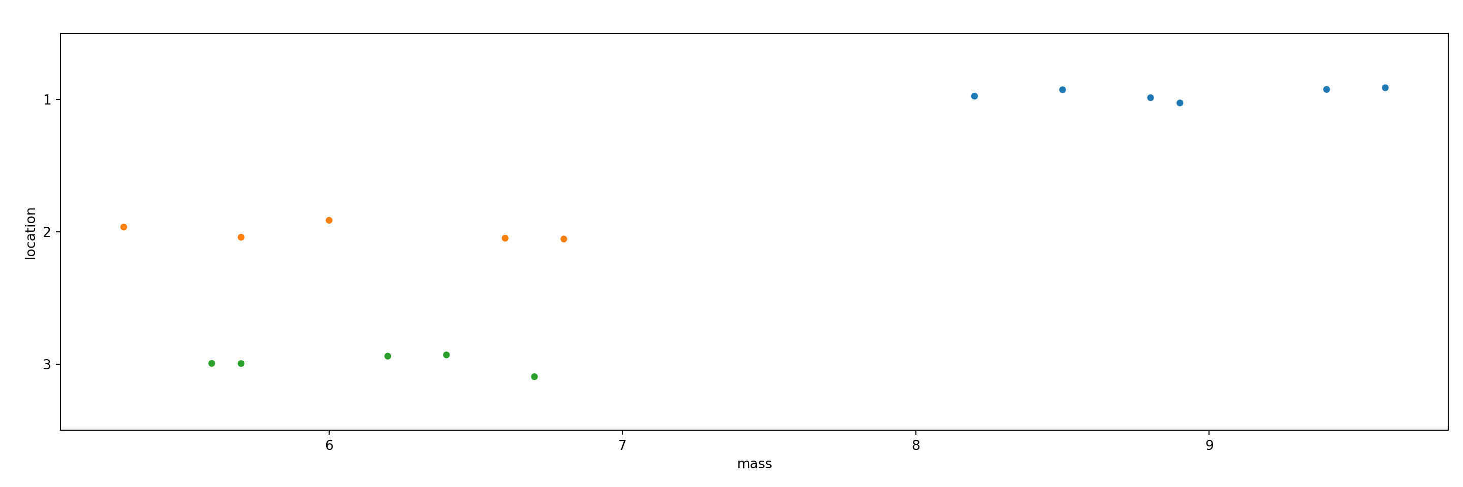
15 5.6 3As with the t-test above, we use a stripchart to visualize the three groups of data. It appears that the pine cones in location 1 have a higher mass.
We can calculate group means using the groupby and mean methods.
location
1    8.90
2    6.08
3    6.12
Name: mass, dtype: float64
One way to perform an ANOVA in Python is via the anova_oneway() function, also available in the statsmodels package.
The anova_oneway() function can perform an ANOVA on a pandas Dataframe, where the first argument specifies the numeric data and the second argument specifies the grouping variable. We also set use_var = 'equal' to replicate the R output below.
<class 'statsmodels.stats.base.HolderTuple'>
statistic = 50.085429769392036
pvalue = 7.786760128813737e-07
df = (2.0, 13.0)
df_num = 2.0
df_denom = 13.0
nobs_t = 16.0
n_groups = 3
means = array([8.9 , 6.08, 6.12])
nobs = array([6., 5., 5.])
vars_ = array([0.28 , 0.387, 0.217])
use_var = 'equal'
welch_correction = True
tuple = (50.085429769392036, 7.786760128813737e-07)
The small p-value of 0.0000007 provides strong evidence that if there were no true mean differences between groups in the population, we’d be unlikely to observe data with the differences we did.
A common follow-up to an ANOVA is Tukey’s Honestly Significant Differences (HSD) procedure, which computes differences between all possible pairs and returns adjusted p-values and confidence intervals to account for the multiple comparisons. To carry this out in the statsmodels package, we need to first create a MultiComparison object using the multicomp.MultiComparison() function. We then use the tukeyhsd() method to compare the means with corrected p-values.
Multiple Comparison of Means - Tukey HSD, FWER=0.05
====================================================
group1 group2 meandiff p-adj   lower   upper  reject
----------------------------------------------------
     1      2    -2.82    0.0 -3.6863 -1.9537   True
     1      3    -2.78    0.0 -3.6463 -1.9137   True
     2      3     0.04 0.9925 -0.8648  0.9448  False
----------------------------------------------------
The difference in means between locations 2 and 1 (2 - 1) and locations 3 and 1 (3 - 1) are about -2.8. The difference in means between locations 3 and 2 (3 - 2) is inconclusive. It seems to be small, but we’re not sure if the difference is positive or negative.
R
t-test
The str() function allows to take a quick look at the data frame ch8_d1. One column contains the scores; the other column indicates which group the subject was in (control vs. treated).
'data.frame': 30 obs. of 2 variables:
$ score: num 77 81 77 86 81 77 82 83 82 79 ...
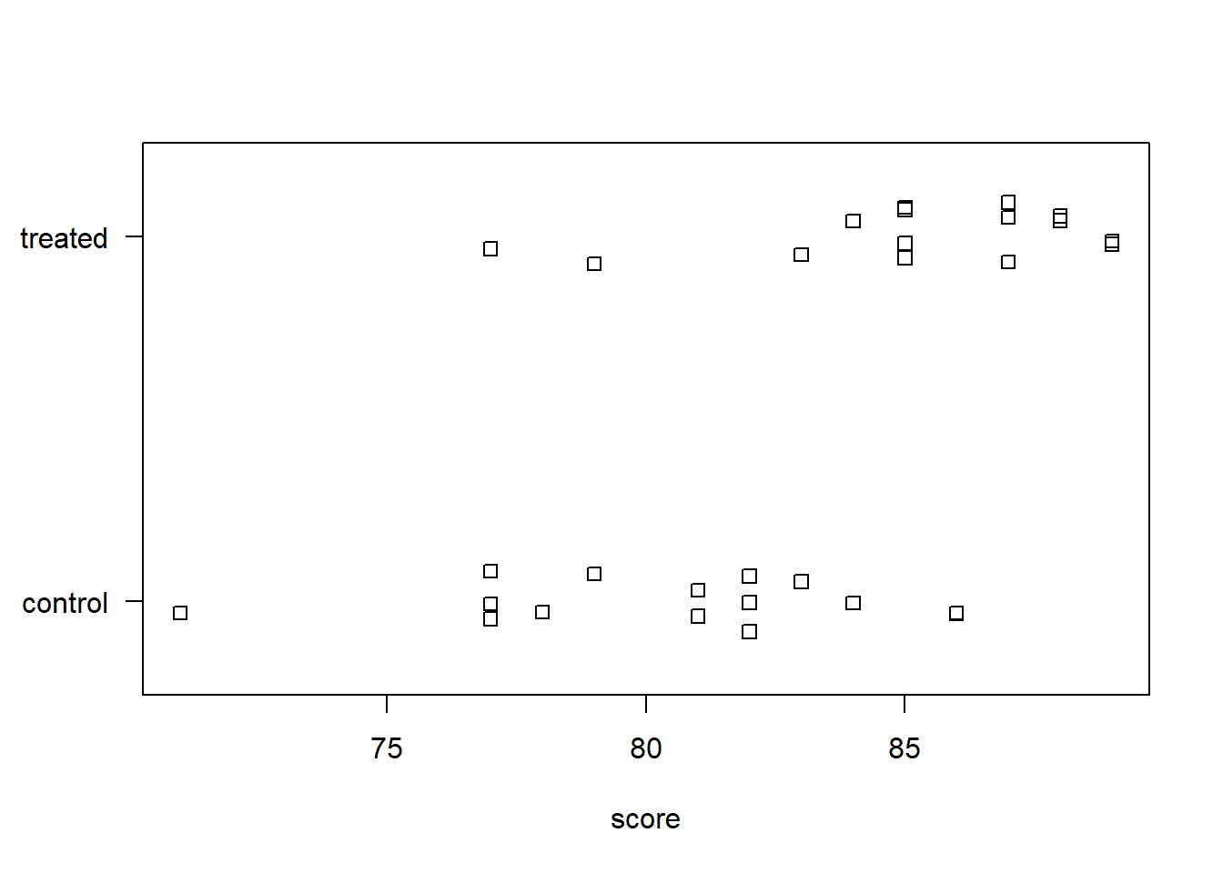
$ group: chr "control" "control" "control" "control" ...A stripchart is one of many ways to visualize numeric data between two groups. Here, we use the base R function stripchart(). The formula score ~ group plots scores by group. The las = 1 argument just rotates the y-axis labels. The method = "jitter" argument adds some random vertical scatter to the points so that there’s less overlap between them. It appears the treated group has a higher average score than the untreated group.
To calculate the means between the two groups, we can use the aggregate() function. Again, the formula score ~ group says to aggregate scores by group. We specify mean to calculate the mean between the two groups. Some other functions we could specify include median, sd, or sum. The sample mean of the treated group is about 5 points higher than the control group.
    group score
1 control  80.4
2 treated  85.2
Is this difference meaningful? What if we took more samples? Would each sample result in similar differences in the means? A t-test attempts to answer this.
The t.test() function accommodates formula notation, allowing us to specify that we want to calculate mean score by group.
    Welch Two Sample t-test

data:  score by group
t = -3.5313, df = 27.445, p-value = 0.001482
alternative hypothesis: true difference in means between group control and group treated is not equal to 0
95 percent confidence interval:
 -7.586883 -2.013117
sample estimates:
mean in group control mean in group treated
                 80.4                  85.2
The p-value of 0.0015 is small, suggesting that we’d be unlikely to observe a difference at least as large as the one we did if there was no actual difference between the groups in the population. The confidence interval on the difference in means tells us the data are consistent with a difference between -7 and -2. It appears we can expect the control group to score at least 2 points lower than the treated group.
ANOVA
The str() function lets us quickly get a glimpse of the data frame ch8_d2. One column contains the mass of the pine cones; the other column indicates which location the pine cone was found.
'data.frame': 16 obs. of 2 variables:
$ mass : num 9.6 9.4 8.9 8.8 8.5 8.2 6.8 6.6 6 5.7 ...
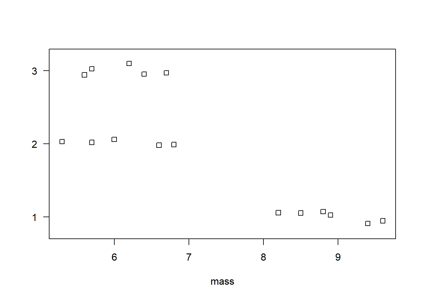
$ location: chr "1" "1" "1" "1" ...We can use a stripchart to visualize the three groups of data. It appears the pine cones in location 1 have a higher mass than the pinecones in locations 2 and 3.
To calculate the means between the three groups, we can use the aggregate() function. The formula mass ~ location says to aggregate mass by location. We specify mean so that we calculate the mean between the three groups.
  location mass
1        1 8.90
2        2 6.08
3        3 6.12
To estimate how likely we’d to observe differences like these in the sample if there were no true differences in the population, we can perform an ANOVA. The aov() function carries out an ANOVA test. It accommodates formula notation. It’s usually preferable to save the ANOVA result into an object and call summary() on the object to view the results in full.
            Df Sum Sq Mean Sq F value   Pr(>F)
location     2 29.404  14.702   50.09 7.79e-07 ***
Residuals   13  3.816   0.294
---
Signif. codes:  0 '***' 0.001 '**' 0.01 '*' 0.05 '.' 0.1 ' ' 1
The small p-value of 0.0000007 provides strong evidence that we’d be unlikely to observe differences as large as those we did if there were no true population-level differences.
Unlike the t.test() output, the aov() summary does not provide confidence intervals on differences in means. That’s because there are many kinds of differences we might want to assess. A common and easy procedure is Tukey’s Honestly Significant Differences (HSD), which computes differences between all possible pairs and returns adjusted p-values and confidence intervals to account for the multiple comparisons. Base R provides the TukeyHSD() function for this task.
  Tukey multiple comparisons of means
    95% family-wise confidence level

Fit: aov(formula = mass ~ location, data = ch8_d2)

$location
     diff        lwr        upr     p adj
2-1 -2.82 -3.6862516 -1.9537484 0.0000028
3-1 -2.78 -3.6462516 -1.9137484 0.0000033
3-2  0.04 -0.8647703  0.9447703 0.9925198
The difference in means between locations 2 and 1 (2 - 1) and locations 3 and 1 (3 - 1) are about -2.8. The difference in means between locations 3 and 2 (3 - 2) is inconclusive. It seems to be small, but we’re not sure if the difference is positive or negative.
8.2 Comparing group proportions
It is often of interest to compare proportions between two groups. This is sometimes referred to as a two-sample proportion test. To demonstrate, we use an exercise from the text Introductory Statistics with R (Dalgaard 2008) (p. 154). We are told that 210 out of 747 patients died of Rocky Mountain spotted fever in the western United States. That’s a proportion of 0.281. In the eastern United States, 122 out 661 patients died. That’s a proportion of 0.185. Is the difference in proportions statistically significant? In other words: Assuming that there is no true difference in the fatality rate between the two regions, is the observed difference in proportions surprising?
Python
A two-sample proportion test can be carried out in Python using the test_proportions_2indep() function from the statsmodels package. The two proportions being compared must be independent.
The first argument is the number of successes or occurrences for the first proportion. The second argument is the number of total trials for the first group. The third and fourth arguments are the occurrences and total number of trials for the second group, respectively.
We can extract the p-value of the test and the difference in proportions using the pvalue and diff attributes, respectively.
1.632346798072468e-050.0966To calculate a 95% confidence interval for the difference in proportions, we need to use the confint_proportions_2indep() function.
(0.05241555145475882, 0.13988087590630482)The result is returned as a tuple with an extreme amount of precision. We recommend rounding these values to few decimal places. Below, we show one way of doing so using f strings. Notice that we extract each element of the pdiff tuple and round each to 5 decimal places.
(0.05242, 0.13988)This results are slightly different from the R example below. That’s because the test_proportions_2indep() and confint_proportions_2indep() functions use different methods. See their respective help pages to learn more about the methods available and other function arguments.
test_proportions_2indep help page
confint_proportions_2indep help page
R
A two-sample proportion test in R can be carried out with the prop.test() function. The first argument, x, is the number of “successes” or “occurrences” of some event for each group. The second argument, n, is the number of total trials for each group.
    2-sample test for equality of proportions with continuity correction

data:  c(210, 122) out of c(747, 661)
X-squared = 17.612, df = 1, p-value = 2.709e-05
alternative hypothesis: two.sided
95 percent confidence interval:
 0.05138139 0.14172994
sample estimates:
   prop 1    prop 2
0.2811245 0.1845688
The proportion of patients who died in the western US is about 0.28. The proportion who died in the eastern US is about 0.18. The small p-value suggests that there is a very small chance of seeing a difference at least as large as this if there is really no difference in the true proportions. The confidence interval on the difference of proportions ranges from 0.05 to 0.14, indicating that Rocky Mountain spotted fever seems to kill at least 5% more patients in the western US.
Data of this sort are sometimes presented in a two-way table with successes and failures. We can present the preceding data in a table using the matrix() function:
fever <- matrix(c(210, 122,
                  747-210, 661-122), ncol = 2)
rownames(fever) <- c("western US", "eastern US")
colnames(fever) <- c("died", "lived")
fever
died lived
western US 210 537
eastern US 122 539When the table is constructed in this fashion with “successes” in the first column and “failures” in the second column, we can feed the table directly to the prop.test() function. (“Success,” here, obviously means “experienced the event of interest.”)
    2-sample test for equality of proportions with continuity correction

data:  fever
X-squared = 17.612, df = 1, p-value = 2.709e-05
alternative hypothesis: two.sided
95 percent confidence interval:
 0.05138139 0.14172994
sample estimates:
   prop 1    prop 2
0.2811245 0.1845688
The chi-squared test statistic is reported as X-squared = 17.612. This is the same statistic reported if we ran a chi-squared test of association using the chisq.test() function.
    Pearson's Chi-squared test with Yates' continuity correction

data:  fever
X-squared = 17.612, df = 1, p-value = 2.709e-05
This tests the null hypothesis of no association between location in the US and fatality of the fever. The result is identical to the prop.test() output; however, there is no indication as to the nature of association.
8.3 Linear modeling
Linear modeling attempts to assess if and how the variability in a numeric variable depends on one or more predictor variables. This is often referred to as regression modeling or multiple regression. While it is relatively easy to “fit a model” and generate lots of output, the model we fit may not be very good. There are many decisions we have to make when proposing a model: Which predictors do we include? Will they interact? Do we allow for non-linear effects? Answering these kinds of questions require subject matter expertise.
Below, we walk through a simple example using data on weekly gas consumption. The data is courtesy of the R package MASS (Venables and Ripley 2002a). The documentation describes the data as follows:
“Mr Derek Whiteside of the UK Building Research Station recorded the weekly gas consumption and average external temperature at his own house in south-east England for two heating seasons, one of 26 weeks before, and one of 30 weeks after cavity-wall insulation was installed. The object of the exercise was to assess the effect of the insulation on gas consumption.”
The whiteside data frame has 56 rows and 3 columns:
Insul: A factor, before or after insulation.Temp: average outside temperature in degrees Celsius.Gas: weekly gas consumption in 1000s of cubic feet.
We demonstrate how to model Gas as a function of Insul, Temp, and their interaction. This is, of course, not a comprehensive treatment of linear modeling; the focus is on implementation in Python and R.
Python
The ols() function in the statsmodels package fits a linear model. In this example, we fit a linear model predicting gas consumption from insulation, temperature, and the interaction between insulation and temperature.
The desired model can be specified as a formula: List the dependent variable (also called the “response” variable) first, then a tilde (~), and then the predictor variables separated by plus signs (+). Separating variables with colons instead of plus signs (x:z) fits an interaction term for those variables. The variables in the formula correspond to columns in a pandas DataFrame. Users specify the pandas DataFrame using the data argument.
import statsmodels.api as sm
import statsmodels.formula.api as smf

model = smf.ols('Gas ~ Insul + Temp + Insul:Temp', data = whiteside)
results = model.fit() # Fit the linear model
With a model in hand, you can extract information about it via several functions, including:
summary(): return a summary of model coefficients with standard errors and test statisticsparams: return the model coefficientsconf_int(): return the 95% confidence interval of each model coefficient- statsmodels also provides functions for diagnostic plots; a few examples are shown below
The summary() function produces the kind of standard regression output one typically finds in a statistics textbook.
                            OLS Regression Results
==============================================================================
Dep. Variable:                    Gas   R-squared:                       0.928
Model:                            OLS   Adj. R-squared:                  0.924
Method:                 Least Squares   F-statistic:                     222.3
Date:                Wed, 14 Jun 2023   Prob (F-statistic):           1.23e-29
Time:                        13:45:19   Log-Likelihood:                -14.100
No. Observations:                  56   AIC:                             36.20
Df Residuals:                      52   BIC:                             44.30
Df Model:                           3
Covariance Type:            nonrobust
=======================================================================================
                          coef    std err          t      P>|t|      [0.025      0.975]
---------------------------------------------------------------------------------------
Intercept               6.8538      0.136     50.409      0.000       6.581       7.127
Insul[T.After]         -2.1300      0.180    -11.827      0.000      -2.491      -1.769
Temp                   -0.3932      0.022    -17.487      0.000      -0.438      -0.348
Insul[T.After]:Temp     0.1153      0.032      3.591      0.001       0.051       0.180
==============================================================================
Omnibus:                        6.016   Durbin-Watson:                   1.854
Prob(Omnibus):                  0.049   Jarque-Bera (JB):                4.998
Skew:                          -0.626   Prob(JB):                       0.0822
Kurtosis:                       3.757   Cond. No.                         31.6
==============================================================================

Notes:
[1] Standard Errors assume that the covariance matrix of the errors is correctly specified.
The following code produces a plot of fitted values against residuals for the model—a key plot for model diagnostics:
plt.figure()
smoothed_line = sm.nonparametric.lowess(results.resid, results.fittedvalues)
plt.plot(results.fittedvalues, results.resid, ".")
plt.plot(smoothed_line[:,0], smoothed_line[:,1],color = 'r')
plt.xlabel("fitted values")
plt.ylabel("residuals")
plt.title("residuals vs fitted")
plt.show()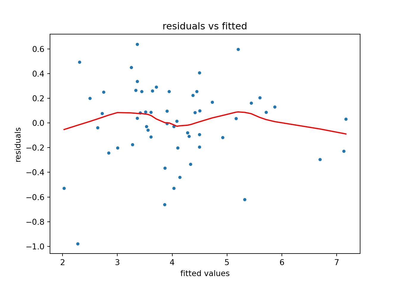
We can also plot model predictions to visualize the predictive effects in the model. Each line of the plot represents a level of the variable Insul.
import numpy as np
import pandas as pd
from statsmodels.sandbox.predict_functional import predict_functional

# Create DataFrame (wrt Inusl == "Before") to pass into predict function
temp = np.linspace(whiteside["Temp"].min(), whiteside["Temp"].max())
insul_before = ["Before"]*temp.shape[0]
# whiteside_before = pd.DataFrame({"Temp": temp, "Insul": insul_before})
whiteside_before = {"Temp": temp, "Insul": insul_before, "Insul:Temp":[0]*temp.shape[0]}
# pr, cb, fv = predict_functional(results, "Temp", values=whiteside_before, ci_method='scheffe')
before_predict_object = results.get_prediction(whiteside_before)
before_predictions = before_predict_object.predicted_mean
before_ci = before_predict_object.conf_int()

# Create DataFrame (wrt Inusl == "After") to pass into predict function
insul_after = ["After"]*temp.shape[0]
whiteside_after = pd.DataFrame({"Temp": temp, "Insul": insul_after, "Insul:Temp":temp})
after_predictions_object = results.get_prediction(whiteside_after)
after_predictions = after_predictions_object.predicted_mean
after_ci = after_predictions_object.conf_int()

# Plot results
plt.figure()
plt.plot(temp, before_predictions, color = "red", label="Before")
plt.fill_between(temp, before_ci[:,0], before_ci[:,1], color = "red", alpha = 0.1)
plt.plot(temp, after_predictions, color="blue", label="After")
plt.fill_between(temp, after_ci[:,0], after_ci[:,1], color = "blue", alpha = 0.1)
plt.legend(title="Insul")
plt.title("Predicted values of Gas")
plt.xlabel("Temp")
plt.ylabel("Gas")
plt.show()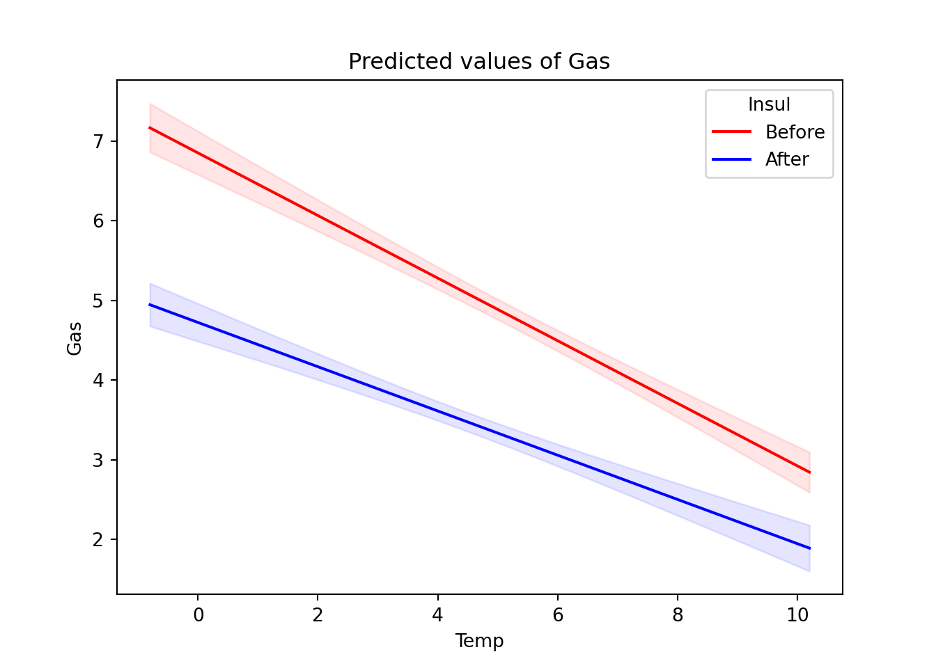
The plot suggests that after installing insulation, gas consumption fell and the effect of temperature on gas consumption was less pronounced.
R
The lm() function fits a linear model in R using whatever model we propose. We specify models using a special syntax. The basic construction is to list your dependent (response) variable, then a tilde (~), and then your predictor variables separated by plus operators (+). Listing two variables separated by a colon (:) indicates we wish to fit an interaction for those variables. (Alternatively, listing variables as x*z is equivalent to x + z + x:z.) See ?formula for further details on formula syntax.
It’s considered best practice to reference variables in a data frame and indicate the data frame using the data argument. Though not required, you’ll almost always want to save the result to an object for further inquiry.
m <- lm(Gas ~ Insul + Temp + Insul:Temp, data = whiteside)
# Equivalently: lm(Gas ~ Insul*Temp, data = whiteside)
Once you fit your model, you can extract information about it using several functions. Commonly used functions include:
summary(): return a summary of model coefficients with standard errors and test statisticscoef(): return the model coefficientsconfint(): return a 95% confidence interval of model coefficientsplot(): return a set of four diagnostic plots
The summary() function produces the standard regression summary table one typically finds described in a statistics textbook.
Call:
lm(formula = Gas ~ Insul + Temp + Insul:Temp, data = whiteside)
Residuals:
Min 1Q Median 3Q Max
-0.97802 -0.18011 0.03757 0.20930 0.63803
Coefficients:
Estimate Std. Error t value Pr(>|t|)
(Intercept) 6.85383 0.13596 50.409 < 2e-16 ***
InsulAfter -2.12998 0.18009 -11.827 2.32e-16 ***
Temp -0.39324 0.02249 -17.487 < 2e-16 ***
InsulAfter:Temp 0.11530 0.03211 3.591 0.000731 ***
---
Signif. codes: 0 '***' 0.001 '**' 0.01 '*' 0.05 '.' 0.1 ' ' 1
Residual standard error: 0.323 on 52 degrees of freedom
Multiple R-squared: 0.9277, Adjusted R-squared: 0.9235
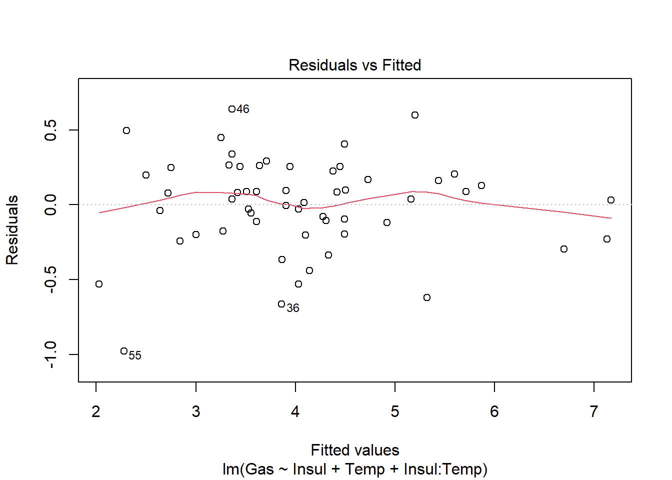
F-statistic: 222.3 on 3 and 52 DF, p-value: < 2.2e-16Calling plot() on a model object produces four different diagnostic plots by default. Using the which argument, we can specify which of six possible plots to generate. The first plot—of fitted values against residuals—helps the modeler assess the constant variance assumption (i.e., that our model is not dramatically over- or under-predicting values). We hope to see residuals evenly scattered around 0. (See ?plot.lm for more details on the diagnostic plots.)
Once we fit a model and we’re reasonably confident that it’s a well-fitting, assumption-satisfying model, we may want to visualize it. Three packages in R that help with this are emmeans, effects, and ggeffects. Below, we give a demonstration of how to use the ggeffects package to visualize the predictive effects of a model.
You need to first install the ggeffects package, as it does not come with the base R installation. Once installed, load using the library() function. Once loaded, we can get a basic visualization of our model by using the plot() and ggpredict() functions. This is particularly useful for models with interactions. Use the terms argument to specify which variables to plot. Below we list Temp first, which will plot Temp on the x axis. Then we list Insul, the grouping variable, to indicate we want a separate fit for each level of Insul.
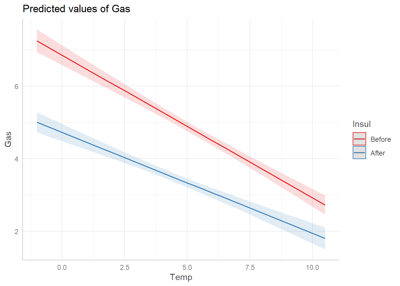
We see that after installing insulation, gas consumption fell considerably and the effect of temperature on gas consumption was less pronounced.
8.4 Logistic regression
Logistic regression attempts to assess if or how the variability a binary variable depends on one or more predictor variables. It is a type of “generalized linear model” and is commonly used to model the probability of an event occurring. As with linear regression, it’s easy to “fit a model” and generate lots of output, but the model we fit may not be particularly good. The same kinds of questions germane to developing a standard linear regression are relevant when developing a logistic regression: Which predictors do we include? Will they interact? Will we include non-linear effects?
We walk through a basic example below using data on low infant birth weight. The data are courtesy of the R package MASS (Venables and Ripley 2002a). Per the documentation, “the data were collected at Baystate Medical Center, Springfield, Mass during 1986.”
The data are contained in the data frame birthwt (see ?birthwt for additional details). birthwt has 189 rows and 9 columns:
low: 1 if birth weight less than 2.5 kg, 0 otherwiseage: mother’s age in yearslwt: mother’s weight in pounds at last menstrual periodrace: mother’s race (white, black, other)smoke: smoking status during pregnancy (1 = yes, 0 = no)ptd: previous premature labors (1 = yes, 0 = no)ht: history of hypertension (1 = yes, 0 = no)ui: presence of uterine irritability (1 = yes, 0 = no)ftv: number of physician visits during the first trimester (0, 1, 2+)
Below we show how one can model low as a function of all other predictors. The focus here is on implementing the model in Python and R; this isn’t a comprehensive treatment of logistic regression.
Python
The Python library statsmodels.formula.api provides the glm() function for fitting generalized linear models. We specify the model as a formula string in the first argument of the glm() function. The format is as follows: dependent/response variable followed by a tilde (~), then the predictor variables separated by a plus sign (+). Separating variables with a colon (a:b) includes the interaction of those variables in the model. To fit a logistic regression, we specify family = sm.families.Binomial(), as our dependent variable is binary. We also specify our data set in the data argument as well.
import statsmodels.api as sm
import statsmodels.formula.api as smf
import pandas as pd
formula = "low ~ age + lwt + race + smoke + ptd + ht + ui + ftv"
mod1 = smf.glm(formula = formula, data = birthwt,
               family = sm.families.Binomial()).fit()
print(mod1.summary())
Generalized Linear Model Regression Results
==============================================================================
Dep. Variable: low No. Observations: 189
Model: GLM Df Residuals: 178
Model Family: Binomial Df Model: 10
Link Function: Logit Scale: 1.0000
Method: IRLS Log-Likelihood: -97.738
Date: Wed, 14 Jun 2023 Deviance: 195.48
Time: 13:45:24 Pearson chi2: 179.
No. Iterations: 5 Pseudo R-squ. (CS): 0.1873
Covariance Type: nonrobust
=================================================================================
coef std err z P>|z| [0.025 0.975]
---------------------------------------------------------------------------------
Intercept 0.8230 1.245 0.661 0.508 -1.617 3.263
race[T.black] 1.1924 0.536 2.225 0.026 0.142 2.243
race[T.other] 0.7407 0.462 1.604 0.109 -0.164 1.646
smoke[T.1] 0.7555 0.425 1.778 0.075 -0.078 1.589
ptd[T.1] 1.3438 0.481 2.796 0.005 0.402 2.286
ht[T.1] 1.9132 0.721 2.654 0.008 0.501 3.326
ui[T.1] 0.6802 0.464 1.465 0.143 -0.230 1.590
ftv[T.1] -0.4364 0.479 -0.910 0.363 -1.376 0.503
ftv[T.2+] 0.1790 0.456 0.392 0.695 -0.715 1.074
age -0.0372 0.039 -0.962 0.336 -0.113 0.039
lwt -0.0157 0.007 -2.211 0.027 -0.030 -0.002
=================================================================================Once we fit a model and are reasonably confident that it’s a good model, we may want to visualize it. For example, we can visualize how ptd is associated with the probability of low infant birth weight, holding other predictors constant.
To begin, we create a pandas DataFrame containing our predictors: Notice the only variable with multiple values is ptd. All other variables are held constant. What values you choose to hold them at is up to you, but typical choices are means or medians for numeric predictors and most populous group for categorical predictors. (This needs to be a pandas DataFrame since we used the formula option when fitting the model.)
# Create dictionary of values
d = {'age': 23, 'lwt': 123, 'race': "white",
     'smoke' : "0", 'ptd' : ["0","1"], 'ht': "0",
     'ui': "0", 'ftv': "0"}
# Convert dictionary to pandas DataFrame.
nd = pd.DataFrame(data = d)
Now plug in our new data (nd) into our model using the get_prediction() method. See this page for further details. This returns the predictions as a PredictionResults object. We can access the predicted probabilities using the predicted_mean property. See this page.
[0.12360891 0.35093623]We can use the conf_int() method to extract the confidence intervals for the predicted probabilities.
[[0.05166761 0.26746827]
 [0.12724595 0.66722908]]
Now, we use the Matplotlib errorbar() function to create the plot. The errorbar() function requires margin of error, not the lower and upper limits. So, we have to do some subtraction to get the lower and upper margins of error.
Finally we can make the plot:
import matplotlib.pyplot as plt
plt.clf()
plt.errorbar(x = ["0","1"], y = prob,
             yerr = [lower, upper], fmt = 'ok')
<ErrorbarContainer object of 3 artists>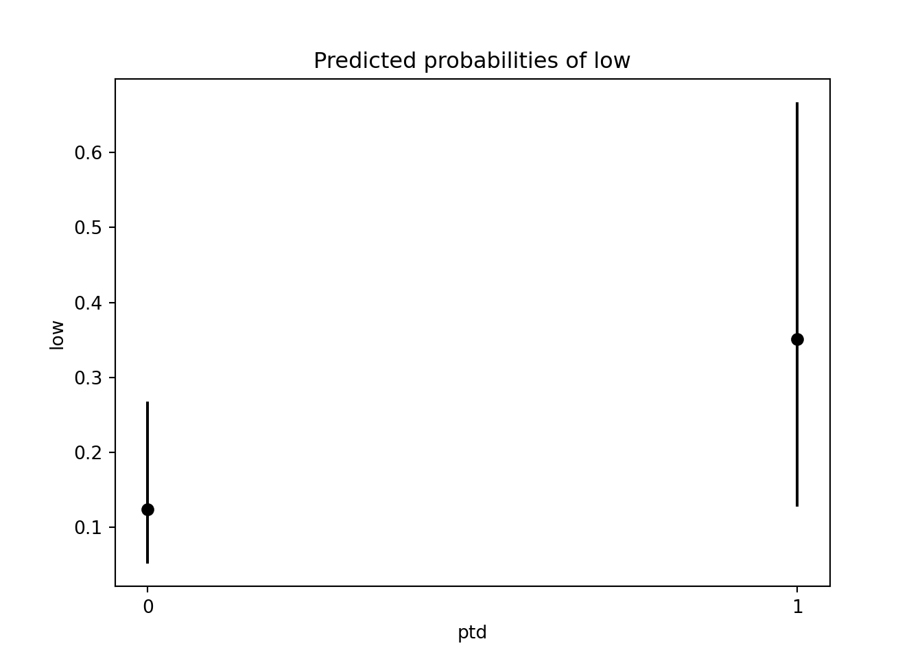
R
The glm() function fits a generalized linear model in R using whatever model we propose. We specify models using formula syntax: List your dependent (response) variable, then a tile ~, and then your predictor variables separated by plus operators (+). Listing two variables separated by a colon (:) indicates we wish to fit an interaction for those variables. See ?formula for further details on formula syntax.
In addition, glm() requires that we specify a family argument to specify the error distribution for the dependent variable. The default is gaussian (normal, as in standard linear regression). For a logistic regression model, we need to specify binomial since our dependent variable is binary.
Indicate the data frame from which variables are sourced using the data argument. You’ll generally want to save the result to an object for further inquiry.
Since we’re modeling low as a function of all other variables in the data frame, we also could have used the following syntax, where the period symbolizes all other remaining variables:
Once you fit your logistic regression model, you can extract information about it using several functions. The most commonly used include:
summary(): return a summary of model coefficients with standard errors and test statisticscoef(): return the model coefficientsconfint(): return the 95% confidence interval of each model coefficient
The summary() function produces a regression summary table, like those typically found in statistics textbooks.
Call:
glm(formula = low ~ age + lwt + race + smoke + ptd + ht + ui +
    ftv, family = binomial, data = birthwt)

Coefficients:
            Estimate Std. Error z value Pr(>|z|)
(Intercept)  0.82302    1.24471   0.661  0.50848
age         -0.03723    0.03870  -0.962  0.33602
lwt         -0.01565    0.00708  -2.211  0.02705 *
raceblack    1.19241    0.53597   2.225  0.02609 *
raceother    0.74069    0.46174   1.604  0.10869
smoke1       0.75553    0.42502   1.778  0.07546 .
ptd1         1.34376    0.48062   2.796  0.00518 **
ht1          1.91317    0.72074   2.654  0.00794 **
ui1          0.68019    0.46434   1.465  0.14296
ftv1        -0.43638    0.47939  -0.910  0.36268
ftv2+        0.17901    0.45638   0.392  0.69488
---
Signif. codes:  0 '***' 0.001 '**' 0.01 '*' 0.05 '.' 0.1 ' ' 1

(Dispersion parameter for binomial family taken to be 1)

    Null deviance: 234.67  on 188  degrees of freedom
Residual deviance: 195.48  on 178  degrees of freedom
AIC: 217.48

Number of Fisher Scoring iterations: 4
Exponentiating coefficients in a logistic regression model produces odds ratios. To get the odds ratio for the previous premature labors variable, ptd, we do the following:
    ptd1
3.833443
This indicates that the odds of having an infant with low birth weight are about 3.8 times higher for women who experienced previous premature labors versus women who did not, assuming all other variables are held constant.
The 3.8 value is just an estimate. We can use the confint() function to get a 95% confidence interval on the odds ratio.
    2.5 %    97.5 %
 1.516837 10.128974
The confidence interval suggests that the data are compatible with an odds ratio of at least 1.5—and possibly as high as 10.1.
Once we fit a model and are reasonably confident that it’s a good model, we may want to visualize it. The emmeans, effects, and ggeffects packages all help visualize the predictive effects of regressions; we demonstrate the ggeffects package below.
Once ggeffects is installed and loaded, we can get a basic visualization of our model by using the plot() and ggpredict() functions. This is particularly useful for logistic regression models because it produces model predictions on a probability scale.
Use the terms argument to specify which variables to plot. Below, we plot the probability of low infant birth weight depending on whether or not the mother had previous premature labors (1 = yes, 0 = no).
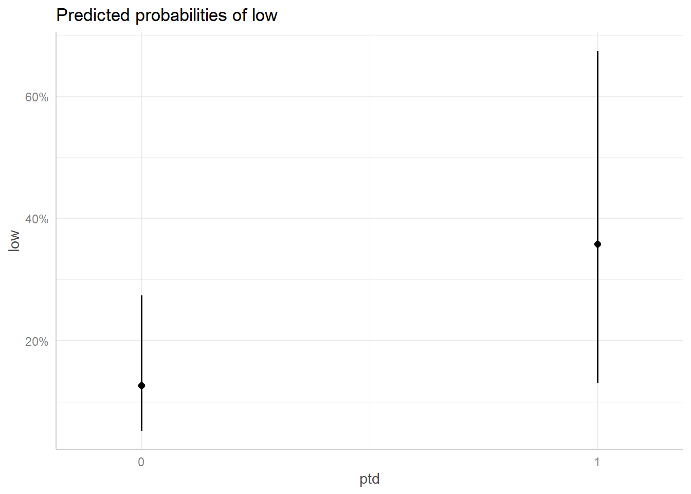
It looks like the probability of low infant birth weight jumps from about 12% to over 35% for mothers who previously experienced premature labors, though the error bars on the expected values are quite large.