Count Models
Poisson regression
The AirCrash dataset in the vcdExtra package contains data on all fatal commercial airplane crashes from 1993–2015. (Friendly 2022) The data excludes small planes (less than 6 passengers) and non-commercial aircraft such as cargo, military, and private planes. How does the number of fatalities depend on other variables? Fit a main effects Poisson regression model. (Friendly and Meyer 2016)
library(vcdExtra)
data("AirCrash")
The AirCrash data frame has data on 439 crashes with the following 5 variables:
str(AirCrash)'data.frame': 439 obs. of 5 variables:
$ Phase : Factor w/ 5 levels "en route","landing",..: 2 2 2 2 2 2 2 2 2 2 ...
$ Cause : Factor w/ 5 levels "criminal","human error",..: 1 1 1 1 4 4 4 4 4 4 ...
$ date : Date, format: "1993-09-21" "1993-09-22" ...
$ Fatalities: int 27 108 125 112 41 19 8 22 14 43 ...
$ Year : int 1993 1993 1996 2002 1993 1993 1994 2000 2002 2004 ...An interesting aspect of this data is that it is technically not a sample. We have all the data. We could argue that no inferential statistics or modeling is necessary. We should simply summarize and describe the data. On the other hand, we could argue that the data we have is just one of many possible outcomes from a population of possibilities. We can’t rewind time and take another sample, but we can imagine that there were many possible outcomes from 1993 to 2015. What we observed – and all that we can observe – was one possible outcome. Therefore, we might use the data to estimate what the future holds. We take the latter approach.
The Fatalities variable is our dependent variable. It records the number of fatalities per crash. This is a count variable; it only takes integer values greater than or equal to 0. We can see the distribution of Fatalities is severely skewed by some large crashes. Notice the mean is over twice as large as the median. We also notice there are no commercial airplane crashes with 0 fatalities.
summary(AirCrash$Fatalities) Min. 1st Qu. Median Mean 3rd Qu. Max.
1.00 7.00 19.00 50.68 60.00 1692.00 A Histogram reveals the extent of the skewness. We set
breaks = 50 to increase the number of bins in the
histogram.
hist(AirCrash$Fatalities, breaks = 50)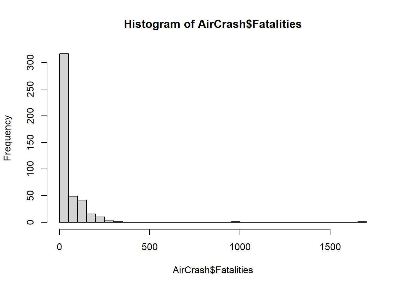
The Phase variable tells us in which one of the five phases of flight the plane crashed:
- standing
- take-off
- en route
- landing
- unknown
Since it’s a factor we can get counts by calling
summary() on the variable.
summary(AirCrash$Phase)en route landing standing take-off unknown
157 210 4 65 3 The Cause variable tells us the cause of the crash (if known):
- criminal
- human error
- mechanical
- unknown
- weather
It, too, is a factor.
summary(AirCrash$Cause) criminal human error mechanical unknown weather
23 207 74 52 83 The Year column tells us in what year the crash occurred. We can use
tapply() to quickly sum Fatalities by Year and pipe into
the barplot() function. A barplot reveals Fatalities
slightly decreasing over time for the most part, except in
2001. The argument las = 2 sets axis labels
perpendicular to the axis.
tapply(AirCrash$Fatalities, AirCrash$Year, sum) |>
  barplot(las = 2)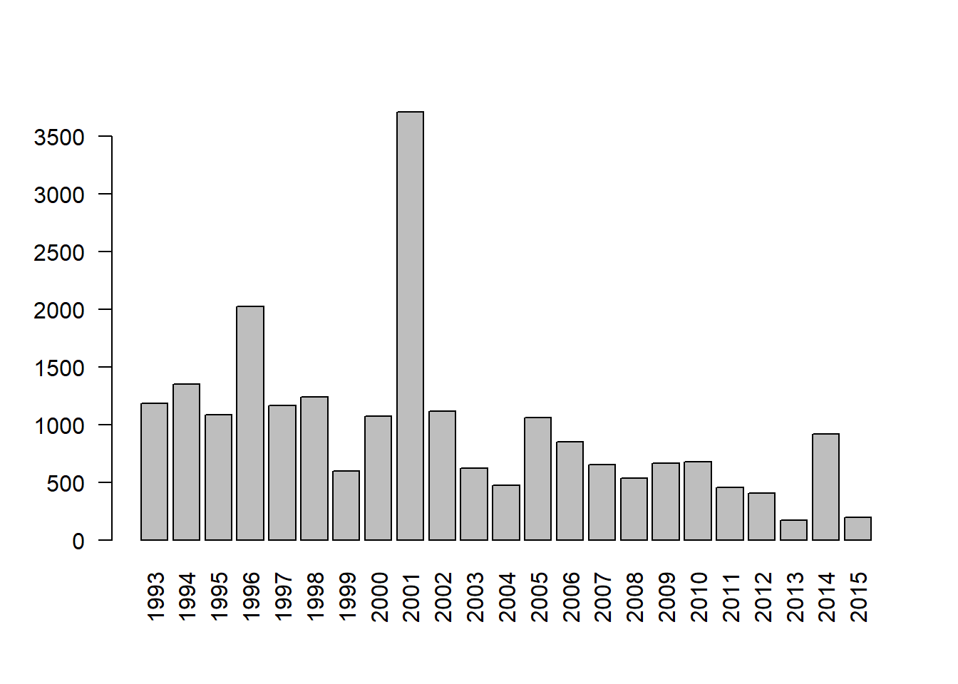
How does Fatalities vary with Phase and Cause? Simple stripcharts are effective for quickly exploring this question. It appears two unusually high cases of fatalities happened en route due to criminal activity.
stripchart(Fatalities ~ Phase, data = AirCrash, method = "jitter",
           vertical = TRUE)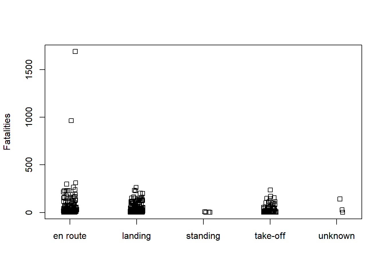
stripchart(Fatalities ~ Cause, data = AirCrash, method = "jitter",
           vertical = TRUE)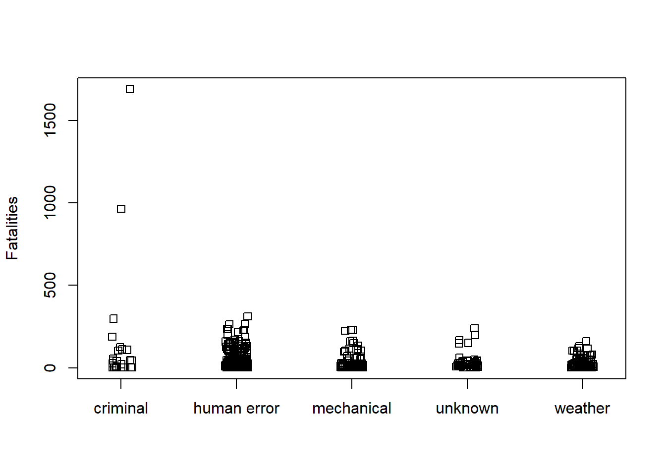
A common distribution used to model count data is the Poisson distribution. The Poisson distribution has one parameter, the mean. The variance of the distribution is also the mean. As the mean gets bigger, so does the variance.
We can model count data using the glm() function with
family=poisson. Let’s model Fatalities as function of Phase
and Cause.
m <- glm(Fatalities ~ Phase + Cause, data = AirCrash, family = poisson)To determine if Phase and/or Cause helps explain the variability in
Fatalities we can assess the analysis of deviance table using the
Anova() function in the car package (Fox and Weisberg 2019). It appears both explain
a substantial amount of variability.
library(car)
Anova(m)
Analysis of Deviance Table (Type II tests)
Response: Fatalities
LR Chisq Df Pr(>Chisq)
Phase 1643.1 4 < 2.2e-16 ***
Cause 4718.1 4 < 2.2e-16 ***
---
Signif. codes: 0 '***' 0.001 '**' 0.01 '*' 0.05 '.' 0.1 ' ' 1The drop1() function in the stats package performs the
same tests and includes information on the change in AIC if we drop the
variable. For example, if we drop Cause from the model, the AIC
increases from 35036 to 38111. Recall that lower AIC is desirable.
drop1(m, test = "Chisq")Single term deletions
Model:
Fatalities ~ Phase + Cause
Df Deviance AIC LRT Pr(>Chi)
<none> 31269 33401
Phase 4 32912 35036 1643.1 < 2.2e-16 ***
Cause 4 35987 38111 4718.1 < 2.2e-16 ***
---
Signif. codes: 0 '***' 0.001 '**' 0.01 '*' 0.05 '.' 0.1 ' ' 1While both variables seem highly “significant” we should assess the model’s goodness of fit. One effective way to do this for count models is creating a rootogram with the topmodels package (Zeileis, Lang, and Stauffer 2024). The tops of the bars are the expected frequencies of the counts given the model. The counts are plotted on the square-root scale to help visualize smaller frequencies. The red line shows the fitted frequencies as a smooth curve. The x-axis is a horizontal reference line. Bars that hang below the line show underfitting, bars that hang above show overfitting. We see our model is extremely ill-fitting for Fatalities ranging from 1 - 100.
# Need to install from R-Forge instead of CRAN
# install.packages("topmodels", repos = "https://R-Forge.R-project.org")
library(topmodels)
rootogram(m, xlim = c(0,100), confint = FALSE)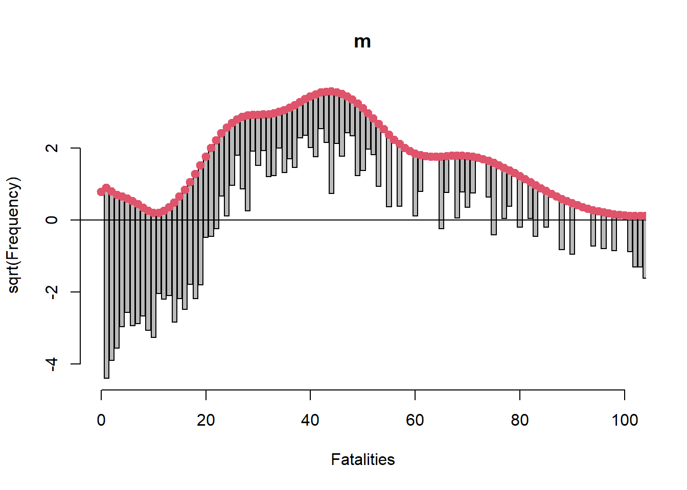
One reason for such an ill-fitting model may be the choice of family
distribution we used with glm(). The Poisson distribution
assumes equivalent mean and variance. A more flexible model would allow
the mean and variance to differ. One such model that allows this is the
negative binomial model. We can fit a negative binomial model using the
glm.nb() function in the MASS package. (Venables and Ripley 2002)
library(MASS)
m2 <- glm.nb(Fatalities ~ Phase + Cause, data = AirCrash)
rootogram(m2, xlim = c(0,100), confint = FALSE)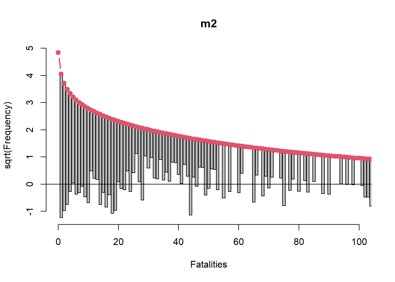
This rootogram looks much better though it’s far from good. However it’s probably not reasonable to expect to sufficiently model something like air crash fatalities using only two categorical variables.
We may wish to entertain an interaction between Phase and Cause. For example, the effect of landing on Fatalities may depend on whether cause is human error or weather. But before we fit an interaction we should look at a cross-tabulation of Phase and Cause to see if we have any sparse cells. Indeed we do. We have five cells of 0 counts and seven cells of counts 3 and under.
xtabs(~ Phase + Cause, data = AirCrash) Cause
Phase criminal human error mechanical unknown weather
en route 16 63 29 25 24
landing 4 114 19 18 55
standing 2 0 2 0 0
take-off 1 29 24 8 3
unknown 0 1 0 1 1Therefore we forego the interaction. We do not want to model interactions that we did not observe.
Let’s add Year to the model. It appears to make a marginal contribution to explaining Fatalities.
m3 <- glm.nb(Fatalities ~ Phase + Cause + Year, data = AirCrash)
Anova(m3)
Analysis of Deviance Table (Type II tests)
Response: Fatalities
LR Chisq Df Pr(>Chisq)
Phase 23.328 4 0.0001089 ***
Cause 51.136 4 2.091e-10 ***
Year 6.137 1 0.0132396 *
---
Signif. codes: 0 '***' 0.001 '**' 0.01 '*' 0.05 '.' 0.1 ' ' 1The interested reader may wish to verify that adding Year to the model doesn’t appreciably change the rootogram.
Diagnostic plots can help us assess if the model does a good job of
representing the data. A useful diagnostic plot function,
influencePlot(), is available in the car package. We simply
give it our model object and it returns a scatter plot of Studentized
Residuals versus Hat-Values (leverage), with point size mapped to Cook’s
D (influence). By default the five most “noteworthy” points are labeled.
The numbers refer to the row number in the data frame.
influencePlot(m3)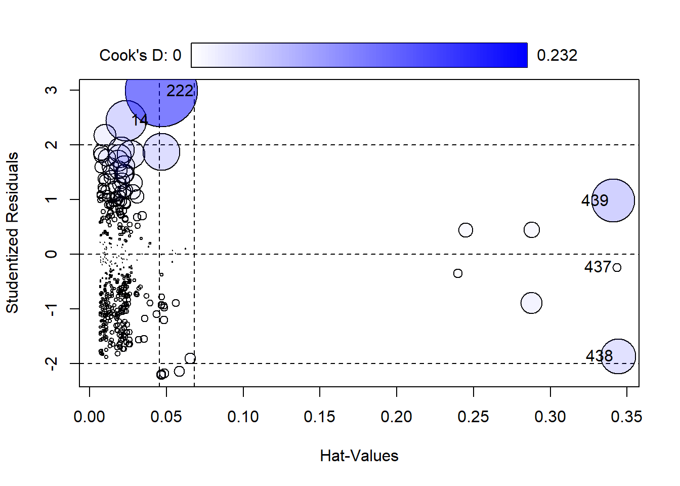
       StudRes        Hat       CookD
14   2.4499231 0.02360668 0.072971602
222  2.9897351 0.04688623 0.232270205
437 -0.2380636 0.34328385 0.003153681
438 -1.8694688 0.34423047 0.055350359
439 0.9817622 0.34111672 0.083016892- Studentized Residuals: This is the scaled difference between the response for case i and the fitted value computed without case i. This can help identify outliers that might not otherwise be identified because they’re so influential they produce a model in which they’re not an outlier. High values indicate a big difference between what we observed and what our model predicts.
- Hat-Values: This measures how far cases are away from the center of the predictor space. In other words, these are predictors with high values that could influence the fit of the model. High values could mean a case is exerting undue leverage on the fit of the model.
- Cook’s D: This is a measure of influence. High values could indicate a case is unduly influencing the model coefficients.
Row 222 has the highest Cook’s D value and Residual. This is one of the planes that was crashed en route on September 11, 2001.
AirCrash[222,] Phase Cause date Fatalities Year
222 en route criminal 2001-09-11 1692 2001When cases appear to have high leverage or influence, we may want to re-fit the model without them (one at a time) to see if the results change. In this case we choose to use all available data.
Our final model summary is as follows:
summary(m3)
Call:
glm.nb(formula = Fatalities ~ Phase + Cause + Year, data = AirCrash,
    init.theta = 0.7339275638, link = log)

Coefficients:
                   Estimate Std. Error z value Pr(>|z|)
(Intercept)      -43.834781  19.577798  -2.239 0.025156 *
Phaselanding      -0.380320   0.128905  -2.950 0.003174 **
Phasestanding     -3.584073   0.679347  -5.276 1.32e-07 ***
Phasetake-off     -0.348486   0.177710  -1.961 0.049880 *
Phaseunknown       0.066040   0.688236   0.096 0.923556
Causehuman error  -1.015330   0.269419  -3.769 0.000164 ***
Causemechanical   -1.322336   0.288925  -4.577 4.72e-06 ***
Causeunknown      -1.731870   0.308109  -5.621 1.90e-08 ***
Causeweather      -1.561468   0.288959  -5.404 6.53e-08 ***
Year               0.024532   0.009792   2.505 0.012238 *
---
Signif. codes:  0 '***' 0.001 '**' 0.01 '*' 0.05 '.' 0.1 ' ' 1

(Dispersion parameter for Negative Binomial(0.7339) family taken to be 1)

    Null deviance: 600.09  on 438  degrees of freedom
Residual deviance: 511.98  on 429  degrees of freedom
AIC: 4207.8

Number of Fisher Scoring iterations: 1

              Theta:  0.7339
          Std. Err.:  0.0443

 2 x log-likelihood:  -4185.7620
Since Phase and Cause have five levels each, both have four coefficients. The reference levels are “en route” and “criminal”, respectively. The coefficients for the other levels are relative to the reference levels. For example, the coefficient for “standing” Phase is about -3.58. This says the expected log count of Fatalities when Phase is “standing” is about 3.58 less than when Phase is “en route”, all other variables held constant.
Log counts are hard to understand. If we exponentiate we get a multiplicative interpretation.
exp(coef(m3)["Phasestanding"])Phasestanding
0.02776239 This says the expected count of Fatalities when Phase is “standing” is about 1 - 0.03 = 97% less than the expected count when Phase is “en route”, all other variables held constant.
Exponentiating the Year coefficient returns the following:
exp(coef(m3)["Year"]) Year
1.024835 This says air crash Fatalities increased by about 2% each year from 1993 - 2015.
Effect plots can help us visualize our count model. Using the
ggpredict() and associated plot() function
from the ggeffects package we plot expected counts given Cause and
Phase. (Lüdecke 2018). It looks like
expected fatalities are around 200 when the cause is criminal, but there
is a great deal of uncertainty. All other expected counts are about 50.
We should note these predictions are made holding Phase at “en route”
and Year at 2000.
library(ggeffects)
ggpredict(m3, terms = "Cause") |> plot()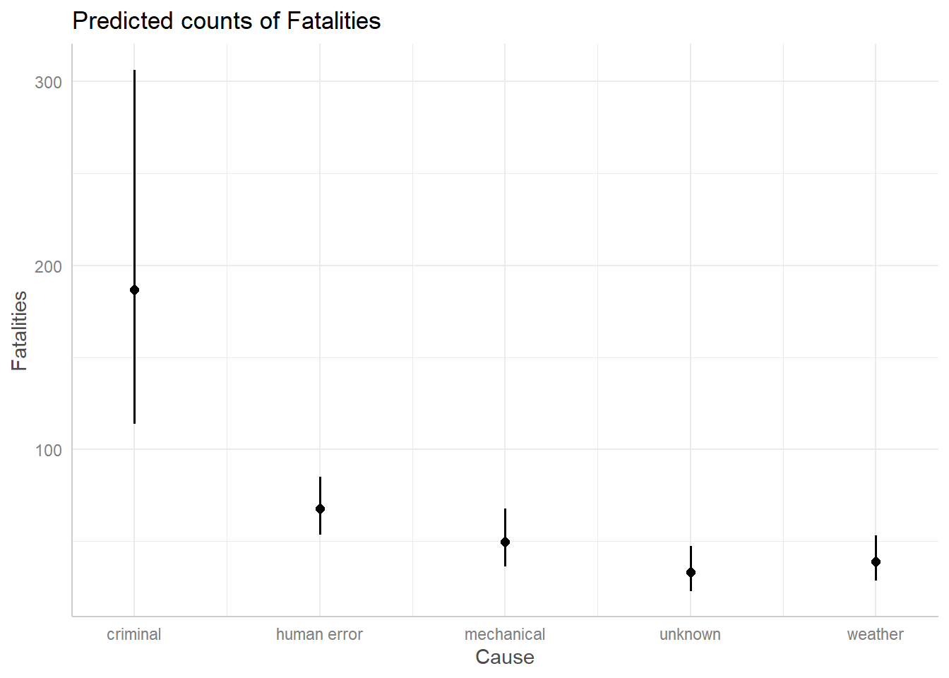
We can see this by calling ggpredict() without
plot().
ggpredict(m3, terms = "Cause")# Predicted counts of Fatalities
Cause | Predicted | 95% CI
----------------------------------------
criminal | 186.65 | 113.74, 306.29
human error | 67.62 | 53.73, 85.09
mechanical | 49.74 | 36.45, 67.89
unknown | 33.03 | 23.03, 47.36
weather | 39.16 | 28.77, 53.32
Adjusted for:
* Phase = en route
* Year = 2000.00If we wanted to change the Phase and Year values, we could do so as follows:
ggpredict(m3, terms = "Cause",
          condition = c(Phase = "landing", Year = 2005)) |>
  plot()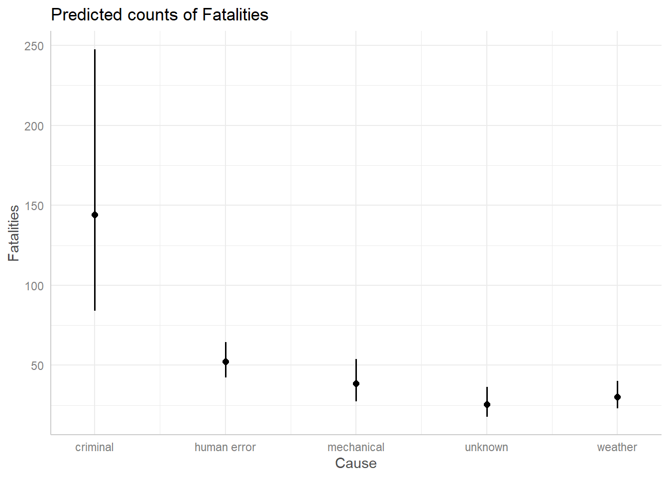
The expected counts are a little different, but the general theme remains: a criminal cause appears to have the potential for around 100 more fatalities than the other causes.
When we visualize the effect of Phase we get an usually big confidence interval for “unknown”.
ggpredict(m3, terms = "Phase") |> plot()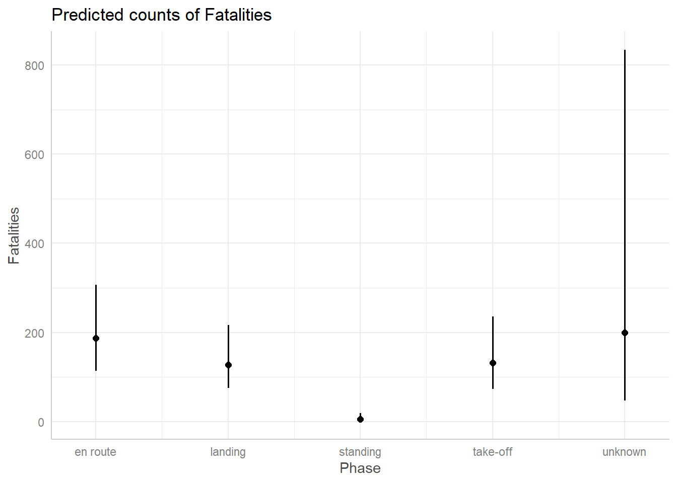
This is because we only have 3 observations of crashes in an unknown phase. We simply don’t have enough data to estimate a count for that phase with any confidence.
The Year predictor seems to suggest there was a slightly positive trend in fatalities from 1993 - 2015 that could continue into the future. But the confidence band is so wide and uncertain that it’s entirely possible the trend could stay steady or decline.
ggpredict(m3, terms = "Year") |>
  plot()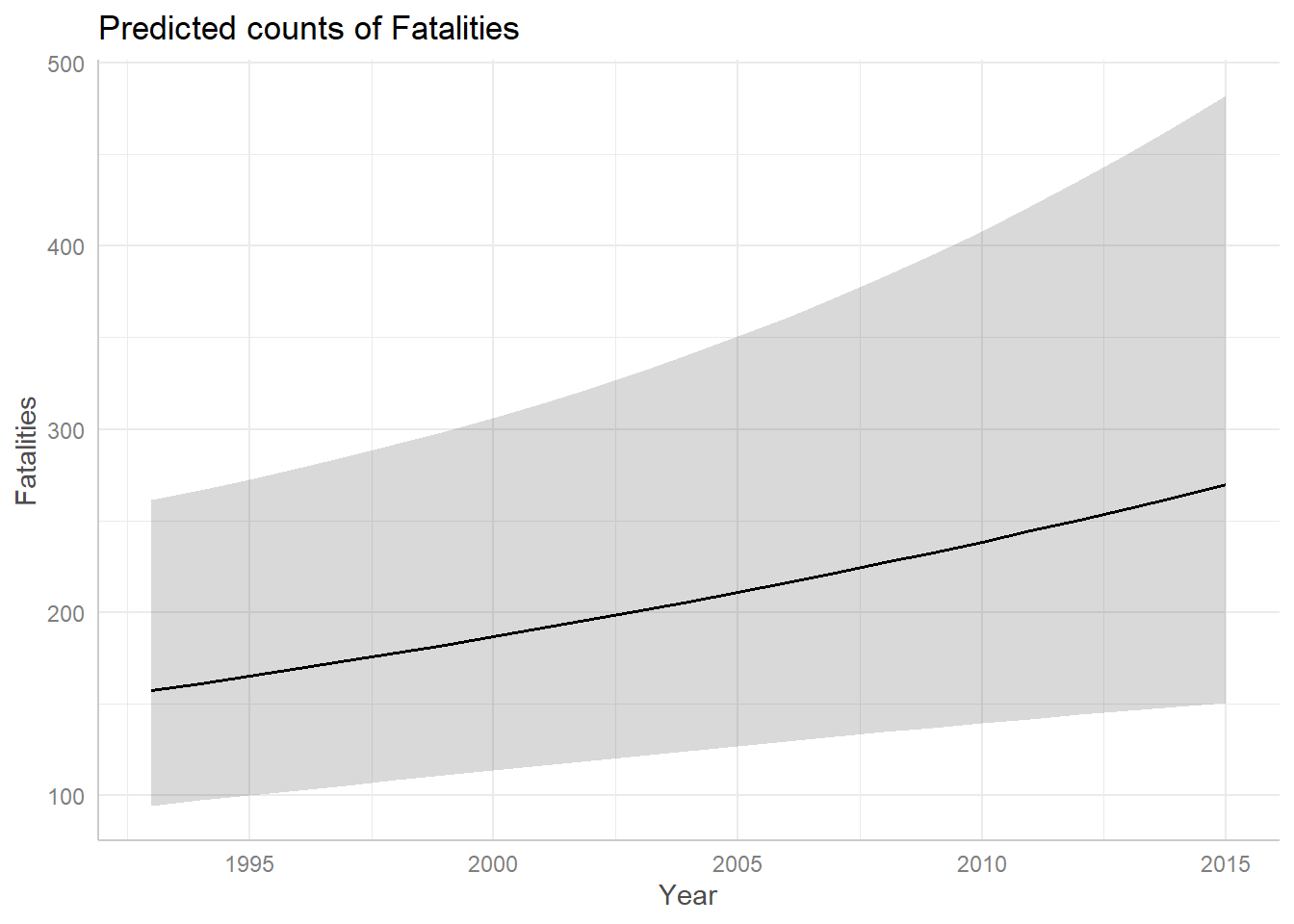
Recall that ggpredict() is adjusting for Cause
and Phase when creating the above plot. The above plot is created
holding Phase = “en route” and Cause = “criminal”.
Another way to create an effect plot is to hold Phase and Cause at their mean values. But how do you hold categorical variables at their mean levels? You simply take the proportions of each and plug into the model. The effects package does this for us. (Fox and Weisberg 2018)
First let’s see the plot it creates. Notice this plot seems a little more certain. We also get a “rug” at the bottom of the plot to remind us how much data we have. We see we have fewer observations after 2010.
library(effects)
Effect(focal.predictors = "Year", mod = m3) |>
  plot()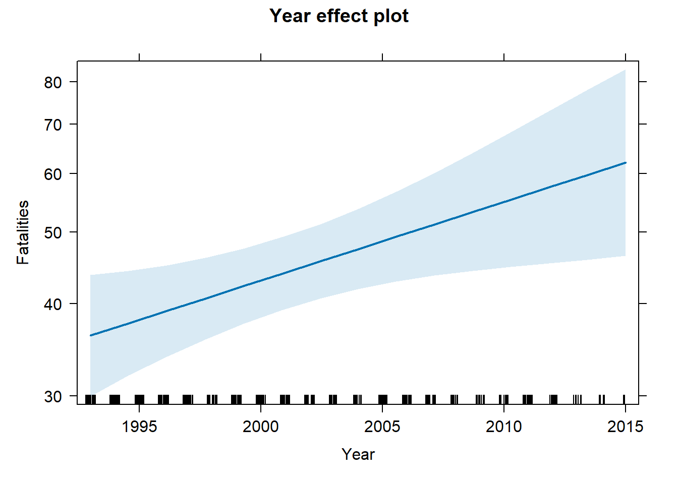
If we save the call to Effect() as an object, we can
look at the “model.matrix” element to see what values Phase and Cause
were held at.
e <- Effect(focal.predictors = "Year", mod = m3)
e$model.matrix
(Intercept) Phaselanding Phasestanding Phasetake-off Phaseunknown
1 1 0.4783599 0.009111617 0.1480638 0.006833713
2 1 0.4783599 0.009111617 0.1480638 0.006833713
3 1 0.4783599 0.009111617 0.1480638 0.006833713
4 1 0.4783599 0.009111617 0.1480638 0.006833713
5 1 0.4783599 0.009111617 0.1480638 0.006833713
Causehuman error Causemechanical Causeunknown Causeweather Year
1 0.4715262 0.1685649 0.118451 0.1890661 1993
2 0.4715262 0.1685649 0.118451 0.1890661 1998
3 0.4715262 0.1685649 0.118451 0.1890661 2004
4 0.4715262 0.1685649 0.118451 0.1890661 2010
5 0.4715262 0.1685649 0.118451 0.1890661 2015
attr(,"assign")
[1] 0 1 1 1 1 2 2 2 2 3
attr(,"contrasts")
attr(,"contrasts")$Phase
[1] "contr.treatment"
attr(,"contrasts")$Cause
[1] "contr.treatment"These values are simply the proportions of observations at each level. For example, compare the above values for Phase to the observed proportions of Phase in the data.
table(AirCrash$Phase) |> proportions()
   en route     landing    standing    take-off     unknown
0.357630979 0.478359909 0.009111617 0.148063781 0.006833713
We see that “landing”, “standing”, “take-off”, and “unknown” are held at their proportions. (“en route” is the reference level and not directly modeled.) While these values are not plausible in real life, they allow us to incorporate all their effects at proportional levels for the purpose of visualizing the effect of Year. Changing these values does not change the shape of the Year effect other than to shift it up or down the y-axis.
The above plot was created with the lattice package (Sarkar 2008). We can create the same plot in
ggplot2 (Wickham 2016) using the
ggeffect() function from the ggeffects package. In fact the
ggeffect() function simply uses the Effect()
function from the effects package.
ggeffect(m3, terms = "Year") |>
  plot()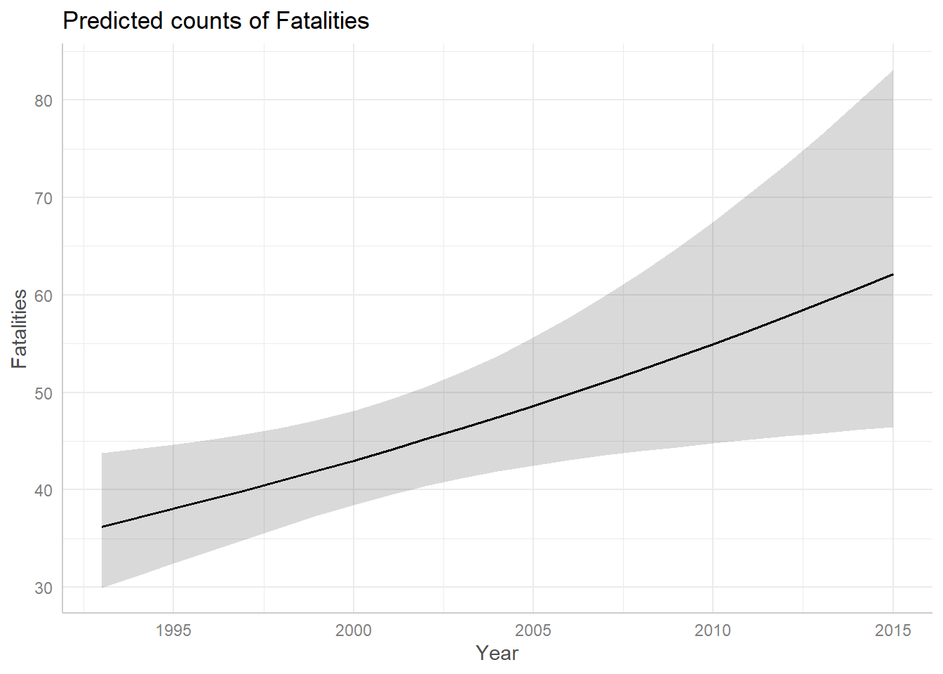
While the effect plots give us some indication of how expected
fatalities differ between Phase and Cause, they don’t directly quantify
how they differ. For this type of analysis we can use the emmeans
package. (Lenth 2022) Below we estimate
differences in expected fatalities between Phases using the
emmeans() function. The syntax
pairwise ~ Phase says to calculate all pairwise differences
between the levels of Phase. The argument
regrid = "response" says to calculate the differences on
the original response scale, which is a count. Finally the
$contrasts notation extracts just the contrasts. (Without
$contrasts the result also includes estimated means at each
level of Phase.) The largest significant difference is between “en
route” and “standing”, which estimates about 75 more fatalities for
plans “en route” versus plans standing on a runway. That seems to make
sense.
library(emmeans)
emmeans(m3, pairwise ~ Phase, regrid = "response")$contrasts
contrast estimate SE df z.ratio p.value
en route - landing 24.39 8.63 Inf 2.826 0.0380
en route - standing 74.97 10.90 Inf 6.892 <.0001
en route - (take-off) 22.69 10.90 Inf 2.074 0.2314
en route - unknown -5.26 56.70 Inf -0.093 1.0000
landing - standing 50.57 8.17 Inf 6.191 <.0001
landing - (take-off) -1.71 9.44 Inf -0.181 0.9998
landing - unknown -29.66 56.40 Inf -0.525 0.9848
standing - (take-off) -52.28 10.70 Inf -4.884 <.0001
standing - unknown -80.23 57.20 Inf -1.403 0.6259
(take-off) - unknown -27.95 56.90 Inf -0.491 0.9882
Results are averaged over the levels of: Cause
P value adjustment: tukey method for comparing a family of 5 estimates We can also pipe this result into plot() to see the
difference in expected values visualized along with 95% confidence
intervals.
emmeans(m3, pairwise ~ Phase, regrid = "response")$contrasts |>
  plot()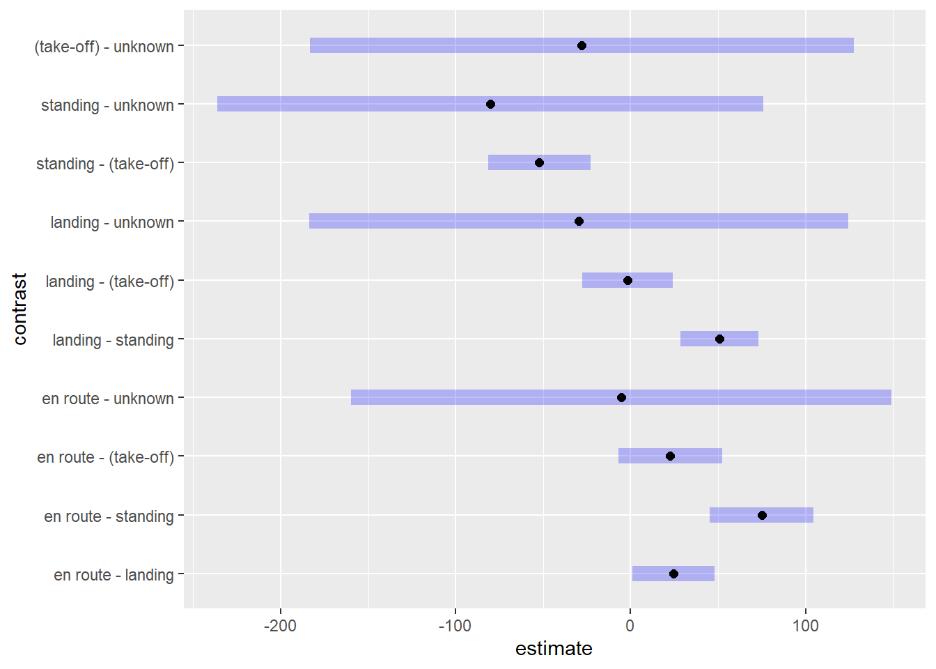
To see the actual values of the 95% confidence intervals, we can pipe
the result into the confint() function. The difference
between “en route” and “standing” is plausibly anywhere between 45.3 and
104.6.
emmeans(m3, pairwise ~ Phase, regrid = "response")$contrasts |>
  confint()
contrast estimate SE df asymp.LCL asymp.UCL
en route - landing 24.39 8.63 Inf 0.846 47.9
en route - standing 74.97 10.90 Inf 45.295 104.6
en route - (take-off) 22.69 10.90 Inf -7.155 52.5
en route - unknown -5.26 56.70 Inf -159.801 149.3
landing - standing 50.57 8.17 Inf 28.293 72.9
landing - (take-off) -1.71 9.44 Inf -27.464 24.1
landing - unknown -29.66 56.40 Inf -183.623 124.3
standing - (take-off) -52.28 10.70 Inf -81.480 -23.1
standing - unknown -80.23 57.20 Inf -236.257 75.8
(take-off) - unknown -27.95 56.90 Inf -183.300 127.4
Results are averaged over the levels of: Cause
Confidence level used: 0.95
Conf-level adjustment: tukey method for comparing a family of 5 estimates Rate model
The esdcomp data frame from the faraway
package (Faraway 2016) contains data on
complaints about emergency room doctors. Data was recorded on 44 doctors
working in an emergency service at a hospital to study the factors
affecting the number of complaints received. Build a model for the
rate of complaints received. (Faraway
2006) Use visits as an offset in the model.
library(faraway)
data("esdcomp")
In addition to the number of complaints and number of patient visits, the data contains information on
- residency: is the doctor in residency training N or Y
- gender: gender of doctor F or M
- revenue: dollars per hour earned by the doctor
- hours: total number of hours worked
str(esdcomp)'data.frame': 44 obs. of 6 variables:
$ visits : int 2014 3091 879 1780 3646 2690 1864 2782 3071 1502 ...
$ complaints: int 2 3 1 1 11 1 2 6 9 3 ...
$ residency : Factor w/ 2 levels "N","Y": 2 1 2 1 1 1 2 1 1 2 ...
$ gender : Factor w/ 2 levels "F","M": 1 2 2 2 2 2 2 2 1 2 ...
$ revenue : num 263 335 206 226 289 ...
$ hours : num 1287 1588 705 1006 1667 ...Hours worked and patient visits are highly correlated, so we’ll just work with visits in our analysis.
corr <- cor(esdcomp$visits, esdcomp$hours)
plot(esdcomp$visits, esdcomp$hours,
     main = paste("correlation:", round(corr, 3)))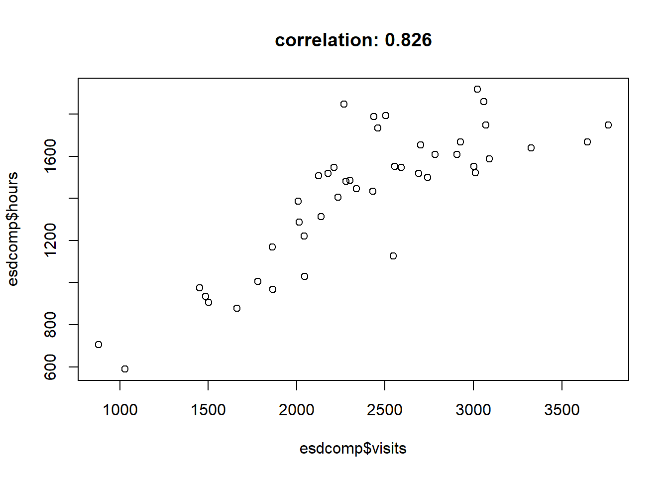
The number of complaints range from 0 to 11, with over half the complaints less than or equal to 2.
summary(esdcomp$complaints) Min. 1st Qu. Median Mean 3rd Qu. Max.
0.000 1.000 2.000 3.341 5.000 11.000 A barplot of counts of complaints shows only one doctor has 0 complaints and that most doctors have one or two complaints.
plot(table(esdcomp$complaints), type = "h")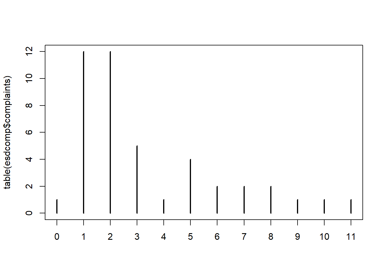
If we look at visits and complaints doctors with 3 complaints we see a wide variety of visits. For example, the first doctor listed had 3 complaints in 3091 visits, while the second doctor listed has 3 complaints in 1502 visits. While the number of complaints is the same for both doctors, the rate of complaints is different.
subset(esdcomp, complaints == 3, select = visits:complaints) visits complaints
2 3091 3
10 1502 3
23 3003 3
36 1451 3
37 3328 3Below we add rate of complaints to the data and look again at doctors with 3 complaints. The first doctor has about 1 complaint per 1000 visits while the second doctor has about 2 complaints per 1000 visits.
esdcomp$rate <- esdcomp$complaints/esdcomp$visits
subset(esdcomp, complaints == 3, select = c(visits:complaints, rate))
visits complaints rate
2 3091 3 0.0009705597
10 1502 3 0.0019973369
23 3003 3 0.0009990010
36 1451 3 0.0020675396
37 3328 3 0.0009014423There appears to be some variability in the rates. Not a lot but perhaps enough to be of interest to hospital administration.
hist(esdcomp$rate)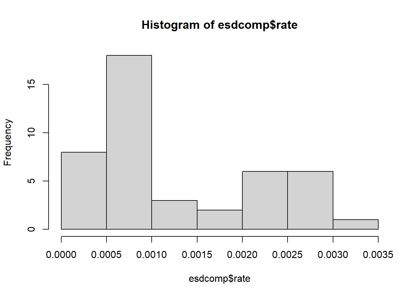
Does the rate of complaints have anything to do with residency, revenue, or gender? A rate model can help us answer this question. With only 44 observations we don’t have enough data to entertain complex models with interactions and non-linear effects, so we fit a simple additive model. Before we fit the model we center revenue so we can interpret the Intercept coefficient.
Notice that visits is added as an offset. For more information on offsets, see Getting Started with Rate Models.
esdcomp$revenueC <- scale(esdcomp$revenue, center = TRUE, scale = FALSE)[,1]
rate_mod <- glm(complaints ~ residency + revenueC + gender +
                  offset(log(visits)),
                data = esdcomp,
                family = poisson)
summary(rate_mod)
Call:
glm(formula = complaints ~ residency + revenueC + gender + offset(log(visits)),
    family = poisson, data = esdcomp)

Coefficients:
             Estimate Std. Error z value Pr(>|z|)
(Intercept) -6.542634   0.208779 -31.338   <2e-16 ***
residencyY  -0.350610   0.191077  -1.835   0.0665 .
revenueC     0.002362   0.002798   0.844   0.3986
genderM      0.128995   0.214323   0.602   0.5473
---
Signif. codes:  0 '***' 0.001 '**' 0.01 '*' 0.05 '.' 0.1 ' ' 1

(Dispersion parameter for poisson family taken to be 1)

    Null deviance: 63.435  on 43  degrees of freedom
Residual deviance: 58.698  on 40  degrees of freedom
AIC: 189.48

Number of Fisher Scoring iterations: 5
Both revenue and gender have high p-values, so we’re unsure if the coefficients for those predictors are positive or negative. The p-value for residency is pretty low, about 0.07, so we have decent evidence that it’s negative. In this case it appears that being a resident may slightly reduce the rate of complaints.
Confidence intervals provide insight into the direction and magnitude of point estimates. In addition, for rate models, exponentiating the coefficient returns the estimated multiplicative effect. Below we see that being a doctor in residency training could reduce the rate of complaints by as much as 1 - 0.48 - 0.52, or 52%. However we can’t rule out that it could also increase the rate of complaints by 1.02, or 2%. The Intercept is the expected rate of complaints for a female doctor, not in residency training, earning an average revenue. This comes out to about 1 complaint per 1000 visits.
car::Confint(rate_mod, exponentiate = TRUE)
Exponentiated Coefficients and Confidence Bounds Estimate 2.5 % 97.5 %
(Intercept) 0.001440689 0.0009389426 0.002132307
residencyY 0.704258118 0.4819236944 1.020449674
revenueC 1.002364774 0.9968532607 1.007848920
genderM 1.137683995 0.7559801492 1.756475968Is this a good model? A rootogram can help us investigate. We use the
rootogram() function from the topmodels package (Zeileis, Lang, and Stauffer 2024). The plot is
not pretty. Our model is over-predicting 0, 3, and 5 counts;
under-predicting 1 and 2 counts; and not doing very well in the higher
counts.
library(topmodels)
rootogram(rate_mod, xlim = c(0,11), confint = FALSE)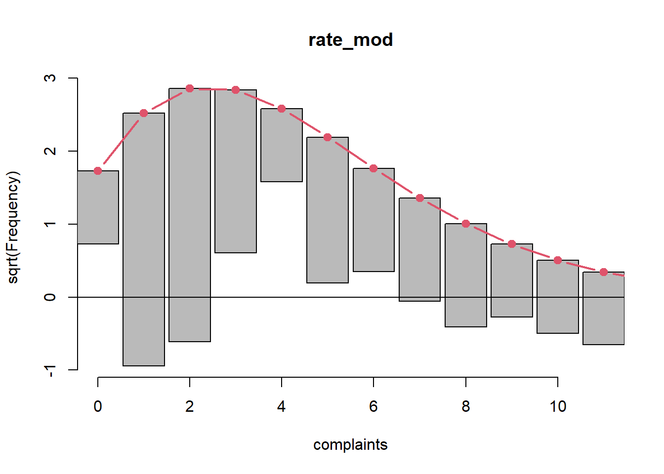
The drop1() function tests single term deletions.
Dropping the gender variable decreases the AIC by about 2 units.
drop1(rate_mod, test = "Chisq")Single term deletions
Model:
complaints ~ residency + revenueC + gender + offset(log(visits))
Df Deviance AIC LRT Pr(>Chi)
<none> 58.698 189.48
residency 1 62.128 190.91 3.4303 0.06401 .
revenueC 1 59.407 188.19 0.7093 0.39969
gender 1 59.067 187.85 0.3689 0.54361
---
Signif. codes: 0 '***' 0.001 '**' 0.01 '*' 0.05 '.' 0.1 ' ' 1We proceed to fit a new model without gender using the
update() function. The syntax . ~ . - gender
means fit the same model as before except drop gender. This results in a
slightly bigger coefficient for residency.
rate_mod2 <- update(rate_mod, . ~ . - gender)
summary(rate_mod2)
Call:
glm(formula = complaints ~ residency + revenueC + offset(log(visits)),
    family = poisson, data = esdcomp)

Coefficients:
             Estimate Std. Error z value Pr(>|z|)
(Intercept) -6.434509   0.103389 -62.236   <2e-16 ***
residencyY  -0.378583   0.185434  -2.042   0.0412 *
revenueC     0.002905   0.002661   1.092   0.2749
---
Signif. codes:  0 '***' 0.001 '**' 0.01 '*' 0.05 '.' 0.1 ' ' 1

(Dispersion parameter for poisson family taken to be 1)

    Null deviance: 63.435  on 43  degrees of freedom
Residual deviance: 59.067  on 41  degrees of freedom
AIC: 187.85

Number of Fisher Scoring iterations: 5
The rootogram for this model is largely unchanged from the first model.
Using this new model we may want to estimate how the rate of
complaints differ between doctors in residency training and doctors not
in training. We can make estimates using the predict()
function. We set the new data to have two rows, one for doctors in
training and one for doctors not in training. We set revenueC to 0 (the
mean) and visits to 1000. We set type = "response" to get
counts per 1000.
p <- predict(rate_mod2, newdata = data.frame(residency = c("N", "Y"),
                                             revenueC = 0,
                                             visits = 1000),
             type = "response")
p
1 2
1.605196 1.099288 To get the rate of complaints we need to divide by 1000:
names(p) <- c("Not in Training", "Training")
p/1000
Not in Training Training
0.001605196 0.001099288 The rate seems slightly higher for doctors not in training. If we take the ratio of the rates we get about 1.46. This estimates that the rate of complaints for doctors not in training is about 46% higher than the rate of complaints for doctors in training.
p_rate <- p/1000
p_rate[1]/p_rate[2]
Not in Training
1.460214 How certain are we about this estimate of 46%? We can use the emmeans
package to help us assess this question (Lenth
2022). Below we load the package and then use the
emmeans() function on our model object. The
trt.vs.ctrl ~ residency simply says to compare the rates
between the levels of residency (as if one was a treatment group and the
other was a control group). We set type = "response" and
offset = log(1000) to get counts per 1000. The revenue is
automatically held at its mean in the calculation. Finally we set
reverse = TRUE get the ratio of N/Y (instead of Y/N) and
pipe into the confint() function.
We see our predictions replicated in the “emmeans” section and a 95% confidence interval on the ratio of rates in the “contrasts” section. The CI of [1.02, 2.1] says the rate of complaints for doctors not in training could be anywhere from 2% to 2 times higher than the rate of complaints for doctors in training.
library(emmeans)
emmeans(rate_mod2, trt.vs.ctrl ~ residency,
        type = "response", offset = log(1000),
        reverse = TRUE) |>
  confint()
$emmeans
residency rate SE df asymp.LCL asymp.UCL
N 1.61 0.166 Inf 1.31 1.97
Y 1.10 0.164 Inf 0.82 1.47
Confidence level used: 0.95
Intervals are back-transformed from the log scale
$contrasts
contrast ratio SE df asymp.LCL asymp.UCL
N / Y 1.46 0.271 Inf 1.02 2.1
Confidence level used: 0.95
Intervals are back-transformed from the log scale If this was a sample of 44 doctors, the 95% confidence interval might lead us to conclude that patient complaints are slightly lower for doctors in residency training. If this was all the data for doctors at a hospital, we might use the confidence interval to estimate that future complaints are likely to be slightly lower for doctors in residency training.
It’s important to consider the raw counts before getting too excited about these estimates. A 46% increase sounds dramatic, but remember our counts per 1000 were 1.61 and 1.01, respectively. Both are very small numbers. A doctor getting only 1 complaint out of 1000 visits is probably not that much different than a doctor who got 2 complaints out of 1000 visits. In fact, hospital administrators would likely be quite satisfied with doctors only receiving 2 complaints every 1000 patient visits!
Negative binomial model
Categorical Data Analysis 2nd ed (Agresti 2002) presents data on nesting
horseshoe crabs. Each record represents one female crab with a male crab
resident in her nest. Of interest is the number of additional male crabs
residing nearby, called “satellites” (satell). Potential
variables that might explain the number of satellites include the color
of the female crab (color), the spine condition
(spine), carapace
width in cm (width), and the weight of the crab in kg
(weight).
The color and spine variables are categorical with levels defined as follows:
URL <- "https://raw.githubusercontent.com/uvastatlab/sme/main/data/crabs.csv"
hsc <- read.csv(URL)
hsc$color <- factor(hsc$color,
                      labels = c("light medium",
                                 "medium",
                                 "dark medium",
                                 "dark"))
hsc$spine <- factor(hsc$spine,
                      labels = c("both good",
                                 "one worn or broken",
                                 "both worn or broken"))
Fit a negative binomial regression model to the data using width and color as predictors. (Agresti 2002, problem 13.16)
To begin let’s explore the data. Our variable of interest,
satell, ranges from 0 to 15 with a fair amount of
zeroes.
summary(hsc$satell) Min. 1st Qu. Median Mean 3rd Qu. Max.
0.000 0.000 2.000 2.919 5.000 15.000 In fact over a third of the crabs had 0 satellites.
mean(hsc$satell == 0)[1] 0.3583815Instead of a histogram, we generate a barplot of counts. In addition to the spike at 0 we see an interesting dip at 2.
table(hsc$satell)|> barplot()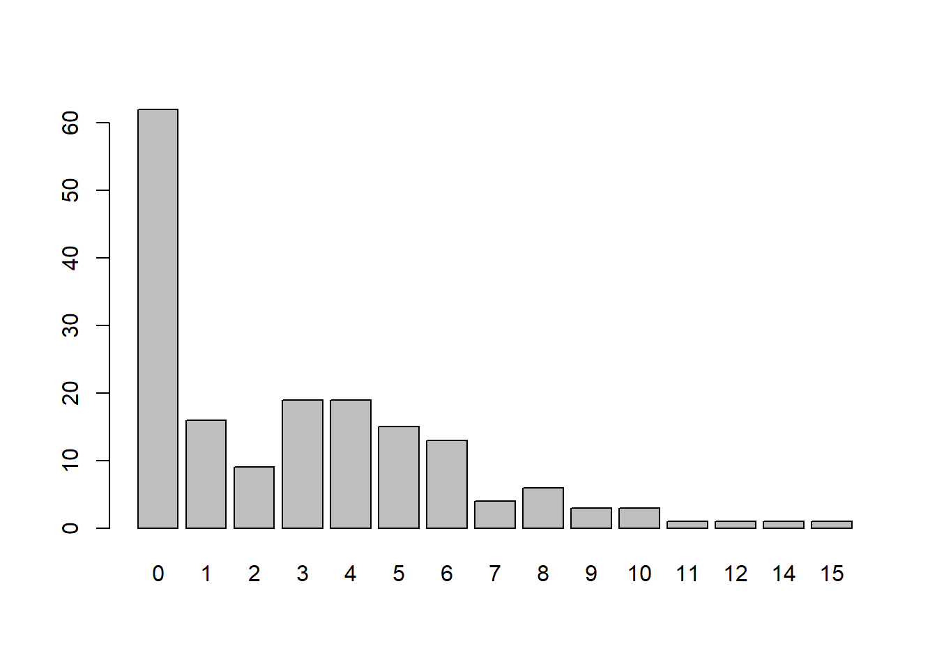
Most crabs are medium color.
summary(hsc$color)light medium medium dark medium dark
12 95 44 22 The median number of satellites increases as coloring of the crab gets lighter.
library(ggplot2)
ggplot(hsc) +
  aes(x = satell, y = color) +
  geom_boxplot(outlier.shape = NA) +
geom_jitter(width = 0, height = 0.1, alpha = 1/2) 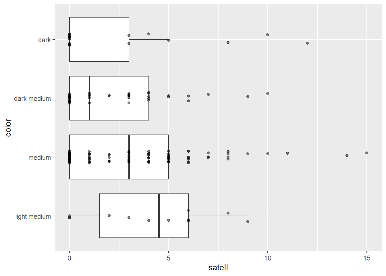
It also appears number of satellites has a weak positive association with width of the female crab.
ggplot(hsc) +
  aes(x = width, y = satell) +
  geom_point() +
  geom_smooth(se = FALSE)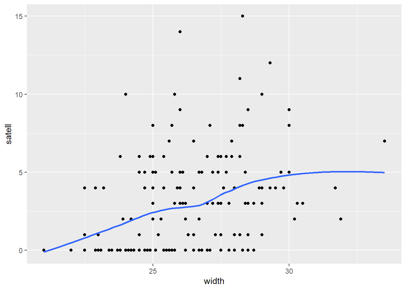
However it appears the positive relationship between width and number of satellites may change depending on color of the crab.
ggplot(hsc) +
  aes(x = width, y = satell) +
  geom_point() +
  geom_smooth(se = FALSE) +
  facet_wrap(~ color)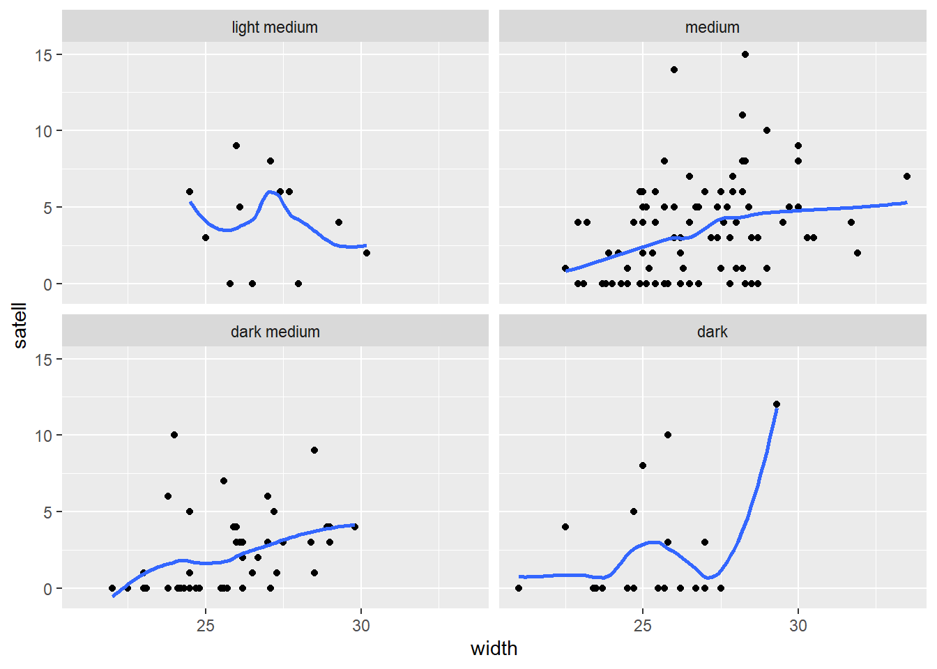
To fit the negative binomial model we’ll use the
glm.nb() function from the MASS package. (Venables and Ripley 2002) We model satell as a
function of width, color and their interaction. The syntax
width * color is shorthand for
width + color + width:color. Before we inspect the model
summary we use the Anova() function from the car package to
assess the interaction.
library(MASS)
library(car)
m <- glm.nb(satell ~ width * color, data = hsc)
Anova(m, test = "F")
Analysis of Deviance Table (Type II tests)
Response: satell
Error estimate based on Pearson residuals
Sum Sq Df F value Pr(>F)
width 14.744 1 15.1595 0.0001432 ***
color 2.774 3 0.9507 0.4175644
width:color 2.100 3 0.7196 0.5416109
Residuals 160.483 165
---
Signif. codes: 0 '***' 0.001 '**' 0.01 '*' 0.05 '.' 0.1 ' ' 1The low F value and high p-value for the width:color
term indicates the interaction adds little value to the model. The null
hypothesis of the test in this case is that the model without the
interaction and the model with interaction fit equally well. We fail to
reject that hypothesis given the evidence.
We therefore proceed to fitting a simpler model without the
interaction. There is no requirement we do this, but a model without an
interaction can be easier to interpret. Again we look at the Analysis of
Deviance Table and associated tests using the Anova()
function. The F value is very low for the color term. The null
hypothesis is that a model with width and color fits as well as a model
with with just width. There appears to be no evidence to reject this
hypothesis. However we’ll retain this term in the model going
forward.
m2 <- glm.nb(satell ~ width + color, data = hsc)
Anova(m2, test = "F")
Analysis of Deviance Table (Type II tests)
Response: satell
Error estimate based on Pearson residuals
Sum Sq Df F value Pr(>F)
width 14.470 1 15.9110 9.892e-05 ***
color 2.723 3 0.9982 0.3952
Residuals 152.785 168
---
Signif. codes: 0 '***' 0.001 '**' 0.01 '*' 0.05 '.' 0.1 ' ' 1Before we interpret the model let’s assess the fit. A good model
should generate data that’s similar to the data used to fit the model.
Below we use the densityPlot() function from the car
package to plot a smooth histogram of the observed counts. That’s the
solid dark line. We see the spike of zeroes and the little bump at 4.
Next we use the simulate() function to generate 50 sets of
data from our model. The result is a data frame we named “sim”. Then we
use a for loop with the lines() function to plot smooth
histograms of the 50 simulated data sets.
densityPlot(hsc$satell, from = 0, to = 15, normalize=TRUE)
sim <- simulate(m, nsim = 50)
for(i in 1:50)lines(density(sim[[i]], from=0), col = "grey90")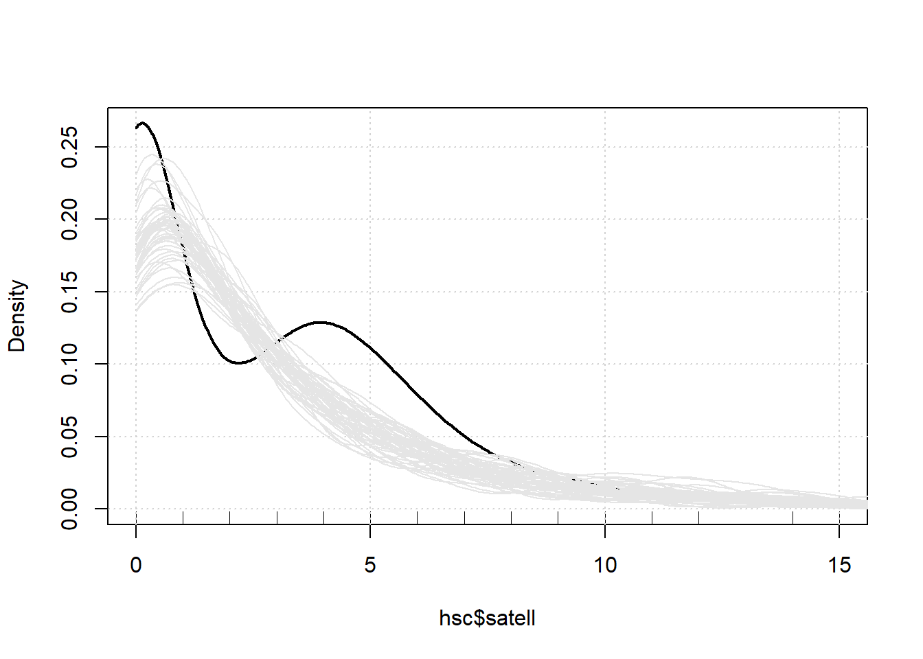
Notice we’re underpredicting 0 counts and in the range of 3 - 6. We’re also overpredicting in the area of 1 and 2.
Another type of fit assessment for count models can be performed with
a rootogram, which we can create using the rootogram()
function from the topmodels package (Zeileis,
Lang, and Stauffer 2024). (Note: The topmodels package is not on
CRAN at the time of this writing (May 2024), but can be installed with
the following code:
install.packages("topmodels", repos = "https://R-Forge.R-project.org"))
The tops of the bars are the expected frequencies of the counts given the model. The counts are plotted on the square-root scale to help visualize smaller frequencies. The red line shows the fitted frequencies as a smooth curve. The bars represent the difference between observed and predicted counts. The x-axis is a horizontal reference line. Bars that hang below the line show underpredicting, bars that hang above show overpredicting. We see our model is ill-fitting for satellites in the 0 - 6 range, but not too bad for the higher counts. The
# install.packages("topmodels", repos = "https://R-Forge.R-project.org")
library(topmodels)
rootogram(m2, confint = FALSE)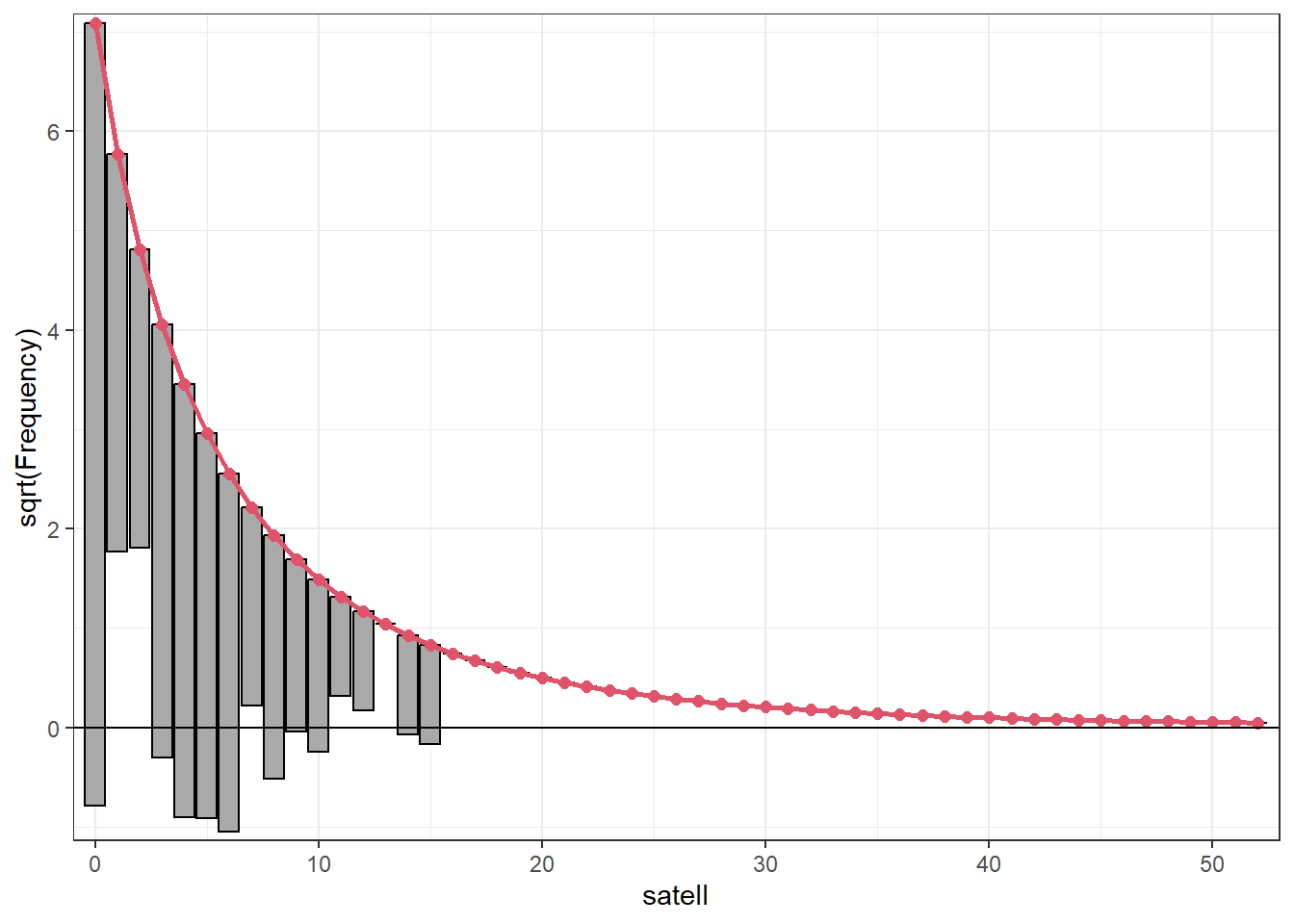
Using the Confint() function (from the car package) with
exponentiate = TRUE returns the multiplicative effect of
the coefficients. For example it appears that for every 1 cm increase in
carapace width results in about a 20% increase in counts (95% CI: [8,
31]).
Confint(m2, exponentiate = TRUE)
Exponentiated Coefficients and Confidence Bounds Estimate 2.5 % 97.5 %
(Intercept) 0.03500076 0.002560117 0.4531445
width 1.19529162 1.089259341 1.3153087
colormedium 0.75886462 0.362037718 1.4724292
colordark medium 0.59432532 0.270255682 1.2280651
colordark 0.58506859 0.245133460 1.3434182We can visualize this effect using the ggeffects package (Lüdecke 2018). Below we use the
ggeffect() function to make predictions of satel for
various values of width, holding color at the proportional values. We
see our estimate becomes very uncertain past 28 cm since we have few
horseshoe crabs that wide.
library(ggeffects)
ggeffect(m2, terms = "width") |> plot()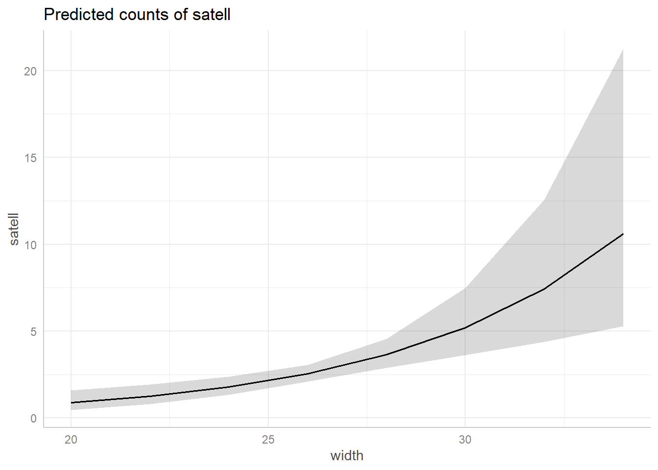
A similar plot can be made for color that suggests a light medium color may lead to more satellites, but we’re very uncertain about that given how few crabs we have of that color (only 12 out of 173).
ggeffect(m2, terms = "color") |> plot()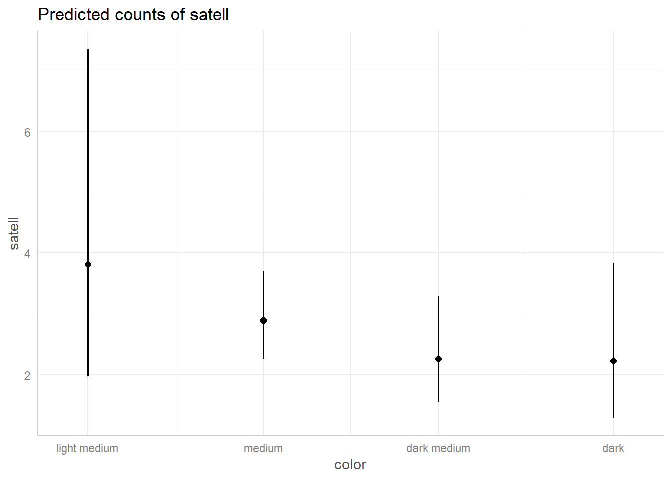
We continue this analysis in the Zero-Inflated model example.
Zero-Inflated model
The horseshoe crab data, analyzed in the previous example (Negative Binomial model), appeared to have a surplus of zeroes. One approach to modeling data of this nature is to entertain a mixture model. This is a model that uses a mix of two models to approximate the data generating process. A zero-inflated model is a mixture of two models:
- a binary logistic regression model for zeroes.
- a count model for zeroes and positive values.
This model basically says there are two types of female horseshoe crabs:
- some that will never have satellites (for whatever reason). Their counts will always be 0.
- some that can have satellites but may not. Their count could be 0.
Let’s read in the data and investigate the distribution of “satell”, our dependent variable. This is the number of additional male crabs residing nearby a nesting female horseshoe crab.
URL <- "https://raw.githubusercontent.com/uvastatlab/sme/main/data/crabs.csv"
hsc <- read.csv(URL)
hsc$color <- factor(hsc$color,
                      labels = c("light medium",
                                 "medium",
                                 "dark medium",
                                 "dark"))
Below we create a table of the “satell” variable and pipe into the
plot() function with type = "h" to visualize
how many of each count we have in our data. Notice the big spike at
0.
table(hsc$satell) |>
  plot(type = "h")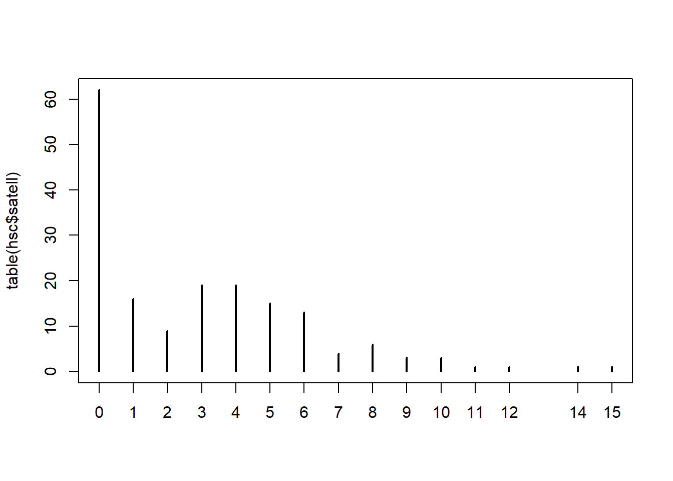
Might the abundance of zeroes be related to the color of the female?
To investigate we create a TRUE/FALSE vector of whether a count is 0 or
not and then convert to 1/0. This new variable is called “zero” and
takes a 1 if the count is zero, and 0 otherwise. We then count the
“zero” variable by “color” and pipe into a the mosaicplot()
function with shade = TRUE. This displays residuals from a
chi-square test of association. The blue shaded box for the dark color
indicates we have more ones in that category than we would expect if
there was no association between the “zero” and “color” variables.
Recall that zero = 1 means we have more zero counts than we might
expect. So the surplus of zeroes may be related to color of shell.
hsc$zero <- as.numeric(hsc$satell == 0)
table(hsc$color, hsc$zero) |>
  mosaicplot(shade = TRUE)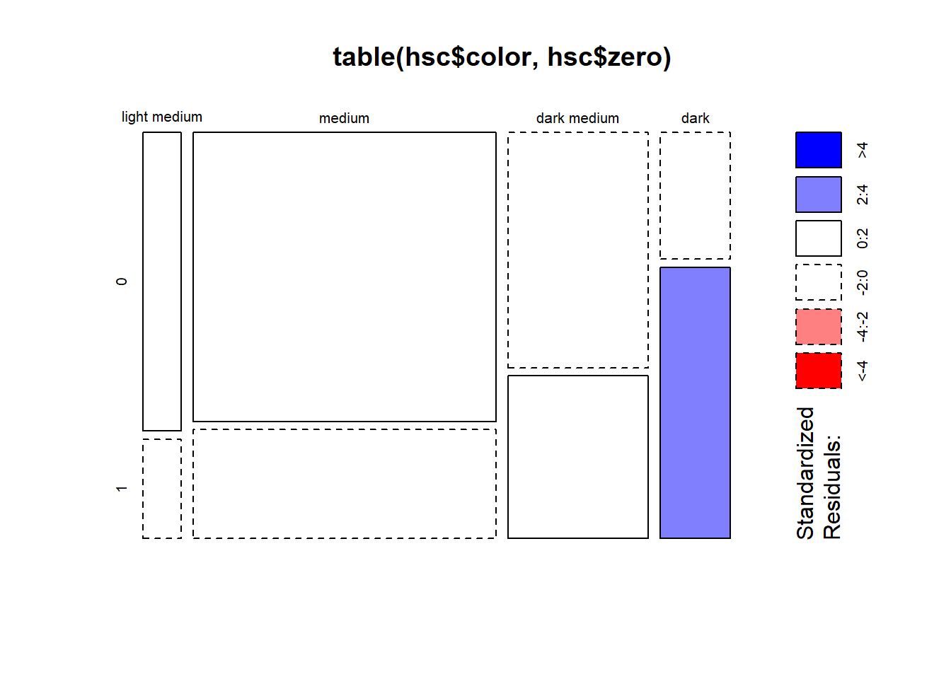
Does the width of the shell help explain some of the zero inflation? We can explore this by modeling zero as a function of width using a binary logistic regression model. It certainly seems that width is associated with the zero variable based on the summary output. The width coefficient is relatively large and negative. This suggests females with wider shells are less likely to have 0 satellites.
glm(zero ~ width, data = hsc, family = binomial) |>
  summary()
Call:
glm(formula = zero ~ width, family = binomial, data = hsc)

Coefficients:
            Estimate Std. Error z value Pr(>|z|)
(Intercept)  12.3508     2.6287   4.698 2.62e-06 ***
width        -0.4972     0.1017  -4.887 1.02e-06 ***
---
Signif. codes:  0 '***' 0.001 '**' 0.01 '*' 0.05 '.' 0.1 ' ' 1

(Dispersion parameter for binomial family taken to be 1)

    Null deviance: 225.76  on 172  degrees of freedom
Residual deviance: 194.45  on 171  degrees of freedom
AIC: 198.45

Number of Fisher Scoring iterations: 4
We can visualize this model using the ggeffect()
function from the ggeffects package. Smaller widths appear to be
associated with higher probabilities of 0 satellites.
glm(zero ~ width, data = hsc, family = binomial) |>
  ggeffect("width") |>
  plot()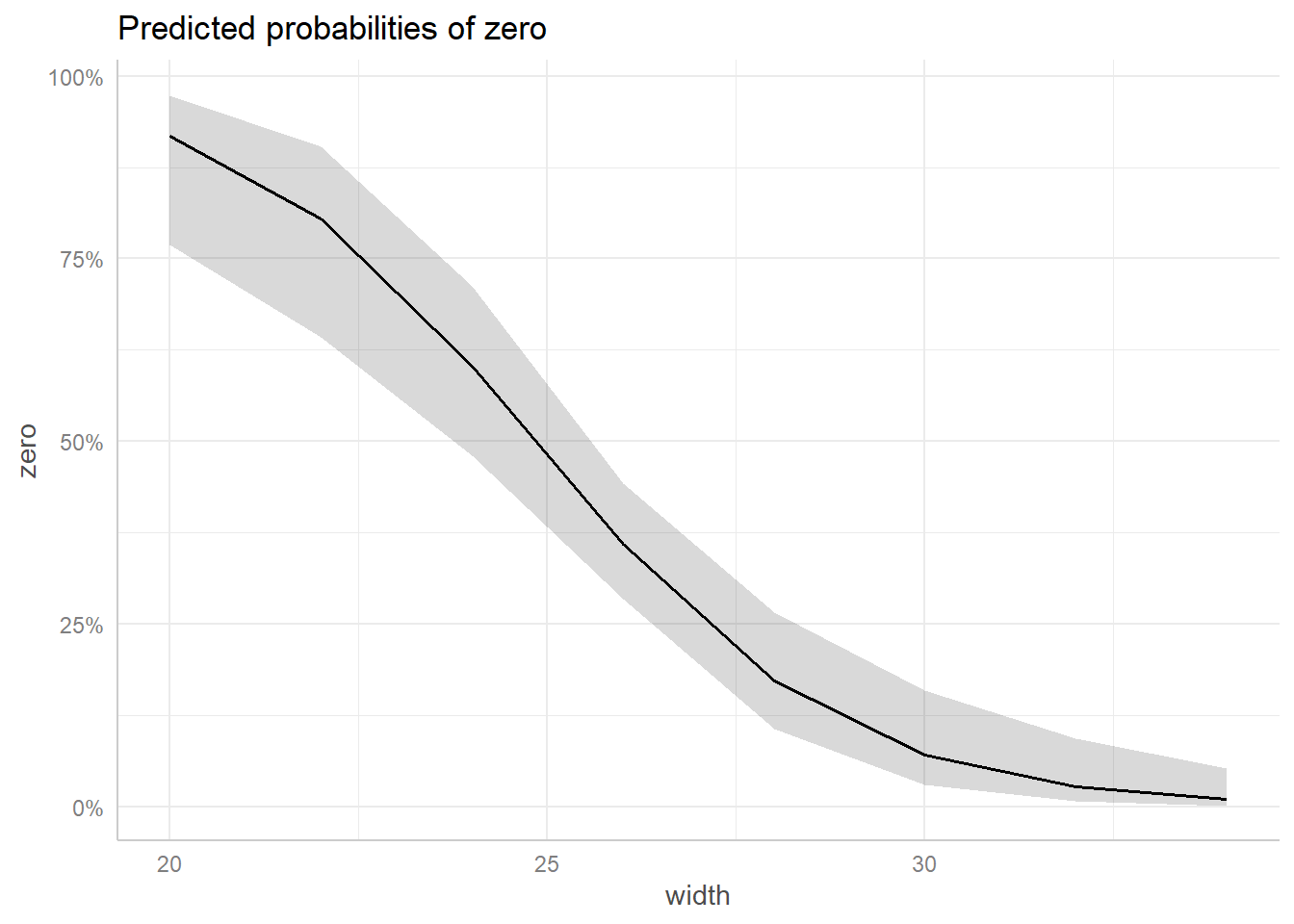
Now we fit a series of zero-inflated models using the
zeroinfl() function from the pscl package (Zeileis, Kleiber, and Jackman 2008). The model
syntax is the same as the syntax used for lm() and
glm(), except now we can specify two models
separated by a |.
- The first model specified to the left of the
|is the count model. We specify the same count model we used in the negative binomial model section. Thedist = "negbin"argument says we want to fit a negative binomial model. (The default is a poisson model.) - The second model specified to the right of the
|is the binary logistic regression model for the zeroes. We try a series of increasingly complex models, starting with the intercept only and then width, color, and both width and color. (We could also not specify a model to the right of the|. In that case the same model is fit to the binomial logistic regression that is fit to the count model.)
library(pscl)
zm <- zeroinfl(satell ~ width + color | 1,
               data = hsc, dist = "negbin")
zm1 <- zeroinfl(satell ~ width + color | width,
                data = hsc, dist = "negbin")
zm2 <- zeroinfl(satell ~ width + color | color,
                data = hsc, dist = "negbin")
zm3 <- zeroinfl(satell ~ width + color | width + color,
                data = hsc, dist = "negbin")
We compare the models’ AIC values to help us decide which model seems to perform the best. Model zm1 appears to give us the most bang for the buck. It doesn’t have the lowest AIC, but it’s not much different from the model with 11 parameters (ie. df, or degrees of freedom). With only 173 observations it seems wise to prefer the model with only 8 parameters.
AIC(zm, zm1, zm2, zm3) df AIC
zm 7 743.8041
zm1 8 717.6382
zm2 10 735.1719
zm3 11 715.6936The model summary shows results for two models: the negative binomial count model and the zero-inflation binary logistic regression model.
summary(zm1)
Call:
zeroinfl(formula = satell ~ width + color | width, data = hsc, dist = "negbin")

Pearson residuals:
    Min      1Q  Median      3Q     Max
-1.3426 -0.7773 -0.2581  0.6553  4.0435

Count model coefficients (negbin with log link):
                 Estimate Std. Error z value Pr(>|z|)
(Intercept)       0.48404    0.84391   0.574    0.566
width             0.04417    0.03044   1.451    0.147
colormedium      -0.20465    0.21731  -0.942    0.346
colordark medium -0.37987    0.24325  -1.562    0.118
colordark         0.17605    0.30884   0.570    0.569
Log(theta)        1.78104    0.37577   4.740 2.14e-06 ***

Zero-inflation model coefficients (binomial with logit link):
            Estimate Std. Error z value Pr(>|z|)
(Intercept)  12.5433     2.8388   4.419 9.94e-06 ***
width        -0.5094     0.1104  -4.613 3.96e-06 ***
---
Signif. codes:  0 '***' 0.001 '**' 0.01 '*' 0.05 '.' 0.1 ' ' 1

Theta = 5.936
Number of iterations in BFGS optimization: 27
Log-likelihood: -350.8 on 8 Df
The only coefficient in the count model that looks reliably positive or negative is theta. This is the dispersion parameter in the negative binomial model. This tells us the conditional mean of the counts is not equal to its variance. If it was, we might consider fitting a Poisson model where the mean and the variance are equal.
It appears width has more to do with understanding the probability of a female crab having zero satellites than understanding the positive counts of satellites. Since a zero inflated model is a mixture of two models, we could try a different count model. Below we fit an intercept-only model for the count model and retain width as a predictor in the binomial logistic regression model. This simplified model with only 4 coefficients seems just as good as the model with 8 coefficients.
zm4 <- zeroinfl(satell ~ 1 | width,
                data = hsc, dist = "negbin")
AIC(zm1, zm4)
df AIC
zm1 8 717.6382
zm4 4 716.3546summary(zm4)
Call:
zeroinfl(formula = satell ~ 1 | width, data = hsc, dist = "negbin")

Pearson residuals:
    Min      1Q  Median      3Q     Max
-1.2864 -0.7710 -0.2773  0.5899  3.6437

Count model coefficients (negbin with log link):
            Estimate Std. Error z value Pr(>|z|)
(Intercept)  1.47294    0.06622  22.244  < 2e-16 ***
Log(theta)   1.55405    0.34194   4.545  5.5e-06 ***

Zero-inflation model coefficients (binomial with logit link):
            Estimate Std. Error z value Pr(>|z|)
(Intercept)  13.1283     2.9472   4.455 8.41e-06 ***
width        -0.5332     0.1152  -4.628 3.69e-06 ***
---
Signif. codes:  0 '***' 0.001 '**' 0.01 '*' 0.05 '.' 0.1 ' ' 1

Theta = 4.7306
Number of iterations in BFGS optimization: 18
Log-likelihood: -354.2 on 4 Df
This updated model basically says that counts of satellites is a mixture of two models:
- a negative binomial model with
mu = exp(1.47294)andtheta = 4.7305 - a binomial logistic regression model where probability of zero satellites decreases with larger widths
We can evaluate the fit of this updated model with a rootogram. The fit is not great, especially when it comes to modeling counts of ones and twos. But we have a much better understanding of zero counts.
rootogram(zm4, confint = FALSE)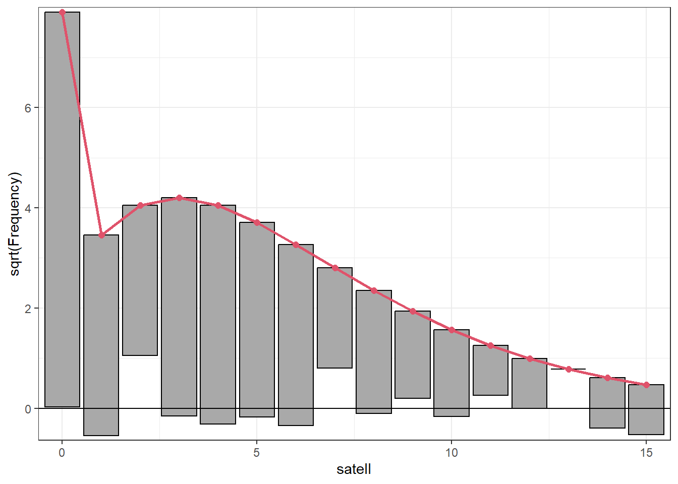
This model also improves on the negative binomial model we fit in the previous section. It has two fewer coefficients and a substantially lower AIC.
# m2 fit in the Negative binomial model section
AIC(zm4, m2)
df AIC
zm4 4 716.3546
m2 6 760.5958