Linear Modeling
Linear model with no predictors (intercept only)
A new reading program is being evaluated at an elementary school. A random sample of 20 students were tested to determine reading speed. Speed was measured in minutes. (Ott and Longnecker, n.d.)
speed <- c(5, 7, 15, 12, 8, 7, 10, 11, 9, 13, 10,
           6, 11, 8, 10, 8, 7, 6, 11, 8, 20)
We can visualize the distribution of data using a histogram as follows:
hist(speed)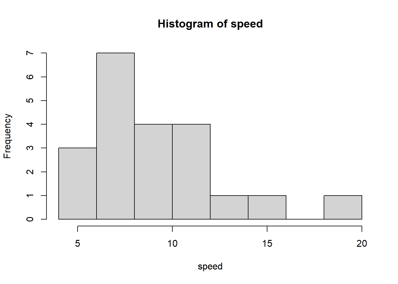
We can use the t.test() function to calculate both the
mean of speed and a 95% confidence interval on the mean. The mean
reading speed was about 9.62 with a 95% CI of [8.04, 11.19].
t.test(speed)
    One Sample t-test

data:  speed
t = 12.753, df = 20, p-value = 4.606e-11
alternative hypothesis: true mean is not equal to 0
95 percent confidence interval:
  8.045653 11.192442
sample estimates:
mean of x
 9.619048
To extract just the confidence interval we can save the result of the
t-test and view the conf.int element of the saved
object.
tout <- t.test(speed)
tout$conf.int
[1] 8.045653 11.192442
attr(,"conf.level")
[1] 0.95We can also calculate the 95% confidence interval using an
intercept-only linear model. Below we model speed as a function of the
number 1 using the lm() function. This is the R syntax for
fitting an intercept-only model. We save the result into an object we
name “m” and use the confint() function to view the 95%
confidence interval.
m <- lm(speed ~ 1)
confint(m)
2.5 % 97.5 %
(Intercept) 8.045653 11.19244Does the sample appear to be from a Normal distribution? If so, the points in a QQ plot should lie close to the diagonal line. See this article for information on QQ plots. This plot looks ok.
qqnorm(speed)
qqline(speed)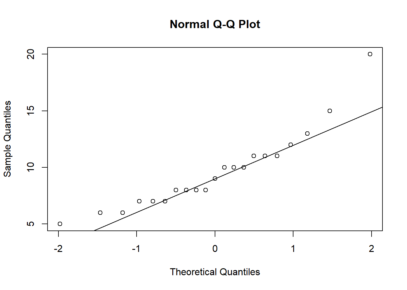
We can also obtain a QQ plot by calling the plot()
function on the model object. By default the plot() method
for model objects returns four plots. Setting which = 2
produces just the QQ plot.
plot(m, which = 2)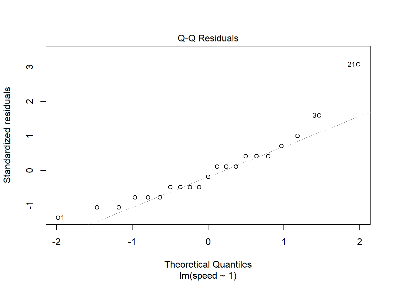
A few observations seem unusual: 1, 3, 21. We can extract their speed values using index subsetting.
speed[c(1, 3, 21)][1] 5 15 20There was a fast reader and a couple of slower readers.
If a Normal QQ plot of your data looks suspect, we can try comparing it to other Normal QQ plots created with Normal data. Below we calculate the mean and standard deviation of our data, re-draw the original QQ Plot, and then generate 24 additional QQ plots from a Normal distribution with the same mean and standard deviation as our data. The QQ plot of our observed data doesn’t seem too different from the QQ plots of Normal data.
m <- mean(speed)
s <- sd(speed)

# create a 5x5 grid of plotting areas
op <- par(mar = c(2,2,1,1), mfrow = c(5,5))

# create first qq plot
qqnorm(speed, xlab = "", ylab = "", main = "")
qqline(speed)

# now create 24 qq plots using observed mean and sd
for(i in 1:24){
  # rnorm() samples from a Normal dist'n
  # with specified mean and sd
  d <- rnorm(20, mean = m, sd = s)
  qqnorm(d, xlab = "", ylab = "", main = "")
  qqline(d)
}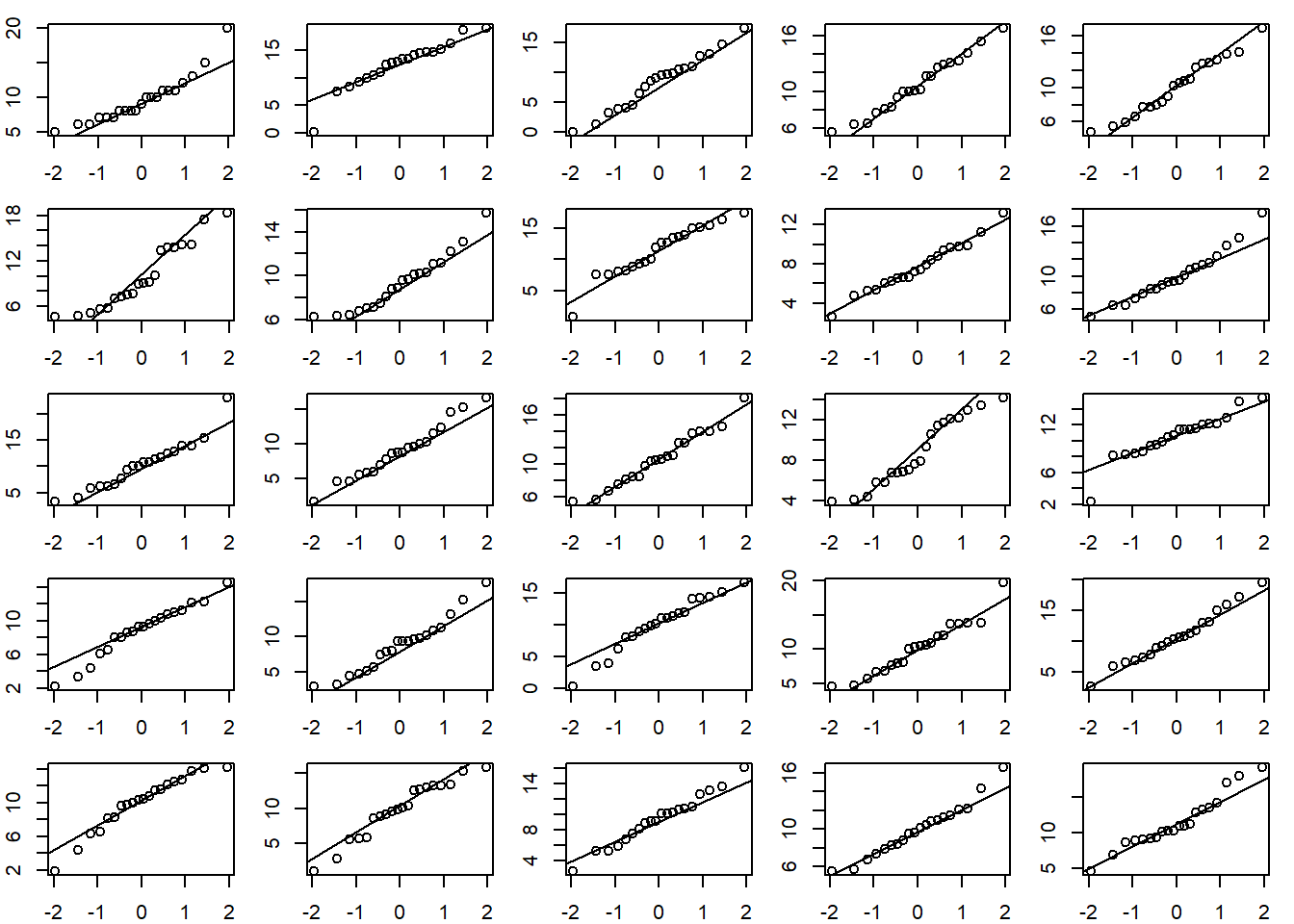
par(op)Linear model with categorical predictors
The schooldays data frame from the HSAUR3 package has
154 rows and 5 columns. It contains data from a sociological study of
Australian Aboriginal and white children. Model absent
(number of days absent during school year) as a function of
race, gender, school (school
type), and learner (average or slow learner). (Hothorn and Everitt 2022)
library(HSAUR3)
data("schooldays")
First we summarize and explore the data.
# plots to look at data
library(ggplot2)
library(dplyr)

# histogram of absences
hist(schooldays$absent)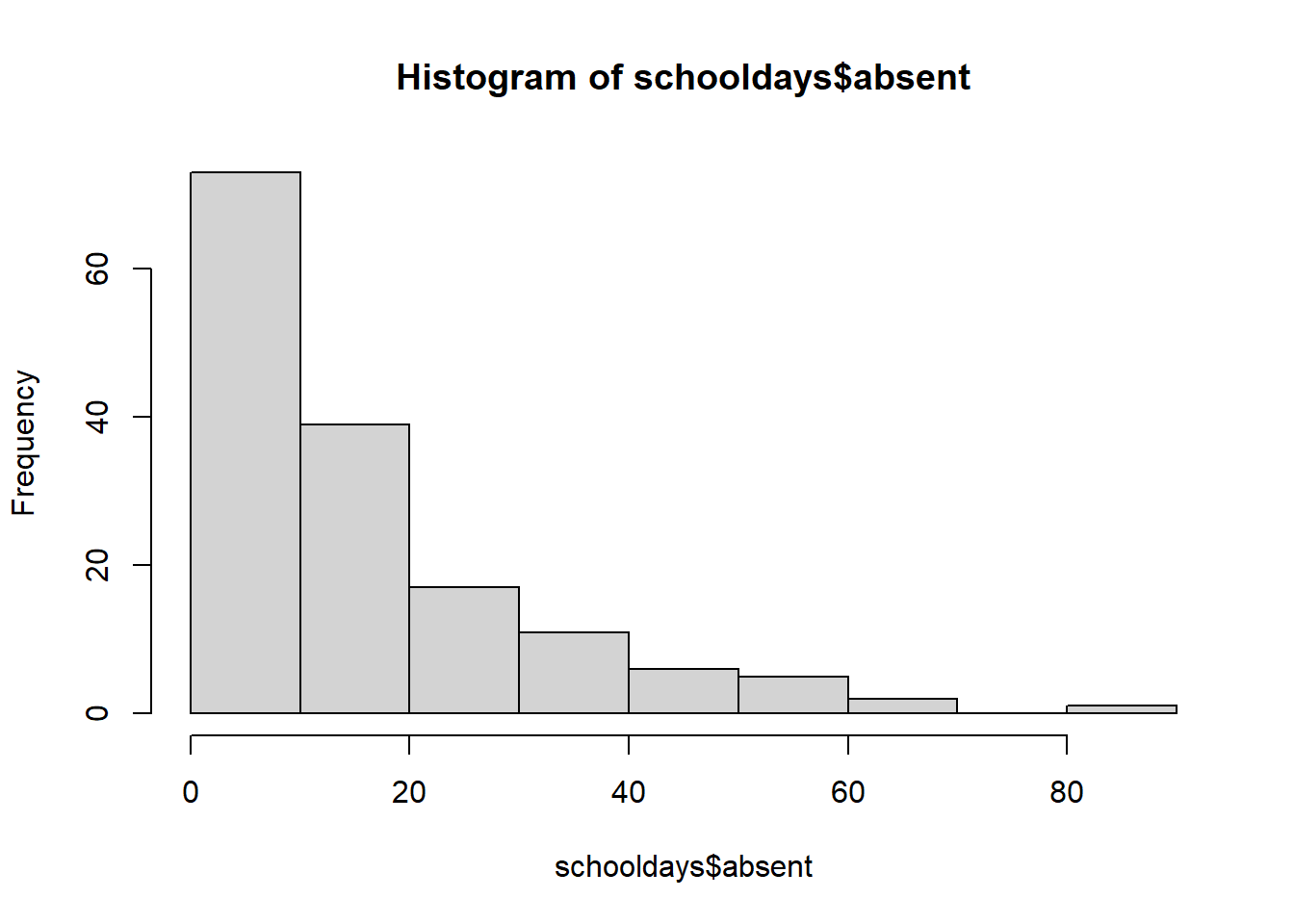
# base r strip chart of absences by gender
stripchart(absent ~ gender, data = schooldays,
           ylab = 'number of absences', xlab = 'gender',
           main = 'Stripchart of Absences by gender')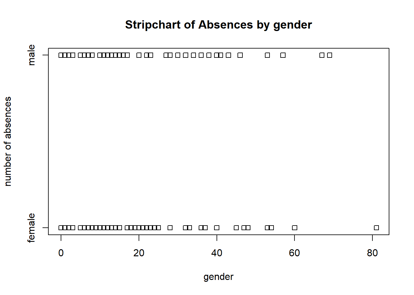
# ggplot strip chart of absences by gender
ggplot(schooldays, aes(x = gender, y = absent, color=learner)) +
  geom_jitter(position = position_jitter(0.2))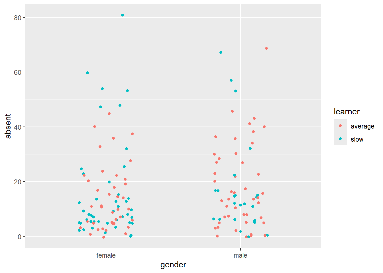
Next we model absent as a function of all other
predictors.
m <- lm(absent ~ race + gender + school + learner, schooldays)
summary(m)
Call:
lm(formula = absent ~ race + gender + school + learner, data = schooldays)

Residuals:
    Min      1Q  Median      3Q     Max
-20.383 -10.252  -3.560   6.232  57.877

Coefficients:
                   Estimate Std. Error t value Pr(>|t|)
(Intercept)         17.0323     3.7353   4.560 1.07e-05 ***
racenon-aboriginal  -7.8280     2.4836  -3.152  0.00197 **
gendermale           2.6356     2.5596   1.030  0.30484
schoolF1            -1.7803     3.8597  -0.461  0.64530
schoolF2             5.3509     3.9365   1.359  0.17612
schoolF3             3.2898     3.8428   0.856  0.39334
learnerslow          0.7393     2.7243   0.271  0.78648
---
Signif. codes:  0 '***' 0.001 '**' 0.01 '*' 0.05 '.' 0.1 ' ' 1

Residual standard error: 15.32 on 147 degrees of freedom
Multiple R-squared:  0.1091,    Adjusted R-squared:  0.07276
F-statistic: 3.001 on 6 and 147 DF,  p-value: 0.00853
In the first section we would like to see Residuals centered around 0, with the min/max and 1Q/3Q having roughly the same absolute value. This indicates a uniform scatter of residuals, which is what a linear model assumes.
- Positive residuals occur when observed response values are greater than predicted response values.
- Negative residuals occur when observed response values are less than predicted response values.
Residuals do not seem uniformly scatter based on these summary statistics.
The Coefficients section shows the fitted model in the Estimate column. A mathematical expression of the model is as follows:
\[\text{absent} = 17.03 + -7.83\text{ non-aboriginal} + 2.64\text{ male} + -1.78\text{ F1} + 5.35\text{ F2} + 3.29\text{ F3} + 0.74\text{ slow learner}\]
For example, we might use our model to predict expected number of days absent for non-aboriginal females in an F1 school who are average learners.
\[\text{absent} = 17.03 + -7.83(1) + 2.64(0) + -1.78(1) + 5.35(0) + 3.28(0) + 0.74(0)\]
Notice we plug in 1 if our subject belongs to the category and 0
otherwise. We can carry out this prediction using the
predict() function. The input values need to be entered in
a data frame using the same variable names and category levels as our
analysis data set.
predict(m, newdata = data.frame(race = "non-aboriginal",
                                gender = "female",
                                school = "F1",
                                learner = "average"))
1
7.423977 Our model predicts about 7 days absence. Adding
interval = "confidence" to predict() reports a
95% confidence interval on this prediction.
predict(m, newdata = data.frame(race = "non-aboriginal",
gender = "female",
school = "F1",
learner = "average"),
interval = "confidence") fit lwr upr
1 7.423977 1.144474 13.70348The estimate is rather wide, ranging from 1 day to 14 days.
The “Std. Error” column in the summary output quantifies uncertainty
in the estimated coefficients. The “t value” column is the ratio of the
estimated coefficient to the standard error. Ratios larger than 2 or 3
in absolute value give us confidence in the direction of the
coefficient. Other than the intercept, the only coefficient that we’re
confident about is the race coefficient. It appears
non-aboriginal students have a lower rate of absence by
about 7 days.
The “Pr(>|t|)” column reports p-values for hypothesis tests for each t value. The null hypothesis is the t value is 0. The reported p-value is the probability of seeing a t value that large or larger in magnitude if the null is true. In all seven hypothesis tests are reported. Two appear to be “significant” in the sense their p-values fall below traditional thresholds.
The “Residual standard error” is the expected amount a predicted response value will differ from its observed value. The reported value of 15.32 tells us the model’s predicted value for days absent will be off by about 15 days.
The Multiple and Adjusted R-squareds are 0.10 and 0.07. This summarizes the proportion of variability explained by the model. Of the variability in days absent, it looks like this model explains about 7% of the variance. The Adjusted R-squared is adjusted for the number of predictors and is the preferred statistic of the two. (Multiple R-squared always increases when variables are added to a model, even variables unrelated to the response.)
The F-statistic tests the null hypothesis that all coefficients (other than the intercept) are 0. Small p-values provide evidence against this hypothesis.
R provides some built-in diagnostic plots. A good one to inspect is the Residuals vs Fitted plot.
plot(m, which = 1)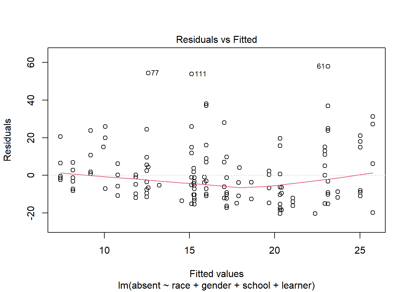
Residuals above 0 are instances where the observed values are larger than the predicted values. It seems our model is under-predicting absences to a greater degree than over-predicting absences. The labeled points of 77, 111, and 61 are the rows of the data set with the largest residuals. These data points may be worth investigating. For example, point 111 is a child that we predict would be absent about 15 days (on the x-axis), but the residual of about 50 (on the y-axis) tells us this student was absent about 65 days.
A QQ Plot can help us assess the Normality assumption of the residuals.
plot(m, which = 2)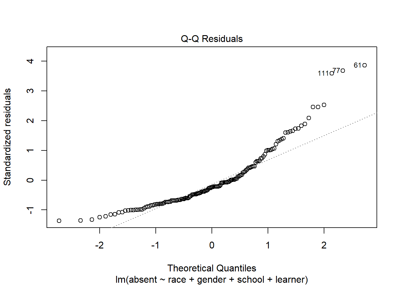
We would like the points to fall along the diagonal line. This plot doesn’t look great. Since our model doesn’t seem to be very good based on the previous plot, it’s probably not worth worrying too much about the QQ Plot.
Another version of the Residuals vs Fitted plot is the Scale-Location plot.
plot(m, which = 3)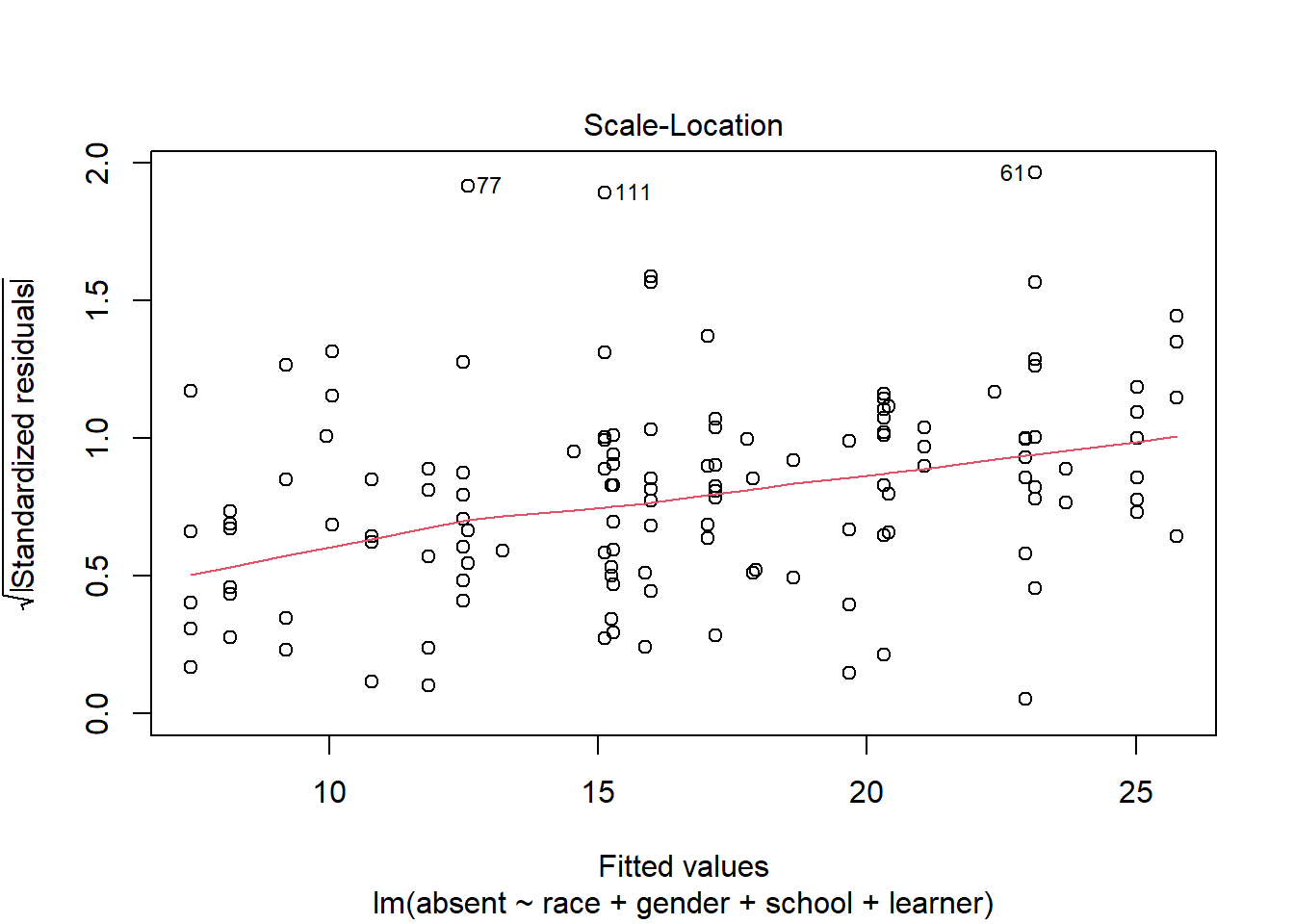
In this plot the residuals are standardized and strictly positive. We would like the smooth red line to trend straight. The fact it’s trending up provides some evidence that our residuals are getting larger as our fitted values get larger. This could mean a violation of the constant variance assumption.
One final plot to inspect is the Residuals vs Leverage plot. This can help us see if any data points are influencing the model.
plot(m, which = 5)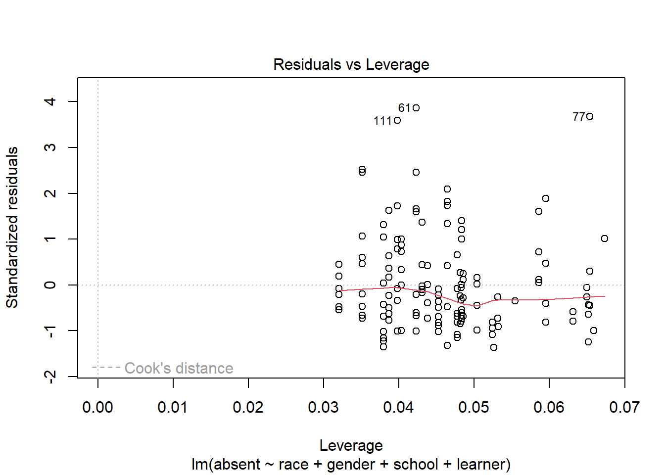
The x-axis is Leverage, also called hat-values. Higher values of leverage mean a higher potential to influence a model. The y-axis shows standardized residuals. Also plotted is Cook’s distance contour lines if any points exceed a particular threshold. Like leverage, Cook’s distance also quantifies the influence of a data point. In this plot it doesn’t appear any points are unduly influencing the model.
Conclusion: it looks like the number of days absent cannot be properly modeled or understood with these categorical predictors.
Linear model with categorical and numeric predictors
The bp.obese data frame from the ISwR package has 102
rows and 3 columns. It contains data from a random sample of
Mexican-American adults in a small California town. Analyze systolic
blood pressure in mm Hg (bp) as a function of obesity
(obese) and sex (sex), where male = 0 and
female = 1. Here obese is a ratio of actual weight to ideal
weight from New York Metropolitan Life Tables. (Dalgaard 2020)
library(ISwR)
data("bp.obese")
First, we will look at summary statistics of the data.
summary(bp.obese) sex obese bp
Min. :0.0000 Min. :0.810 Min. : 94.0
1st Qu.:0.0000 1st Qu.:1.143 1st Qu.:116.0
Median :1.0000 Median :1.285 Median :124.0
Mean :0.5686 Mean :1.313 Mean :127.0
3rd Qu.:1.0000 3rd Qu.:1.430 3rd Qu.:137.5
Max. :1.0000 Max. :2.390 Max. :208.0 Sex is encoded with 0s (male) and 1s (female). Sex’s mean of 0.5686 tells us that about half of the people are female. Obese is a ratio representing participants weight. 1 indicates actual weight equals ideal weight. >1 indicates actual weight is greater than ideal weight. And <1 the opposite.
Next, we will visualize the distribution of blood pressure, for all subjects and by sex.
library(ggplot2)

# ggplot(bp.obese, aes(x = bp)) +
#   geom_density()

ggplot() +
  geom_density(bp.obese, mapping = aes(x = bp, fill=as.factor(sex)), alpha=1/3) +
  labs(fill='sex') +
  scale_fill_manual(values = c('blue', 'red'),
                    labels=c('male','female'))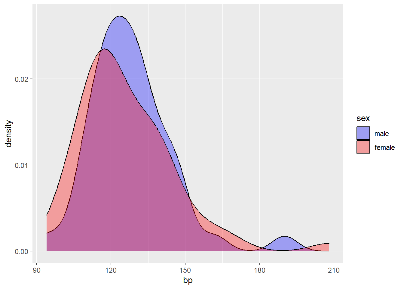
The distribution of bp appears to skew right, and does not differ much between male and female.
Next, we will plot the relationship between the variables bp and obese.
ggplot(bp.obese, aes(x = obese, y = bp)) +
  geom_point()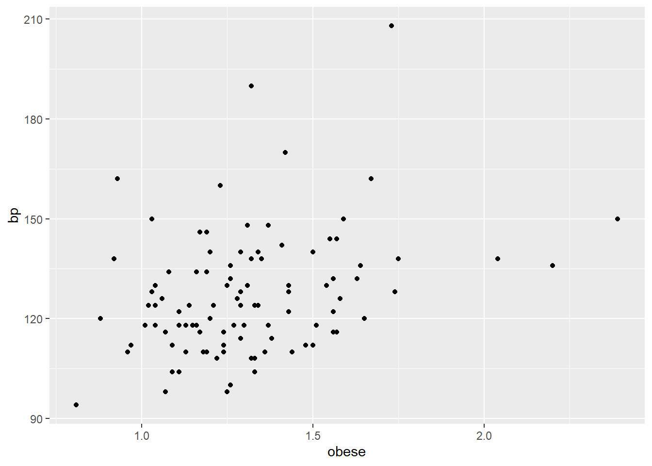
Most participants have above ideal weight and below 150 bp. The relationship between obese and bp, in general, appears to be positive and somewhat linear. But obese does not entirely explain bp. For example, the 3 participants with obese greater than 2 have bps at about or below 150. Then, the 2 participants with bp greater than 180 have obese less that 1.75.
Below we model bp as a function of the variables obese and sex.
bp.obese$sex <- as.factor(bp.obese$sex)
m3 <- lm(bp ~ obese + sex, bp.obese)
summary(m3)
Call:
lm(formula = bp ~ obese + sex, data = bp.obese)

Residuals:
    Min      1Q  Median      3Q     Max
-24.263 -11.613  -2.057   6.424  72.207

Coefficients:
            Estimate Std. Error t value Pr(>|t|)
(Intercept)   93.287      8.937  10.438  < 2e-16 ***
obese         29.038      7.172   4.049 0.000102 ***
sex1          -7.730      3.715  -2.081 0.040053 *
---
Signif. codes:  0 '***' 0.001 '**' 0.01 '*' 0.05 '.' 0.1 ' ' 1

Residual standard error: 17 on 99 degrees of freedom
Multiple R-squared:  0.1438,    Adjusted R-squared:  0.1265
F-statistic: 8.314 on 2 and 99 DF,  p-value: 0.0004596
One way we can assess the model is by examining diagnostic plots. We will view the fitted vs. residuals plot.
plot(m3, which=1)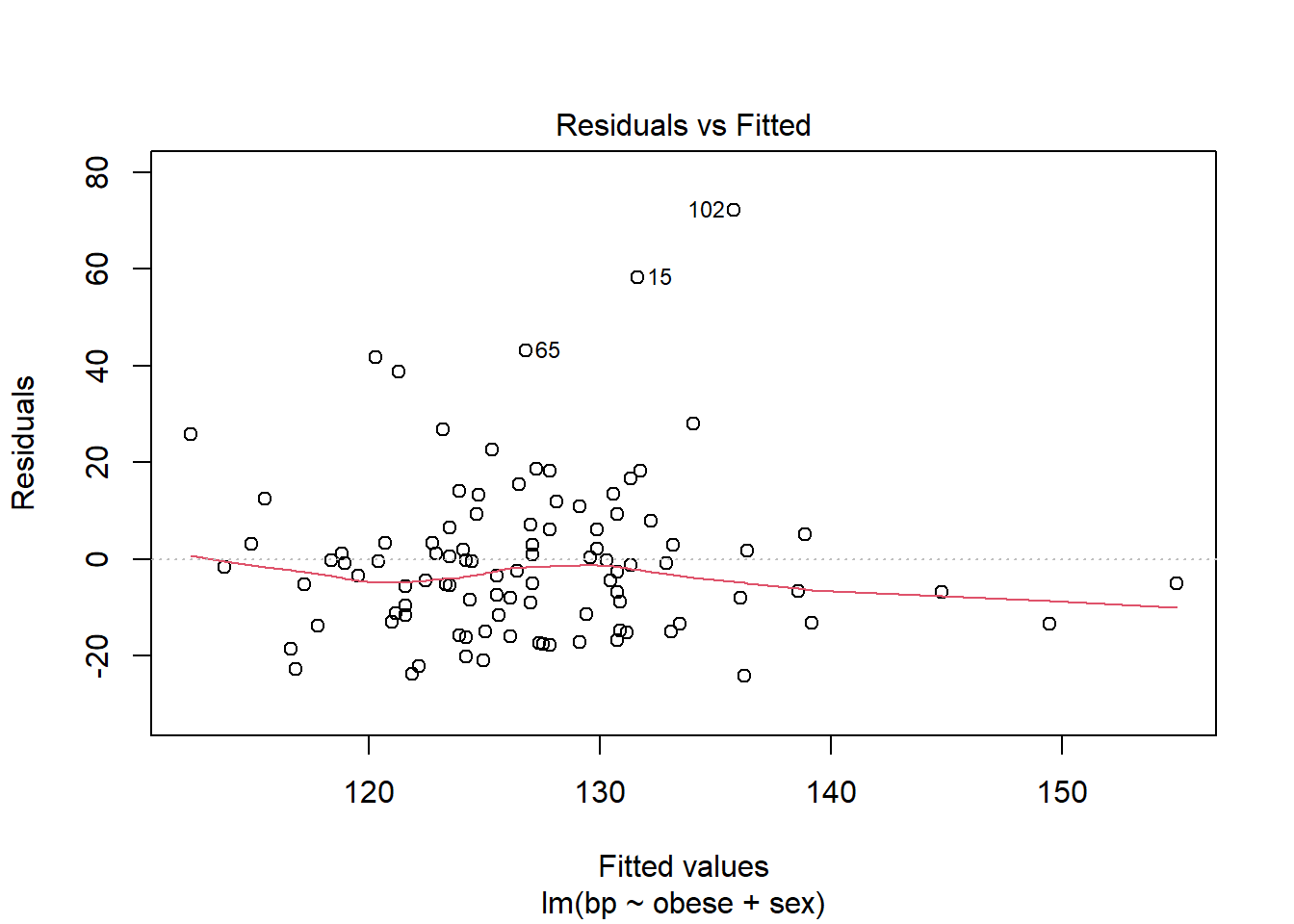
The fitted vs. residuals plot summarizes the spread of residuals. For a ‘good’ model, we expect to see residuals centered around 0, with an even distribution above and below 0. The red trend line helps us detect any patterns in the residuals. We hope to see it approximately horizontal around 0.
Many (but not all) of the values on the plot are within 20 units of 0. This is what we would expect based on the residual standard error, which is 17. Linear modeling assumes the distribution of residuals has a mean of 0 and a constant standard deviation. This standard deviation is estimated as the residual standard error. The residual standard error is how much we can expect a prediction to deviate from its true value.
The residual versus fitted plot also reveals several subjects with residuals well above 20. This means our model is severely underfitting their blood pressure values. For example subject 15 has a fitted value of about 130, but a residual of 60. This means their observed blood pressure was 190, but our model predicts 130. There are many subjects experiencing this underfitting which indicates our model probably isn’t very good.
Additionally, this model has an adjusted R-squared value of 0.1265. This roughly means the model explains 13% of the variability in bp. This is another indication that the model is not good.
Another way to assess model fit is through a calibration plot, which plots predicted values against observed values. The values should cluster around the slope=1 line shown in red.
plot(bp.obese$bp, predict(m3))
abline(a=0, b=1, col='red')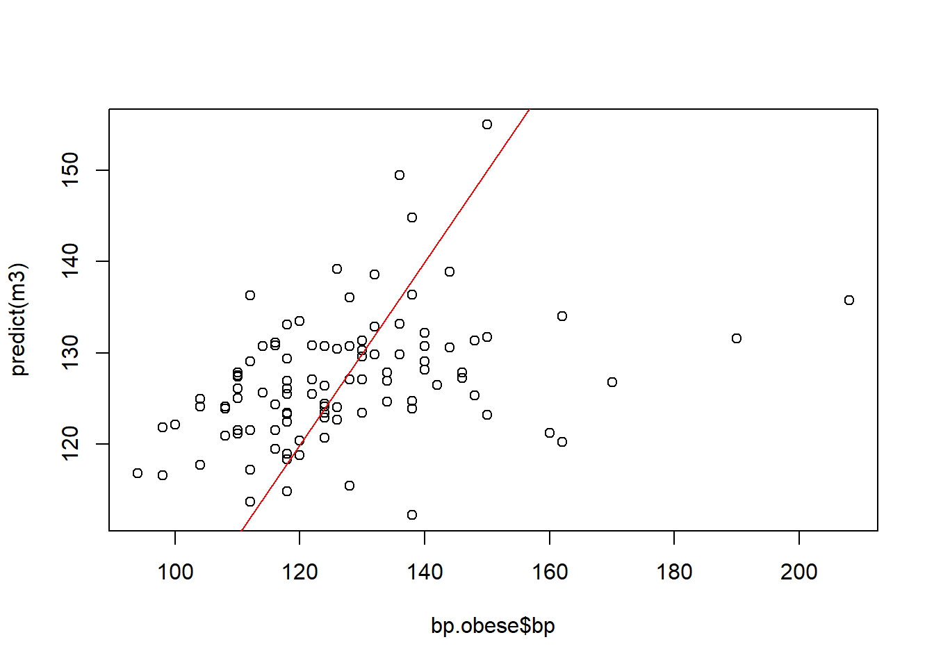
These values do not cluster around the slope=1 line, another signal that this model does not perform well. It is likely that factors outside of the predictors in the model also affect bp.
Next, we will calculate confidence intervals for each of the coefficients in the model.
confint(m3) 2.5 % 97.5 %
(Intercept) 75.55321 111.0205442
obese 14.80766 43.2687683
sex1 -15.10225 -0.3580819For the obese variable, the 95% confidence interval goes from 14.8 to 43.3. According to the confidence interval, generally a 1 unit increase in obese will increase bp by about 14 to 43 units. If a participant’s obese measure increased from 1 to 2, then they started at their “ideal” weight and increased to twice their ideal weight.
We can use an example to better understand the relevance of the obese variable. A participant weighs 200 pounds and their ideal weight is 150 pounds. This makes their obese measure about 1.3. Then the participant gains 20 pounds, making their obese measure about 1.5. What happens if the obese measure increases by 0.2? To determine how much bp increases for every 0.1 unit increase in obese, we can divide the confidence interval by 10.
confint(m3)['obese',]/10 2.5 % 97.5 %
1.480766 4.326877 So generally, for every 0.1 unit increase in obese, bp increases by 1.5 to 4.3 units. If a participant increases in obese by 0.2, the model predicts about a 2.0 to 8.6 unit increase in bp.
For the sex variable, a 1 unit difference means switching from one sex to another. According to the model, switching sex from male to female generally decreases bp.
Linear model with time ordered data
The heating equipment data set from Applied Linear Statistical
Models (5th Ed) (Kutner 2005)
contains data on heating equipment orders over a span of four years. The
data are listed in time order. Develop a reasonable predictor model for
orders. Determine whether or not autocorrelation is
present. If so, revise model as needed.
URL <- "https://github.com/uvastatlab/sme/raw/main/data/heating.rds"
heating <- readRDS(url(URL))
names(heating)
[1] "orders" "int_rate" "new_homes" "discount" "inventories"
[6] "sell_through" "temp_dev" "year" "month" The variables are as follows:
orders: number orders during monthint_rate: prime interest rate in effect during monthnew_homes: number of new homes built and for sale during monthdiscount: percent discount offered to distributors during monthinventories: distributor inventories during monthsell_through: number of units sold by distributor to contractors in previous monthtemp_dev: difference in avg temperature for month and 30-year avg for that monthyear: year (1999, 2000, 2001, 2002)month: month (1 - 12)
First we look at the distribution of orders.
hist(heating$orders)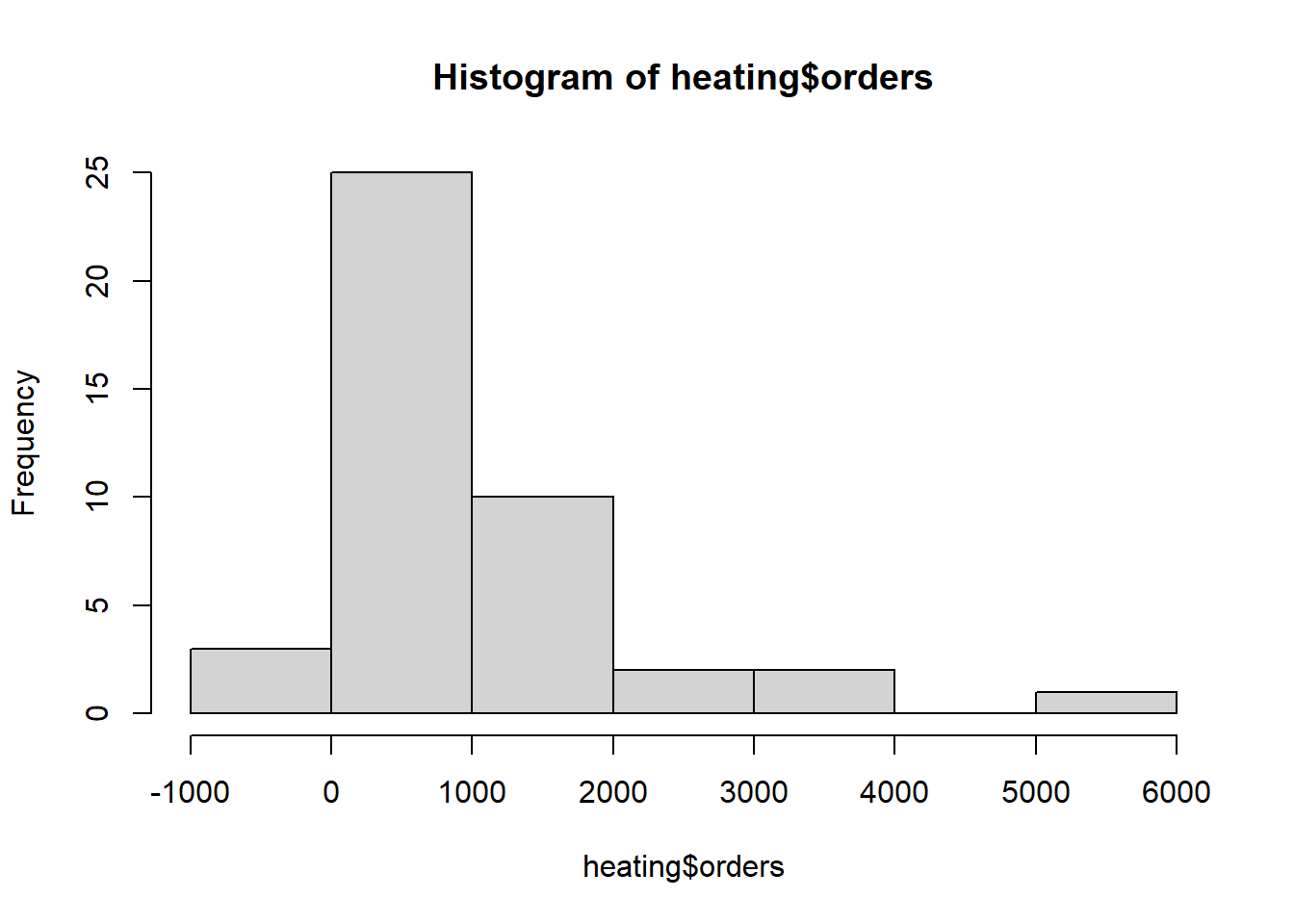
We had negative orders one month and zero orders a couple of months
summary(heating$orders) Min. 1st Qu. Median Mean 3rd Qu. Max.
-5.0 262.5 754.0 937.4 1167.0 5105.0 head(sort(heating$orders))[1] -5 0 0 8 12 34Let’s review summaries of potential predictors. Discounts are almost always 0.
summary(heating[,2:7]) int_rate new_homes discount inventories
Min. :0.04750 Min. :59.00 Min. :0.0000 Min. :1151
1st Qu.:0.06250 1st Qu.:63.00 1st Qu.:0.0000 1st Qu.:1796
Median :0.07500 Median :65.00 Median :0.0000 Median :2422
Mean :0.07448 Mean :65.53 Mean :0.3721 Mean :3052
3rd Qu.:0.08750 3rd Qu.:68.00 3rd Qu.:0.0000 3rd Qu.:4018
Max. :0.09500 Max. :72.00 Max. :5.0000 Max. :7142
sell_through temp_dev
Min. : 538.0 Min. :0.020
1st Qu.: 724.0 1st Qu.:0.445
Median : 832.0 Median :0.860
Mean : 926.1 Mean :1.190
3rd Qu.:1002.5 3rd Qu.:2.130
Max. :2388.0 Max. :3.420 Tabling up discounts shows there were only 5 occasions when a discount was not 0.
table(heating$discount)
 0  1  2  3  5
38  1  1  1  2
Pairwise scatterplots again reveal that discount is mostly 0. But when greater than 0, it appears to be associated with higher orders.
pairs(heating[,1:7], lower.panel = NULL)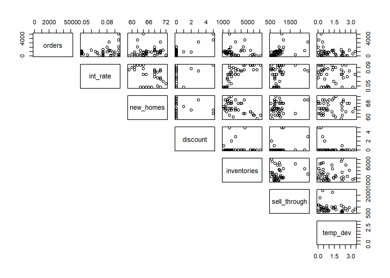
Since the data is in time order, we can plot orders
against its index to investigate any trends in time. There appears to be
an upward trend in the first 9 months. After that orders seem rather
sporadic.
plot(heating$orders, type = "b")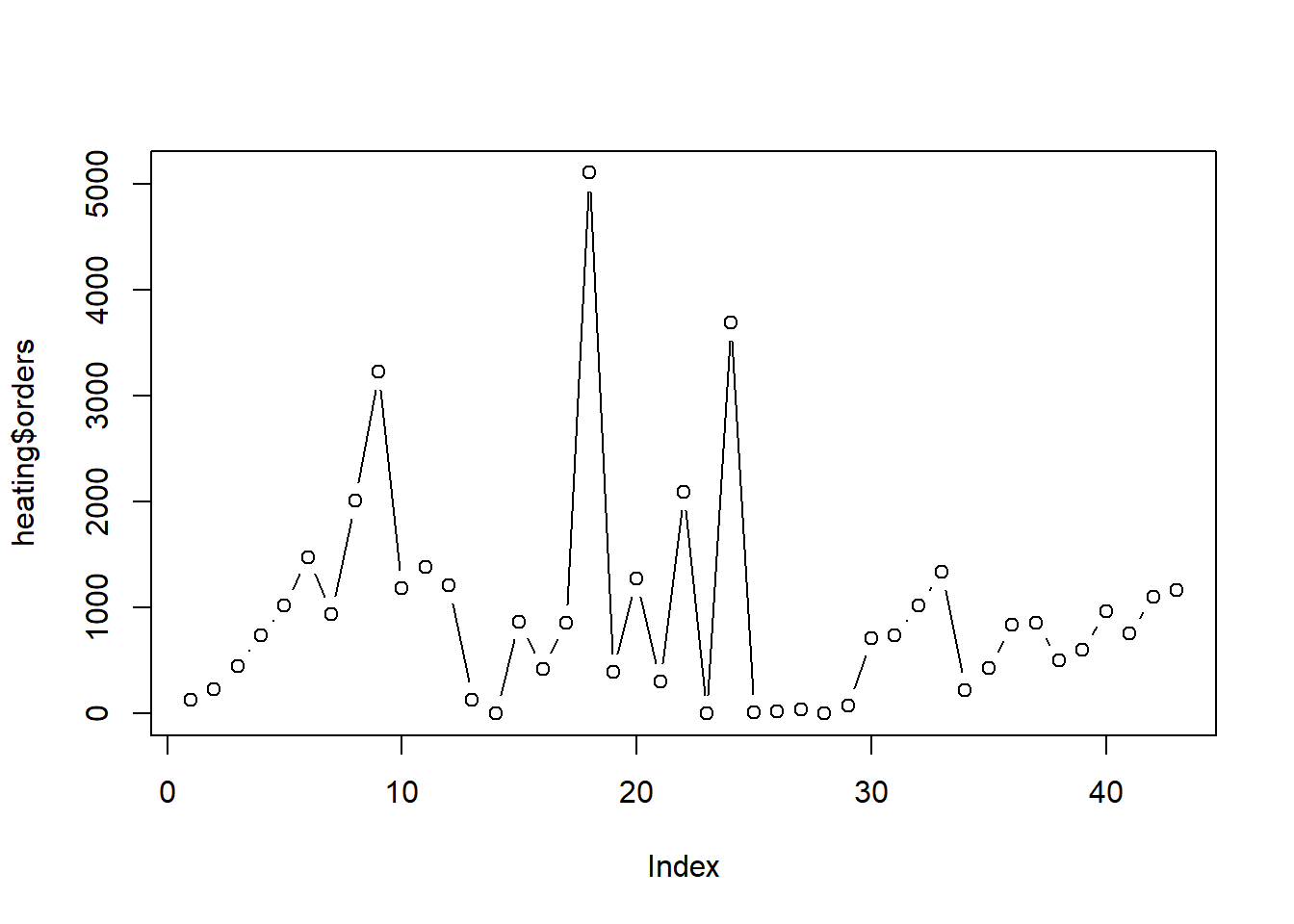
The acf() function allows us to formally check for
autocorrelation (ie, self-correlation). At lag 0, we see
orders is perfectly correlated with itself. That will
always be the case for any variable. Of interest is autocorrelation at
lag 1 and beyond. The area between the horizontal dashed lines is where
we would expect to see random autocorrelation values hover for pure
noise (ie, data with no autocorrelation). Other than at lag 5, we so no
evidence for autocorrelation. And even there it appears rather weak.
acf(heating$orders)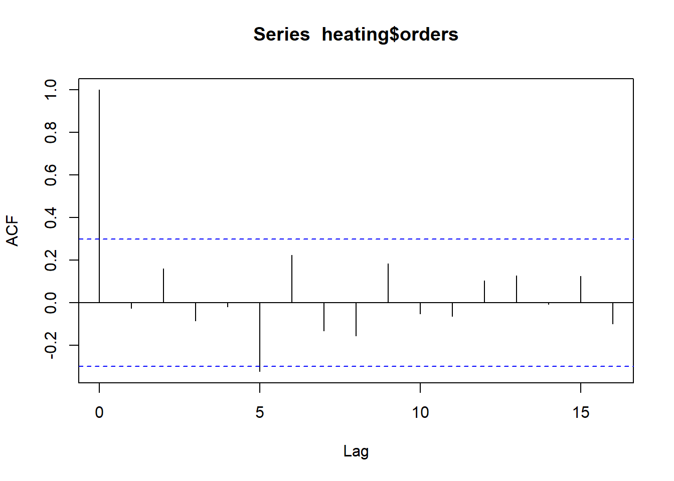
With only 43 observations and little knowledge of this industry, we
decide to pursue a simple model with no interactions or non-linear
effects. To help us decide which predictors to use, will use a bootstrap
procedure to investigate the variability of model selection under the
stepAIC() function from the MASS package (Venables and Ripley 2002), which performs
stepwise model selection by AIC. The bootStepAIC() function
from the package of the same name allows us to easily implement this
procedure. (Rizopoulos 2022)
First we fit a “full” model with all predictors we would like to entertain, with the exception of year and month.
m <- lm(orders ~ . - year - month, data = heating)Then we bootstrap the stepAIC() function 999 times and
investigate which variables appear to be selected most often.
library(bootStepAIC)
b.out <- boot.stepAIC(m, heating, B = 999)
The Covariates element of the BootStep object shows three predictors
being selected most often: sell_through,
discount, and inventories
b.out$Covariates (%)
sell_through 96.19620
discount 94.99499
inventories 84.18418
int_rate 42.34234
new_homes 28.22823
temp_dev 21.12112The Sign element of the BootStep object shows that
sell_through had a positive coefficient 100% of the time,
while discount had a positive coefficient about 99.9% of
the time. The sign of the coefficient for inventories was
negative about 99.5% of the time.
b.out$Sign + (%) - (%)
sell_through 100.0000000 0.0000000
discount 99.8946259 0.1053741
int_rate 93.8534279 6.1465721
new_homes 92.5531915 7.4468085
temp_dev 20.3791469 79.6208531
inventories 0.4756243 99.5243757Let’s proceed with these three predictors in a simple additive model.
m <- lm(orders ~ discount + inventories + sell_through, data = heating)
summary(m)
Call:
lm(formula = orders ~ discount + inventories + sell_through,
    data = heating)

Residuals:
   Min     1Q Median     3Q    Max
-934.5 -364.4 -138.4  236.0 1531.2

Coefficients:
              Estimate Std. Error t value Pr(>|t|)
(Intercept)  371.89514  244.83077   1.519  0.13683
discount     643.11308   71.31200   9.018 4.39e-11 ***
inventories   -0.11845    0.04962  -2.387  0.02192 *
sell_through   0.74260    0.22357   3.322  0.00195 **
---
Signif. codes:  0 '***' 0.001 '**' 0.01 '*' 0.05 '.' 0.1 ' ' 1

Residual standard error: 519.9 on 39 degrees of freedom
Multiple R-squared:  0.7599,    Adjusted R-squared:  0.7414
F-statistic: 41.14 on 3 and 39 DF,  p-value: 3.694e-12
Before we get too invested in the model output, we investigate the residuals for autocorrelation since our data is in time order. One (subjective) way to do that is to plot residuals over time. Since our data is already in time order, we can just plot residuals versus its index. We’re looking to see if residuals are consistently above or below 0 for extended times. It appears we may have some instances of this phenomenon but nothing too severe.
plot(residuals(m), type = "b")
segments(x0 = 0, y0 = 0, x1 = 43, y1 = 0, lty = 2)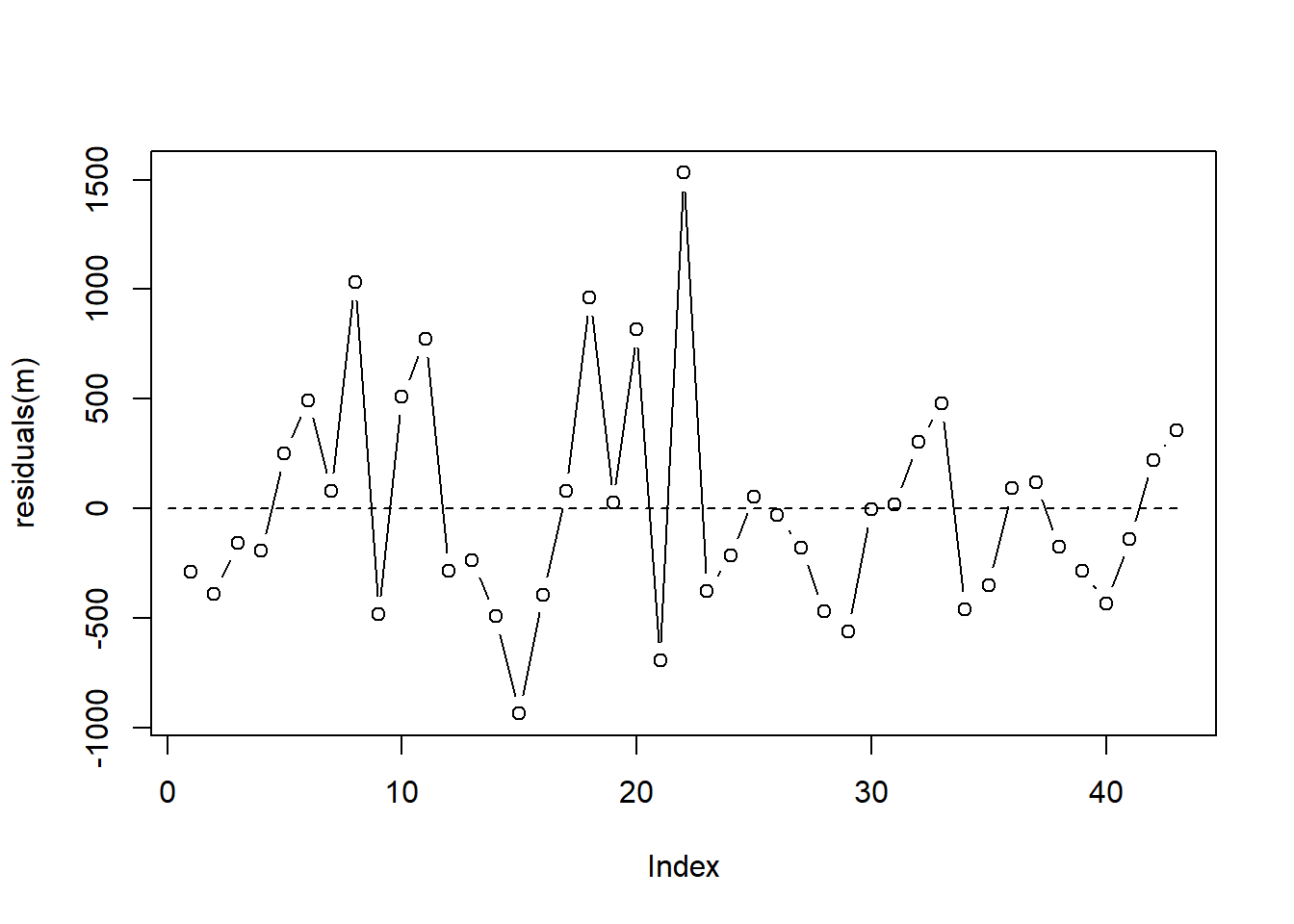
A test for autocorrelation is the Durbin-Watson Test. The car package (Fox and Weisberg 2019) provides a function for this test. The null hypothesis is the autocorrelation parameter, \(\rho\), is 0. Rejecting this test with a small p-value may provide evidence of serious autocorrelation. The test result below fails to provide good evidence against the null.
library(car)
durbinWatsonTest(m)
lag Autocorrelation D-W Statistic p-value
1 -0.05006007 2.079992 0.93
Alternative hypothesis: rho != 0Based on our residual versus time plot and the result of the Durbin-Watson test, we decide to assume our residual errors are independent.
Our Residuals versus Fitted plot shows a couple of observations (22 and 18) that the model massively under-predicts. Observation 18, for example, has a fitted value of over 4000, but its residual is about 1000, indicating the model under-predicted its order value by about 1000 units.
plot(m, which = 1)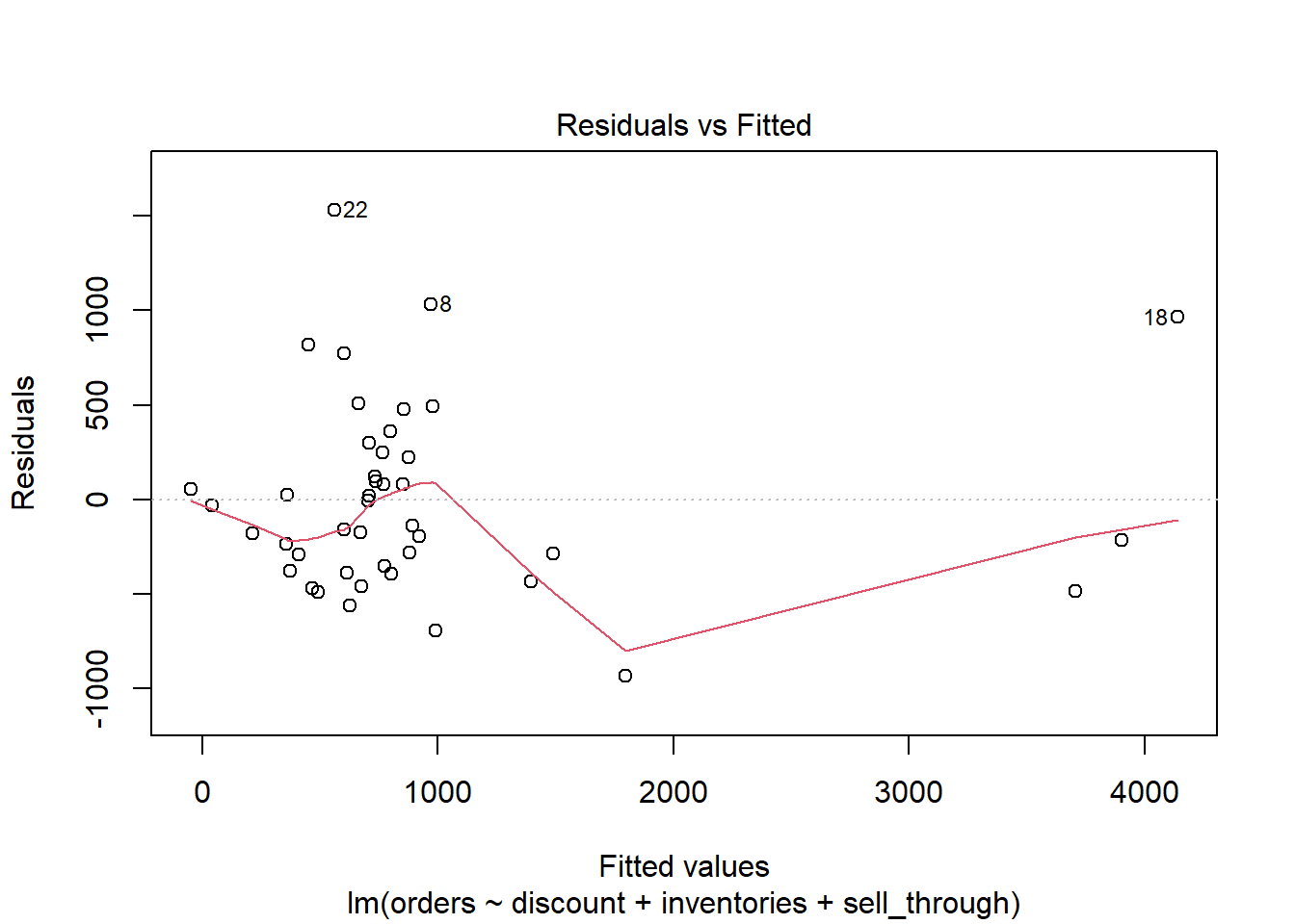
The Residuals versus Leverage plot indicates that observation 18 may be exerting a strong influence on the model.
plot(m, which = 5)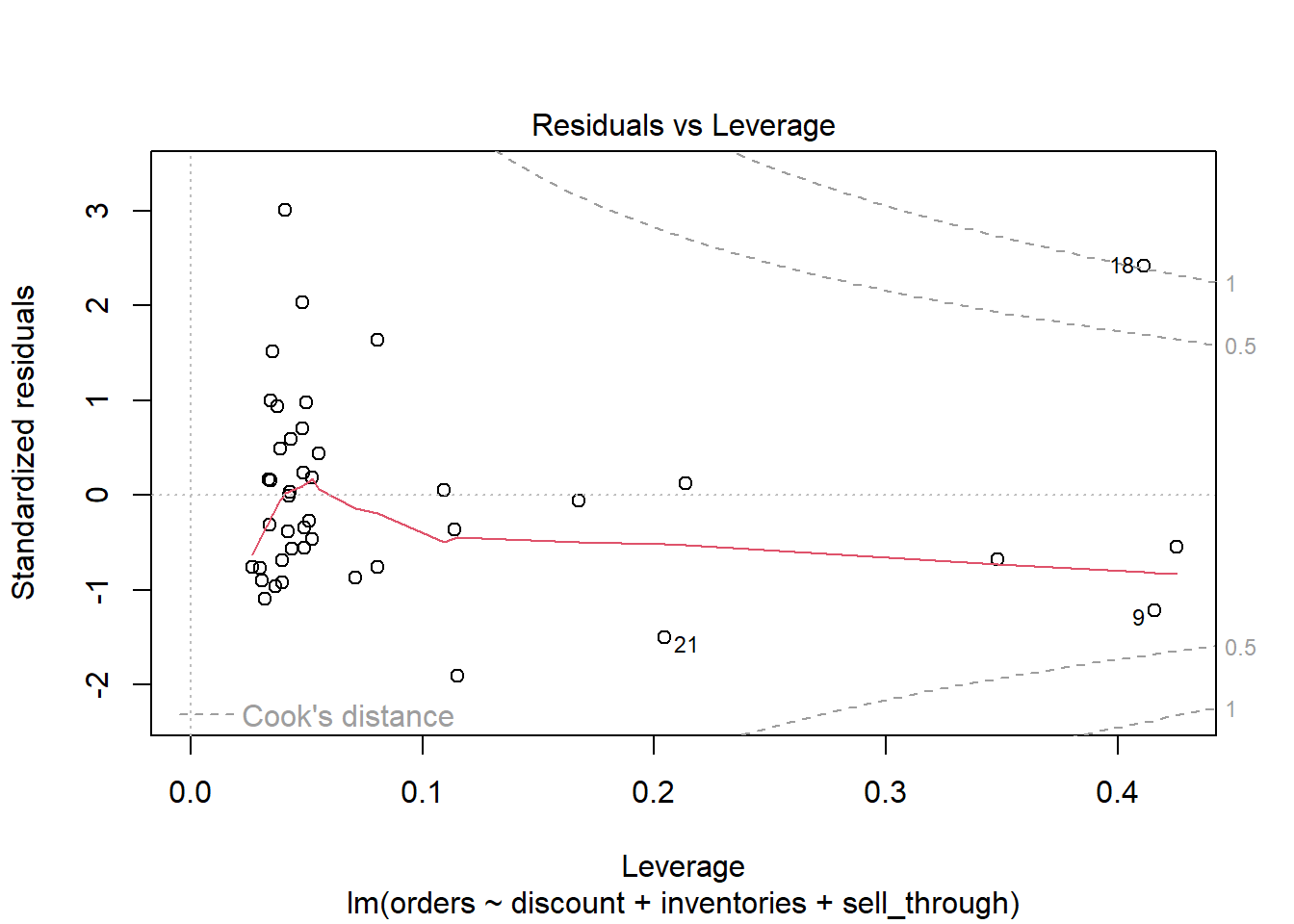
The “18” label allows us to easily investigate this observation. It appears this is one of the rare times there was a discount. And at 5%, this is the largest observed discount.
heating[18, c("orders", "discount", "inventories", "sell_through")] orders discount inventories sell_through
18 5105 5 2089 1078We can assess how our model changes by re-fitting without observation 18.
m2 <- update(m, subset = -18)The compareCoefs() function from the car package makes
it easy to compare model coefficients side-by-side. It doesn’t appear to
change the substance of the results and we elect to keep the observation
moving forward.
compareCoefs(m, m2)Calls:
1: lm(formula = orders ~ discount + inventories + sell_through, data =
heating)
2: lm(formula = orders ~ discount + inventories + sell_through, data =
heating, subset = -18)
Model 1 Model 2
(Intercept) 372 282
SE 245 231
discount 643.1 505.7
SE 71.3 85.2
inventories -0.1185 -0.1071
SE 0.0496 0.0466
sell_through 0.743 0.816
SE 0.224 0.211
Computing confidence intervals on the coefficients can help with interpretation. It appears every additional one percentage point discount could boost orders by about 500 units, perhaps as much as 750 or higher. Of course with only 5 instances of discounts being used, this is far from a sure thing, especially for forecasting future orders.
The inventories coefficient is very small. One reason
for that is because it’s on the scale of single units. Multiplying by
100 yields a CI of [-21, -1]. This suggests every additional 100 units
in stock may slightly decrease orders. Same with the
sell_through coefficient. If we multiple by 100 we get a CI
of [29, 119]. Every 100 number units sold the previous month suggests an
increase of a few dozen orders.
confint(m) 2.5 % 97.5 %
(Intercept) -123.3218428 867.11212629
discount 498.8709468 787.35521450
inventories -0.2188203 -0.01808456
sell_through 0.2903863 1.19480804We can use our model to make a prediction. What’s the expected mean
number of orders with inventories at 2500 and
sell_through at 900, assuming a 1% discount?
predict(m, newdata = data.frame(inventories = 2500,
                                sell_through = 900,
                                discount = 1),
        interval = "confidence")
fit lwr upr
1 1387.215 1194.674 1579.755Based on the confidence interval, a conservative estimate would be about 1200 orders.
Inverse Gaussian Linear Model
The {faraway} package (Faraway 2016) provides data on an experiment that investigates the effects of various treatments on certain toxic agents. 48 rats were randomly poisoned with one of three types of poison, and then treated with one of four available treatments. Of interest is which treatment helped the rats survive the longest. The data were original published in Box and Cox (1964).
data("rats", package = "faraway")We see the data is balanced with 4 rats per poison/treatment combination.
table(rats$poison, rats$treat)
      A B C D
  I   4 4 4 4
  II  4 4 4 4
  III 4 4 4 4
The outcome is survival time. It is measured in units of 10 hours.
summary(rats$time) Min. 1st Qu. Median Mean 3rd Qu. Max.
0.1800 0.3000 0.4000 0.4794 0.6225 1.2400 It looks like most rats survived about 5 hours, but a few lived a bit longer.
plot(density(rats$time))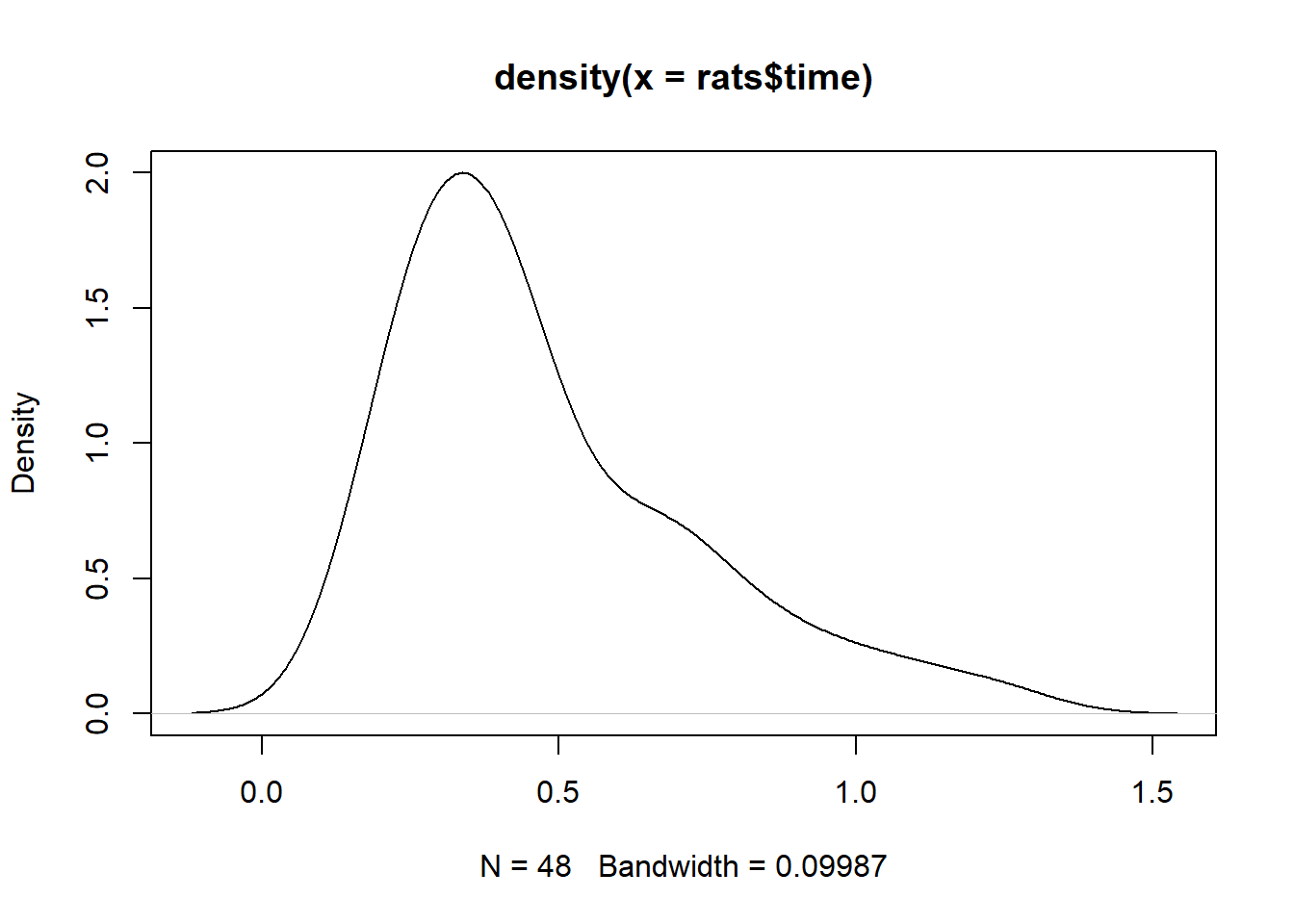
Stripcharts help visualize the variability in time within each group. It appears poison III was the most lethal, and that treatment A is the least efficacious.
stripchart(time ~ poison, data = rats, method = "jitter",
           ylab = "poison", las = 1)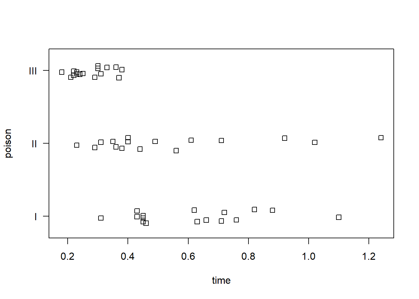
stripchart(time ~ treat, data = rats, method = "jitter",
           xlab = "treatment", las = 1)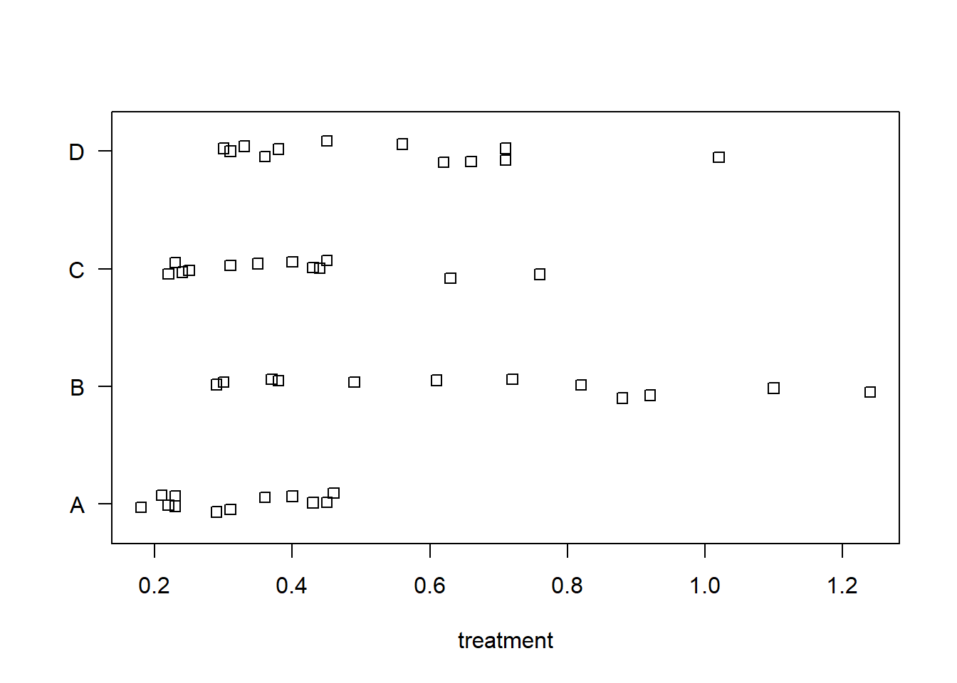
An interaction plot can help us assess if treatment effect depends on the poison. There doesn’t appear to be any major interactions. It looks like treatment B may be preferred to increase survival time, at least for poisons I and II.
with(rats, interaction.plot(x.factor = treat,
                            trace.factor = poison,
                            response = time))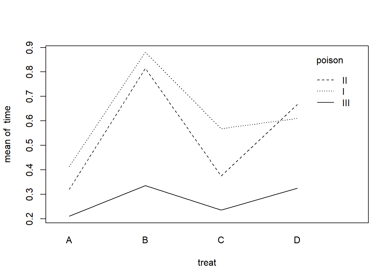
Next we model time as a function of treat, poison, and their interaction. The summary is somewhat difficult to interpret with interactions.
m <- lm(time ~ treat * poison, data = rats)
summary(m)
Call:
lm(formula = time ~ treat * poison, data = rats)

Residuals:
     Min       1Q   Median       3Q      Max
-0.32500 -0.04875  0.00500  0.04312  0.42500

Coefficients:
                 Estimate Std. Error t value Pr(>|t|)
(Intercept)       0.41250    0.07457   5.532 2.94e-06 ***
treatB            0.46750    0.10546   4.433 8.37e-05 ***
treatC            0.15500    0.10546   1.470   0.1503
treatD            0.19750    0.10546   1.873   0.0692 .
poisonII         -0.09250    0.10546  -0.877   0.3862
poisonIII        -0.20250    0.10546  -1.920   0.0628 .
treatB:poisonII   0.02750    0.14914   0.184   0.8547
treatC:poisonII  -0.10000    0.14914  -0.671   0.5068
treatD:poisonII   0.15000    0.14914   1.006   0.3212
treatB:poisonIII -0.34250    0.14914  -2.297   0.0276 *
treatC:poisonIII -0.13000    0.14914  -0.872   0.3892
treatD:poisonIII -0.08250    0.14914  -0.553   0.5836
---
Signif. codes:  0 '***' 0.001 '**' 0.01 '*' 0.05 '.' 0.1 ' ' 1

Residual standard error: 0.1491 on 36 degrees of freedom
Multiple R-squared:  0.7335,    Adjusted R-squared:  0.6521
F-statistic:  9.01 on 11 and 36 DF,  p-value: 1.986e-07
Before we try to interpret this model, let’s check the residuals versus fitted values plot.
plot(m, which = 1)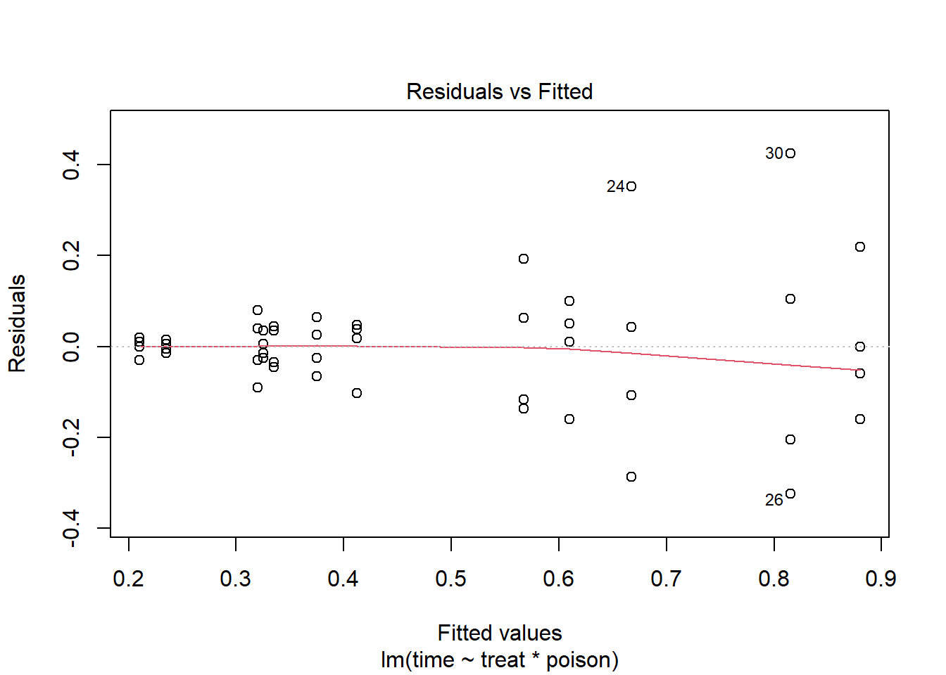
We see noticeable heteroscedasticity. As our fitted values get bigger, so do the residuals. Ideally we would like the residuals to be uniformly scattered around 0, which would indicate our assumption of constant variance is satisfied. That is not the case here.
To address this, we can attempt to transform the outcome. Common
transformations include a log transformation and square root
transformation. We can use the powerTransform() function
from the {car} package (Fox and Weisberg
2019) to help us identify a suitable transformation.
car::powerTransform(m)Estimated transformation parameter
Y1
-0.815736 The suggested parameter, -0.81, is the power we could raise our
outcome to. But -0.81 is close to -1, which would be a simple inverse
(or reciprocal) transformation. The boxCox() function helps
us assess if -0.81 is close enough to -1.
car::boxCox(m)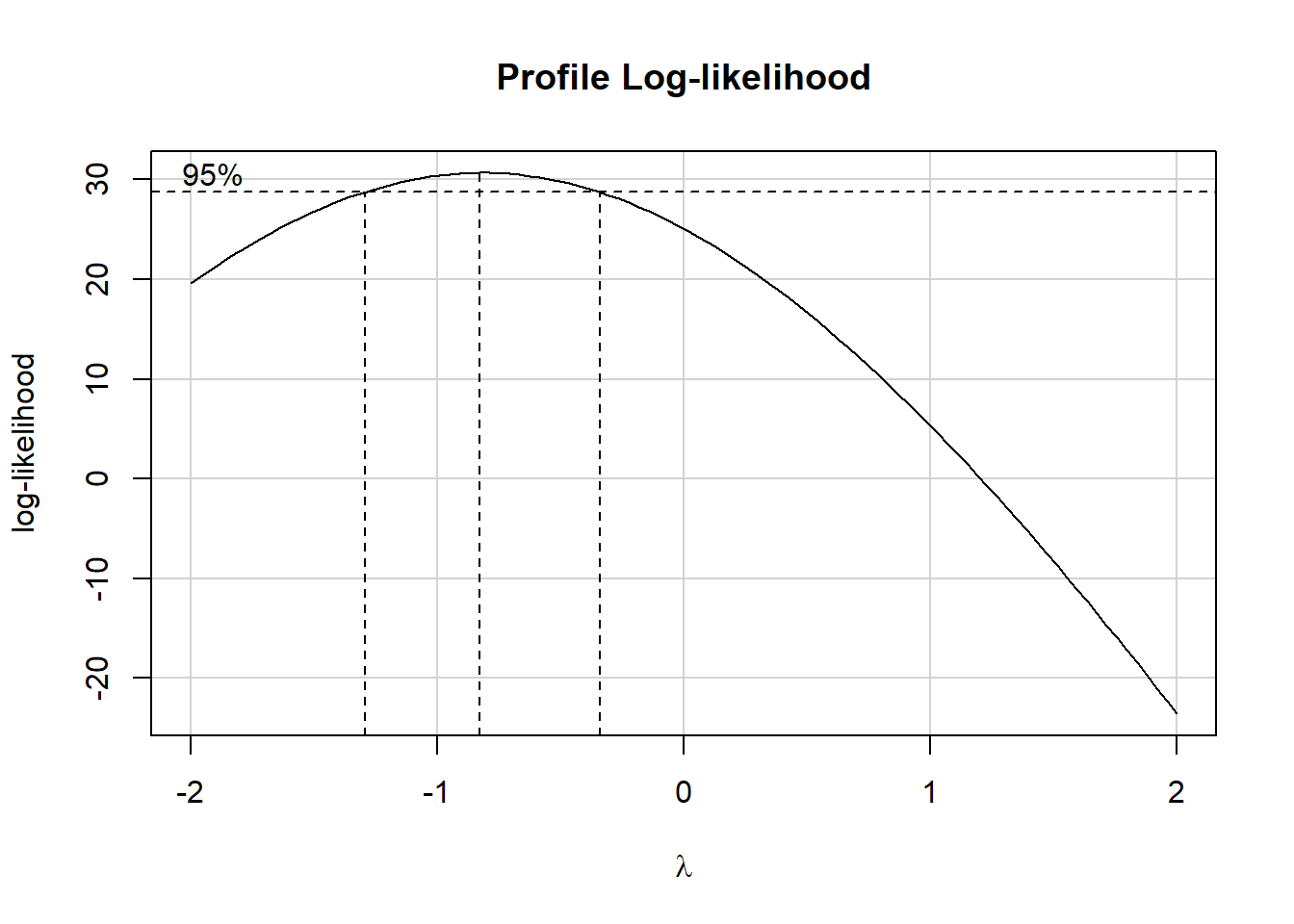
The outer dashed lines comfortably enclose -1, so we elect to use -1
as a our transformation parameter. We refit the model using this
transformation, which can be expressed as 1/time. This
transformation corresponds to rate of death.
m2 <- lm(1/time ~ treat * poison, data = rats)The residuals versus fitted values plot looks much better.
plot(m2, which = 1)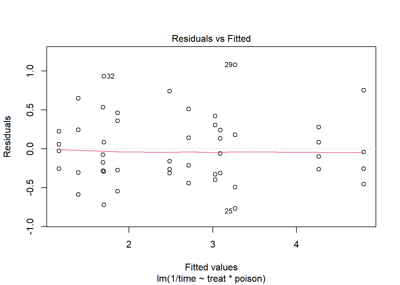
Before we attempt to interpret the model, lets assess whether we
should keep the interaction using the Anova() function from
the {car} package.
car::Anova(m2)Anova Table (Type II tests)
Response: 1/time
Sum Sq Df F value Pr(>F)
treat 20.414 3 28.3431 1.376e-09 ***
poison 34.877 2 72.6347 2.310e-13 ***
treat:poison 1.571 6 1.0904 0.3867
Residuals 8.643 36
---
Signif. codes: 0 '***' 0.001 '**' 0.01 '*' 0.05 '.' 0.1 ' ' 1It certainly doesn’t seem to contribute much to the model. Let’s drop the interaction and fit a new model.
m3 <- lm(1/time ~ treat + poison, data = rats)
summary(m3)
Call:
lm(formula = 1/time ~ treat + poison, data = rats)

Residuals:
     Min       1Q   Median       3Q      Max
-0.82757 -0.37619  0.02116  0.27568  1.18153

Coefficients:
            Estimate Std. Error t value Pr(>|t|)
(Intercept)   2.6977     0.1744  15.473  < 2e-16 ***
treatB       -1.6574     0.2013  -8.233 2.66e-10 ***
treatC       -0.5721     0.2013  -2.842  0.00689 **
treatD       -1.3583     0.2013  -6.747 3.35e-08 ***
poisonII      0.4686     0.1744   2.688  0.01026 *
poisonIII     1.9964     0.1744  11.451 1.69e-14 ***
---
Signif. codes:  0 '***' 0.001 '**' 0.01 '*' 0.05 '.' 0.1 ' ' 1

Residual standard error: 0.4931 on 42 degrees of freedom
Multiple R-squared:  0.8441,    Adjusted R-squared:  0.8255
F-statistic: 45.47 on 5 and 42 DF,  p-value: 6.974e-16
The summary is a little easier to understand, but the coefficients
are relative to the reference levels: Treatment A and Poison I. We can
use the {emmeans} package (Lenth 2022) to
estimate mean survival time conditional on the poison type. Notice we
specify type = "response" and tran = "inverse"
to back-transform the response back to the original scale.
library(emmeans)
emmeans(m3, ~ treat | poison, type = "response", tran = "inverse")
poison = I:
treat response SE df lower.CL upper.CL
A 0.371 0.02400 42 0.328 0.426
B 0.961 0.16100 42 0.718 1.453
C 0.470 0.03860 42 0.404 0.564
D 0.747 0.09720 42 0.591 1.013
poison = II:
treat response SE df lower.CL upper.CL
A 0.316 0.01740 42 0.284 0.355
B 0.663 0.07660 42 0.537 0.864
C 0.385 0.02590 42 0.339 0.446
D 0.553 0.05330 42 0.463 0.687
poison = III:
treat response SE df lower.CL upper.CL
A 0.213 0.00791 42 0.198 0.230
B 0.329 0.01890 42 0.295 0.372
C 0.243 0.01030 42 0.224 0.265
D 0.300 0.01570 42 0.271 0.335
Confidence level used: 0.95
Intervals are back-transformed from the inverse scale We can pipe the output into the {emmeans} plot method to visualize these estimates. Treatments B and D seem to be most effective but also the most variable. No treatment appears to help rats subjected to poison type III.
emmeans(m3, ~ treat | poison, type = "response", tran = "inverse") |>
  plot()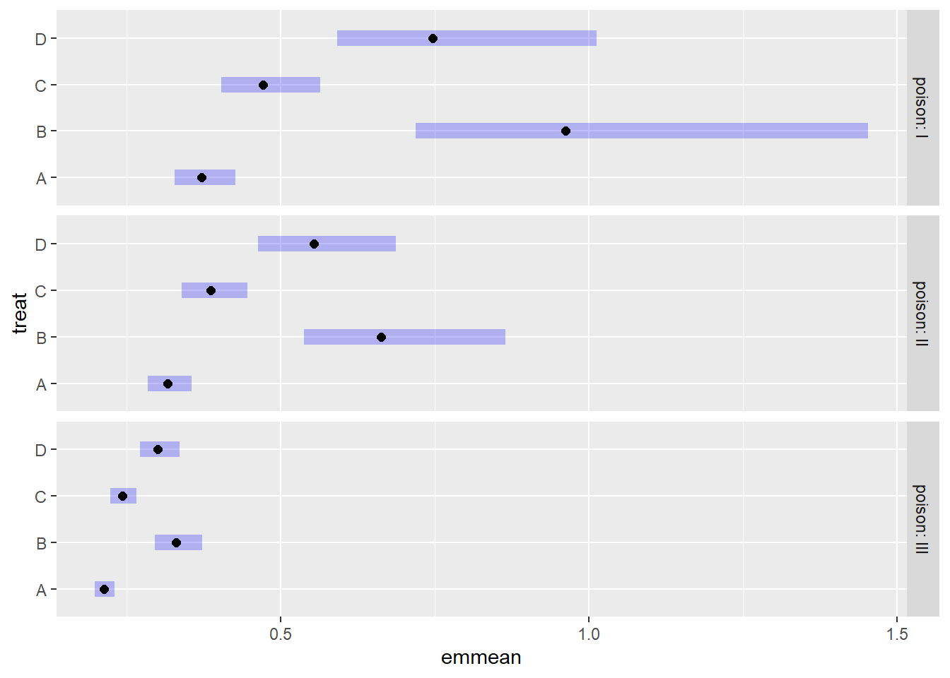
Another approach to modeling this data is using an inverse Gaussian
generalized linear model. Instead of transforming the response, we use
the glm() function with family set to
inverse.gaussian(link = "inverse"). We see the coefficients
in the model summary are not too different from our model above with a
transformed response.
m4 <- glm(time ~ treat + poison, data = rats,
          family = inverse.gaussian(link = "inverse"))
summary(m4)
Call:
glm(formula = time ~ treat + poison, family = inverse.gaussian(link = "inverse"),
    data = rats)

Coefficients:
            Estimate Std. Error t value Pr(>|t|)
(Intercept)   2.6465     0.1939  13.648  < 2e-16 ***
treatB       -1.6095     0.2110  -7.627 1.87e-09 ***
treatC       -0.5835     0.2347  -2.486    0.017 *
treatD       -1.2940     0.2187  -5.917 5.24e-07 ***
poisonII      0.2900     0.1566   1.853    0.071 .
poisonIII     1.9660     0.1929  10.192 6.34e-13 ***
---
Signif. codes:  0 '***' 0.001 '**' 0.01 '*' 0.05 '.' 0.1 ' ' 1

(Dispersion parameter for inverse.gaussian family taken to be 0.1139811)

    Null deviance: 25.7437  on 47  degrees of freedom
Residual deviance:  4.5888  on 42  degrees of freedom
AIC: -85.701

Number of Fisher Scoring iterations: 2
The residuals versus fitted values plot hints at some heteroscedasticity, but it’s being driven by only 3 points: 30, 24, and 15.
plot(m4, which = 1)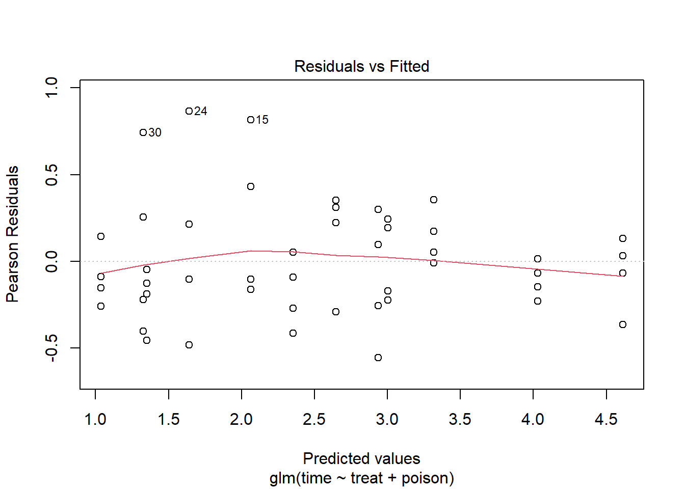
As before, we can use the {emmeans} package to estimate mean survival
times and create a plot with error bars. Notice we don’t need to specify
a transformation with the tran argument. The
emmeans() function knows to automatically back-transform
the response since the “inverse” link is part of the fitted model
object.
emmeans(m4, ~ treat | poison, type = "response") |>
  plot()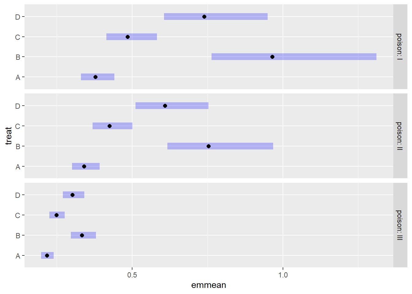
The results are very similar to the previous plot.